

The master bedroom is the one room in an Indian home that belongs to two people rather than to the whole family, and that makes choosing its colours surprisingly difficult. One partner wants a calm, pale room; the other wants something bold and dramatic. One loves blue, the other finds it cold. One is thinking of the photographs on social media, the other of how the room will feel at six in the morning. Add parents who have opinions about auspicious colours, a builder's off-white walls, and a wardrobe laminate already chosen, and the bedroom often ends up as a compromise that pleases no one.
Colour in a bedroom also has to work harder than in other rooms. It is seen in bright morning light, in the afternoon when the room may be dim behind curtains, and at night under lamps, often from a lying-down position that no other room is designed for. It has to suit two people's sleep, their clothes and furniture, and in many families their sense of what a married couple's room should feel like. The good news is that there is a reliable method for choosing colours together, and a small set of combinations that work in most Indian bedrooms.
This article sets out that method: how colour properties affect a bedroom, how to reach agreement, ten tested combinations for couples, where each colour should go on the walls and ceiling, how light changes everything, and what painting costs. It follows the same colour principles as this site's living room colour guide and the same Vastu colour notes as its Vastu colours guide, so the advice stays consistent across the home.
What colour does in a bedroom
Every paint colour has a hue (its family, such as green or blue), a value or lightness, a saturation (how intense or greyed it is) and a temperature (warm or cool). In a bedroom, lightness and saturation matter more than hue. A room painted in a light, greyed colour of almost any hue — sage, greige, dusty rose, pale blue — will feel calm; a room painted in a saturated colour of the same hue — emerald, bright pink, royal blue — will feel energetic, whatever the colour's name. This is why two partners who disagree on hue can usually agree on a colour once they agree on how light and how muted it should be.
Lightness is measured on paint datasheets as Light Reflectance Value, or LRV: the percentage of light a surface reflects, from close to 0 for black to around 85–90 for the brightest whites. A bedroom with walls around LRV 55–75 will feel light but soft; walls above about 80 can feel stark under cool light; and a single deeper wall at LRV 15–40 can add depth without darkening the room. There is also a body of general research and common experience suggesting that warm, dim light in the evening helps people wind down, while bright, cool light is better suited to the morning and to work; colour and lighting should support that rhythm.
How couples can agree on bedroom colours
In practice, most disagreements about bedroom colour are not really about colour. They are about mood (calm or dramatic), about light (a dark room for sleep or a bright room for mornings), and about identity (a room that feels like one's own). A designer's job is to separate those questions and answer each one. The five steps below are the method Aaditya Interior uses with couples, and they usually end the argument within one meeting.
- Agree on the mood first, in words: calm and restful, warm and cosy, fresh and airy, or rich and dramatic. Choose one primary mood.
- Each partner picks three rooms from photographs that feel right, without discussing colour. Look for what the six images share — usually lightness and saturation, not hue.
- Agree on depth: three walls light (LRV about 55–75), and at most one deeper wall. This alone removes most conflicts.
- Let each partner own one element: one chooses the headboard wall colour, the other the bedding and curtains, within the agreed mood.
- Test two or three finalists as large swatches — at least 600 × 600 mm — on two walls, and look at them in morning light and under the bedroom's own lamps at night before deciding.
There is also a useful rule for the most common split, where one partner prefers warm colours and the other cool. Choose a near-neutral base that sits between them — a warm grey (greige), a muted sage or a soft taupe — and let the warm-loving partner bring warmth through wood, brass and textiles, while the cool-loving partner chooses a cool accent such as a blue-grey headboard wall or blue linen. Because the base is neutral, both sets of choices sit comfortably together.
| Common disagreement | What is really being asked | Solution that usually works |
|---|---|---|
| Bright and bold versus pale and calm | Energy versus rest | Pale base on three walls; one deeper, muted headboard wall; bold colour only in cushions or art |
| Warm colours versus cool colours | Cosiness versus freshness | Near-neutral base (greige, sage, taupe); warmth from wood and textiles, coolness from one accent |
| Dark, moody room versus bright room | Sleep versus mornings | Deeper headboard wall, light wall opposite the bed, blackout curtains for sleep |
| Pink versus 'not pink' | Romance versus formality | Dusty rose or blush, greyed down, beside greige and brass; or rose only in textiles |
| Parents want auspicious colours | Tradition and blessings | Use the traditional colour family in a muted shade (sand, peach, light earthy pink) on one wall |
| Wardrobe laminate already chosen | Matching existing finishes | Pick the wall colour from the laminate's undertone; contrast in lightness, not hue |
Ten bedroom colour combinations for couples
The combinations below have been tested in Indian bedrooms in different orientations and under warm LED lighting. Each one gives a base for about 60 per cent of what the eye sees (three walls, ceiling, large textiles), a secondary colour or material for about 30 per cent (headboard wall, wardrobe, bed, curtains), and an accent for about 10 per cent. The shades named are colour families, not specific products; every manufacturer has its own versions, and they should be compared on the wall, not on a phone screen.
| Combination | Base walls (≈ 60 %) | Secondary (≈ 30 %) | Accent (≈ 10 %) | Mood | Works best |
|---|---|---|---|---|---|
| Sage and warm white | Warm white, LRV 75–80 | Muted sage headboard wall, oak or teak | Brass, terracotta pots | Calm, natural | Most orientations; with plants |
| Dusty rose and greige | Light greige | Dusty rose headboard or bedding | Brass, walnut | Soft, romantic, grown-up | East and north light |
| Navy and cream | Cream or ivory | Deep navy headboard wall | Brass lamps, mustard cushion | Rich, restful | Larger rooms; west light |
| Terracotta and sand | Sand or light beige | Terracotta or clay headboard wall | Cane, jute, dark wood | Warm, earthy | North and east light; south-west master bedrooms |
| Greige and charcoal | Greige | Charcoal headboard or upholstered panel | Brass, white linen | Hotel-like, quiet | Couples who want neutrality |
| Powder blue and white | Soft white | Powder or dusty blue walls or bedding | Light wood, cane | Fresh, airy | Hot south and west rooms |
| Teal and ivory | Ivory | Deep teal headboard wall or velvet bed | Gold, blush | Dramatic but calm | Rooms with good daylight |
| Olive and ivory | Ivory | Olive green headboard wall | Rust, terracotta, brass | Earthy, warm | Rooms with wood floors or Kota |
| Lavender grey and white | Soft white | Lavender-grey walls or bedding | Silver, pale wood | Quiet, gentle | Smaller bedrooms |
| Peach and warm white | Warm white | Soft peach walls | Teak, ochre textiles | Cheerful, warm | North light; Vastu-preferred south-east rooms |
Three cautions apply to the whole list. First, saturated reds, bright oranges and very bright pinks on a whole wall are best avoided in bedrooms; they are energising, and they are also among the colours that Vastu guidance commonly advises against for the master bedroom. Second, very dark colours on every wall make most Indian bedrooms, which are usually about 11–14 ft wide, feel smaller and hotter. Third, pure cool white under cool 6500 K light gives the hospital look that many couples dislike; warm white walls with 2700–3000 K light avoid it.
Where the colour goes: walls, headboard and ceiling
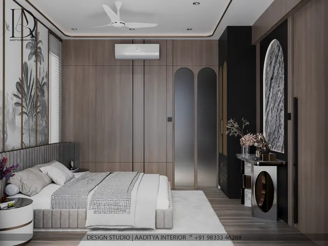
A bedroom is seen from two positions: standing at the door, and lying in bed. From the door, the eye goes to the headboard wall, which is why it is the natural place for the deeper or feature colour. From the bed, however, the eye rests on the wall opposite — usually the wardrobe or TV wall — and on the ceiling. Those surfaces should be calm: light, muted and free of strong pattern. Many bedrooms get this backwards, with a bold feature wall facing the bed, and the couple then lies looking at the loudest surface in the room.
Fig. 2 shows one of the most useful bedroom techniques: a two-tone headboard wall, with the deeper colour on the lower part of the wall, up to about 900–1200 mm or aligned with the top of the headboard, and the lighter base above. The darker band grounds the bed and the side tables, hides scuffs, and adds colour where it is seen from the door, while the upper wall and ceiling stay light. A crisp, masked line or a slim wooden strip of 20–40 mm makes the split look intentional. Where the couple prefers a full feature wall, the accent covers the whole headboard wall and the other three walls stay in the base colour.
The ceiling deserves more attention in a bedroom than anywhere else, because it is what the couple sees when lying down. A plain white ceiling is safe; a very light tint of the base colour, mixed at a fraction of its strength, makes the room feel enveloping without lowering it. Dark ceilings can work in large bedrooms with high ceilings, but in typical Indian flats with ceiling heights of about 2700–3000 mm, they usually make the room feel lower and warmer.
Light changes every colour
No bedroom colour can be judged without its light. Daylight differs with the window's direction: north light in India is soft and even, so colours look true but slightly cooler; east light is bright and warm in the morning and fades later; south and west light are strong and hot in the afternoon, so walls facing them benefit from cooler, lighter colours that do not add to the sense of heat. At night, the colour temperature of the lamps matters more than the paint card. Warm white LEDs at 2700–3000 K, the usual residential choice, make warm colours glow and can make cool greys look muddy; neutral white at about 4000 K is better for a dressing mirror than for the whole room.
| Window direction (India) | Light character | Base colours that work | Accent suggestions | Avoid |
|---|---|---|---|---|
| North | Soft, even, slightly cool | Warm white, sand, peach, greige | Terracotta, olive, dusty rose | Cool grey or blue on every wall |
| East | Bright warm mornings, softer afternoons | Warm white, sage, blush | Sage, teal, navy | Very dark walls that waste morning light |
| South | Strong, warm, long hours | Soft white, pale blue-grey, light sage | Navy, teal | Hot oranges and reds |
| West | Harsh, hot afternoon sun | Light cool neutrals, powder blue, soft white | Deep blue or green on the headboard wall | Dark colours on the sunlit wall |
| Little daylight (inner room) | Mostly artificial | Light warm neutrals, LRV 70+ | One muted accent | Dark walls and cool lamps together |
Vastu colour notes for the master bedroom
Many Indian couples, or their parents, want the bedroom colours to respect Vastu. Popular Vastu guidance, as summarised in this site's Vastu colours guide, places the master bedroom ideally in the south-west, associated with the earth element, and suggests earthy, warm and calming colours there: beige, sand, light brown, soft terracotta and light earthy pink. It commonly advises against bright red and black across a bedroom, and against harsh white under cool light. Bedrooms in other directions are often given the colour family of their zone — greens and blues to the north, whites and light colours to the east and west, peach and warm colours to the south-east.
The practical design view largely agrees. Earthy, muted, warm colours are restful, flatter skin tones and wood, and sit well in a south-west room that receives hot afternoon sun only on its outer walls. Where a couple's preferred colour differs from the traditional suggestion, the balanced approach is to keep the traditional colour family in the base or the textiles and bring the preferred colour into the headboard wall or bedding in a muted shade. No colour should be chosen out of fear, and a well-lit, well-ventilated, calm bedroom matters more than any single shade.
Materials, finishes and textiles
Colour in a bedroom is not only paint. The wardrobe shutters, bed and headboard, curtains, rug and bedding together cover as much visible area as the walls, so they belong in the palette from the start. Matte or super-matte finishes suit bedroom wardrobes better than gloss, which shows fingerprints and reflects lamps. Wood tones should be kept to one or two families — light oak with sage or blue palettes, teak or walnut with terracotta, navy or olive. Bedding and curtains are the easiest place to change the mood over the years, so it is sensible to put the strongest or most fashionable colour there rather than on the walls.
For paint itself, a washable matte or low-sheen emulsion is the usual bedroom choice. Premium emulsions hold colour longer and resist marks, which matters on the headboard wall where heads and pillows rub. Texture paints, limewash-look finishes and wallpaper suit a single feature wall; they should be kept off the wall opposite the bed if the couple wants a quiet view from the pillow.
| Item for a 12 × 14 ft bedroom | Area (approx.) | Rate (indicative October 2026) | Indicative cost |
|---|---|---|---|
| Economy emulsion, walls and ceiling | ≈ 500–550 sq ft paintable | ₹12–18 per sq ft all-in | ≈ ₹6,000–10,000 |
| Premium emulsion, walls and ceiling | ≈ 500–550 sq ft paintable | ₹20–30 per sq ft all-in | ≈ ₹10,000–16,500 |
| Texture or designer paint, one accent wall | ≈ 100–120 sq ft | ₹40–150+ per sq ft | ≈ ₹4,000–18,000 extra |
| Two-tone split with masked line or wood strip | One or more walls | Small labour extra; strip priced per running ft | Confirm with the painter or carpenter |
| Upholstered or wood headboard panel | ≈ 20–30 sq ft | Veneer ₹600–1,100 per sq ft of finished panel | ≈ ₹12,000–33,000 in veneer |
The paintable area of a room is roughly three times its floor area once walls and ceiling are included, which is why a 168 sq ft bedroom carries about 500–550 sq ft of paintable surface. These figures follow the rates used in this site's painting cost guide; the difference between economy and premium emulsion across a whole bedroom is usually only a few thousand rupees, which makes premium paint good value in the one room where the walls are seen up close every day.
The future of bedroom colour
Bedroom palettes in India are moving away from the high-contrast feature walls of the 2000s and the grey-and-white rooms of the 2010s towards warmer, softer, more natural colours: earthy neutrals, muted greens, clay tones and gentle pinks, combined with wood, cane and handloom textiles. Lighting is changing too. Tunable white LEDs that shift from cooler light in the morning to warm, dim light at night are becoming affordable, and they make it easier to choose colours that look right in both. Mineral and lime-based paints, low-VOC emulsions and washable matte finishes are also growing in popularity, reflecting a wider interest in healthier materials in the room where people spend about a third of their lives.
Eight rules for a couple's bedroom palette
- Agree on the mood and the depth before discussing hue: three light walls (LRV ≈ 55–75), at most one deeper wall.
- Put the deeper colour on the headboard wall or in a two-tone band below 900–1200 mm, not on the wall opposite the bed.
- Choose muted, greyed shades rather than saturated ones; save bright colour for cushions and art.
- Use a near-neutral base (greige, sage, taupe) when one partner likes warm colours and the other cool.
- Keep the ceiling white or a very light tint of the base colour.
- Light the room at 2700–3000 K with dimmers; use 4000 K only at the dressing mirror.
- Test 600 × 600 mm swatches on two walls in morning and night light before buying paint.
- Plan wardrobe, headboard, curtains and bedding as part of the palette, with one or two wood tones only.
Frequently asked questions
Which colour is best for a couple's bedroom?
There is no single best colour, but muted, mid-light colours suit most couples: sage green, greige, dusty rose, sand, soft blue and warm white, with one deeper colour such as navy, terracotta or olive on the headboard wall. Avoid saturated red, bright orange and black across whole walls.
Which two colours go well together on bedroom walls?
Pair a light base with a deeper colour from the same temperature family: warm white with sage or terracotta, greige with charcoal or dusty rose, cream with navy or teal, ivory with olive. Put the deeper colour on the headboard wall or in a lower band.
Is pink a good bedroom colour for couples?
Greyed or dusty pinks work well in couples' bedrooms because they read as warm neutrals rather than bright pink, especially beside greige, wood and brass. Bright or candy pinks are better kept to textiles.
Should the bedroom ceiling be white?
White is the safe choice. A very light tint of the wall colour makes the room feel softer without lowering it. Dark ceilings suit only large bedrooms with high ceilings.
What is the Vastu colour for a master bedroom?
Popular Vastu guidance suggests earthy, warm colours such as beige, sand, light brown, soft terracotta and light earthy pink for a south-west master bedroom, and advises against bright red and black. These muted colours are also restful in practical design terms.
Sources & standards
- Bureau of Indian Standards — IS 15489 (paints, plastic emulsion) and manufacturers' datasheets for light reflectance values
- National Building Code of India 2016, Part 8 (building services — lighting and natural ventilation)
- Bureau of Energy Efficiency — guidance on efficient LED lighting for homes
- Neufert, Architects' Data — bedroom furniture sizes and clearances
- Time-Saver Standards for Interior Design and Space Planning — colour, light and residential interiors
- Manufacturers' shade cards and LRV data from major Indian paint companies, described generically
- Price ranges: indicative October 2026 estimates — confirm locally before budgeting