

Paint is the cheapest way to change how a home feels, and colour is the decision Indian homeowners most often get wrong. A shade that looked calm on a two-inch card turns muddy on a north wall, glaring on a west wall, or dark and cramped in a 10 × 11 ft bedroom. A trend picked from social media, photographed in northern European light, behaves very differently under the intense sun of Surat, Jaipur or Chennai and under the cool-white tube lights still common in Indian flats.
Every year brings forecasts of the colours that will define the next one. Paint manufacturers announce their own colours of the year, and design media turn them into lists. This article does not repeat those announcements. Instead it describes the broad design directions that designers in India are observing and specifying going into 2027, explains why they are happening, and — more importantly — shows how to use them in Indian rooms so that they still look right in five years.
The directions here are consistent with the wider interior trends discussed in this blog's Interior Design Trends 2027 article: warmer, more natural and more textured. What follows adds the colour science — light reflectance, orientation, lighting temperature — and the practical numbers: proportions, dado heights, paint costs and room-by-room palettes.
How colour trends form — and why they move slowly
A colour trend is not invented in one announcement. It usually builds over several years: designers and early adopters start using a family of colours in projects; materials and furniture manufacturers bring out products in those tones; paint companies refine shades and promote them; magazines and social media spread the look; and eventually the colours become so common that they start to look ordinary, and a new direction begins. For a paint colour this cycle can take several years; for underlying moods, such as the move from cool to warm, it can last a decade or more.
This matters for homeowners because a home is repainted every five to eight years in most Indian cities, and furniture, flooring and kitchen shutters last much longer. The useful question is not which colour is newest but which direction is broad and stable enough to last the life of the paint. The directions below are of that kind: they have been building for several years, they connect to deeper shifts in how people want their homes to feel, and they are supported by materials — wood, stone, lime, cane, terracotta — that will not date quickly.
A short history of colour in Indian homes
For most of Indian history, house walls were finished in lime. Lime-wash gave a white or off-white surface that reflected heat, resisted insects and was renewed every year before festivals. Colour came from pigments mixed into lime: indigo blue on the houses of Jodhpur's old city, ochre and red earth (geru) on rural walls, pink and terracotta in Jaipur. Red oxide floors, polished to a deep sheen, were common in homes across the south and west. Colour was regional and material — it came from the earth and stone of the place.
Through the second half of the twentieth century, distemper and then emulsion paints brought factory colour to every city. Pastel greens, blues, pinks and creams became the standard Indian interior, often one colour per room, sometimes with a contrasting border. From the 2000s, the feature or accent wall arrived: one wall in a strong colour, often behind the television or the bed. In the 2010s, many urban interiors moved to white and grey, influenced by international minimalism. Since around the early 2020s, the movement has been firmly back towards warmth — off-whites with yellow or pink undertones, beige, sand, clay, terracotta and muted greens — and towards texture through limewash and mineral finishes.
Seven colour directions for Indian homes going into 2027
The seven directions below are observations of what designers are specifying and what materials suppliers are offering, not predictions of a single winning shade. Each is described as a family of colours, with the undertone that makes it work in Indian light and the materials it pairs with.
1. Warm whites and soft neutrals as the base
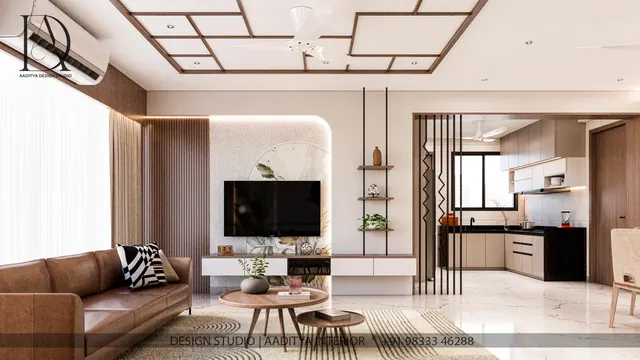
Bright, cool, blue-tinged whites are giving way to whites with a little yellow, pink or grey-beige in them — ivory, cream, putty, linen, warm greige. In strong Indian daylight a cool white can look harsh and clinical; a warm white softens the glare and flatters wood, stone and skin. These remain the safest base for most of the home, especially in compact flats where walls need to reflect light.
2. Earth reds: terracotta, clay and rust
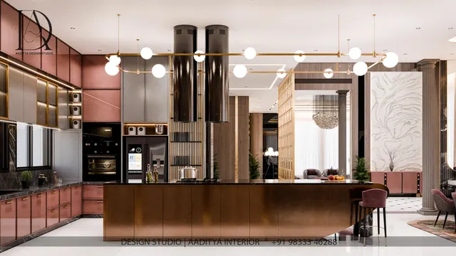
Terracotta, baked clay, brick red, rust and dusty rose bring warmth and a sense of place, echoing Indian building materials. They work well on one wall of a living or dining room, in a foyer, on a bed wall or in textiles. In a south- or west-facing room they can feel hot; balance them with plenty of off-white and green.
3. Greens: olive, moss, sage and bottle green
Green has been the most consistent colour family in interiors for several years and continues into 2027, shifting from mint and sage towards deeper olive, moss and bottle green. Green connects to plants and views, and it is particularly popular for kitchen shutters, study walls and bedrooms. Olive and moss sit comfortably with oak, walnut and cane; bottle green with brass and marble.
4. Ink blues and indigo
Deep blues — ink, navy, indigo, slate — are replacing charcoal and black as the strong dark colour. They have a long Indian history, from indigo dye to the blue houses of Jodhpur. Used on a study wall, a bed wall, kitchen base units or a powder room, they feel calm rather than heavy, provided the room has good light or warm lighting.
5. Browns are back: mocha, chocolate and walnut
After years out of favour, brown is returning — through walnut and smoked-oak veneers, leather, mocha and chocolate paint and upholstery, and taupe-brown tiles. Brown makes a room feel enclosed and warm; it suits a library corner, a home theatre or a bedroom used mainly at night. It needs good warm lighting and lighter surroundings, or it can feel gloomy.
6. Ochre, turmeric and mustard accents
Yellow-earth colours — ochre, turmeric, mustard, saffron — appear as accents: a cushion, a cabinet, a door, an arch niche or a single chair. They bring sun into a north-facing room and work beautifully with blue and green. Large areas of strong yellow can be tiring in hot climates, so they are best used at about 10 per cent of a room.
7. Muted pastels with grey in them
For children's rooms, bedrooms and bathrooms, soft pastels continue — but greyed, chalky versions rather than the sugary pastels of the past: dusty pink, powder blue, pale pistachio, lilac-grey. They are restful, they hide less dirt than deeper colours, and they pair with light wood and white.
| Direction | Typical colours | Undertone to look for | Where it works | Pairs with |
|---|---|---|---|---|
| Warm whites and neutrals | Ivory, cream, putty, linen, greige | Yellow, pink or beige — not blue | Whole-home base, compact flats | Oak, marble, cane, brass |
| Earth reds | Terracotta, clay, rust, dusty rose | Warm brown-orange | Living, dining, foyer, bed wall | Off-white, olive, jute, terracotta tiles |
| Greens | Olive, moss, sage, bottle green | Yellow-green for warmth; blue-green for calm | Kitchen shutters, study, bedroom | Walnut, brass, white marble |
| Ink blues | Indigo, navy, slate, ink | Slightly warm or grey, not electric | Study, bed wall, kitchen base, powder room | Brass, mustard, light oak |
| Browns | Mocha, chocolate, taupe | Red-brown or grey-brown | Library corner, home theatre, bedroom | Cream, leather, smoked wood |
| Yellow-earth accents | Ochre, turmeric, mustard, saffron | Brown-yellow, not lemon | Accents, doors, a single chair | Indigo, green, off-white |
| Muted pastels | Dusty pink, powder blue, pistachio, lilac-grey | Grey, chalky | Children's rooms, bedrooms, bathrooms | Light wood, white, cane |
Techniques replacing the single accent wall
How colour is used is changing as much as which colours. The single bright accent wall in an otherwise white room — the signature of the 2000s and 2010s — is giving way to more considered approaches.
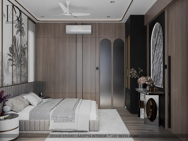
Tonal schemes use several shades of one colour family — say three greens from pale sage to olive — on walls, joinery and textiles, so the room feels rich but calm. Colour drenching paints the walls, ceiling, skirting, doors and sometimes built-in joinery in one colour, which blurs the edges of a small room and can make it feel larger and more enveloping; it works best in rooms with one function, such as a powder room, a study or a bedroom. Two-tone walls divide a wall horizontally at a dado height of about 900–1200 millimetres, with a deeper colour below and a lighter one above, a practical choice in Indian homes where the lower wall takes the most marks. Coloured ceilings — a soft tint rather than plain white — make tall rooms feel more intimate. And texture — limewash, mineral paints, matt finishes — is often used instead of a strong colour to add depth.
In the bedroom in Fig. 2, the deeper colour runs from the floor to a dado line at 1100 millimetres, just below the top of a 1200 millimetre headboard, and the upper wall is a warm white that carries daylight deep into the room. The ceiling is not plain white but a pale tint of the wall colour, finished with a narrow band where wall meets ceiling. This kind of scheme costs no more than plain paint — two colours instead of one — yet changes the proportions of the room.
The science: light reflectance, orientation and lighting
Light reflectance value (LRV)
Every paint colour has a light reflectance value, usually printed on the shade card or available from the manufacturer: a number from 0 (absolute black, reflecting no light) to 100 (a perfect white, reflecting all of it). Most whites fall around 80–90, mid-tone colours around 40–60 and deep colours below 20. LRV is the single most useful number for predicting how light or dark a room will feel. In a compact Indian flat with one window per room, keeping the main walls above an LRV of about 60 and the ceiling above about 80 keeps the room bright; deeper colours with low LRV should be used on smaller areas, in well-lit rooms, or in rooms used mainly at night.
| LRV band | How it behaves | Good uses in Indian homes | Caution |
|---|---|---|---|
| 85–95 (bright white) | Maximum reflection; can look cool | Ceilings, dark north-facing rooms | Glare in strong sun; shows marks |
| 70–85 (warm whites, creams) | Bright but soft | Main walls of most rooms | Check undertone under the room's lighting |
| 50–70 (light mid-tones) | Noticeable colour, still bright | Bedrooms, living rooms with good daylight | May look deeper on large walls than on the card |
| 30–50 (mid-tones) | Clear colour, absorbs more light | Feature walls, dado, kitchen shutters | Avoid on all walls of a small dark room |
| 10–30 (deep) | Dramatic, enclosing | Lower walls, joinery, powder rooms, studies | Needs warm lighting; can feel heavy |
| Under 10 (very deep) | Near-black | Trims, frames, small accents | Shows dust and scuffs; heats up on sunny exteriors |
Orientation and Indian light
In India, north light is the most even and the coolest: it suits deeper and warmer colours, which it keeps from looking flat. South and west light is intense and hot, especially in the afternoon: rooms facing it benefit from lighter, cooler-feeling colours — soft greens, blue-greys, warm whites — and from shading. East light is bright and warm in the morning and cooler later, which suits bedrooms and kitchens painted in fresh, light colours. These are tendencies rather than rules; window size, shading, neighbouring buildings and the colour of the floor all change the result.
Lighting colour temperature
A paint colour is only ever seen under light, and in the evening that light is artificial. Warm-white lamps around 2700–3000 K bring out reds, browns, ochres and olives and make warm whites look creamy; cool-white lamps around 5000–6500 K flatten warm colours and can make terracotta look brown and olive look grey. Lamps with a colour rendering index (CRI) of 90 or more show colours more faithfully than cheaper lamps at around 80. The 2027 palette, which is warm and earthy, needs warm, high-CRI lighting to look as intended.
Room-by-room palettes for 2027
The palettes below combine the directions above with the orientation and LRV logic. Each gives a base for the main walls, a secondary colour for one wall, joinery or textiles, and an accent. They are starting points, to be tested on the actual walls.
| Room | Base (≈ 60 %) | Secondary (≈ 30 %) | Accent (≈ 10 %) | Why it works |
|---|---|---|---|---|
| Living room | Warm white or putty | Terracotta or olive on one wall or in textiles | Brass, ochre, ink blue | Bright for daytime, warm in the evening |
| Dining | Cream or linen | Bottle green or clay red | Brass, walnut | Deeper colours suit evening meals |
| Kitchen | Warm white walls | Olive, sage or ink-blue shutters | Brass or matte black handles | Colour on shutters, light walls keep it bright |
| Master bedroom | Warm white upper wall | Olive, mocha or dusty rose dado or bed wall | Ochre, cane, linen | Enclosing and restful at night |
| Children's room | Chalky pastel or warm white | Powder blue, pistachio or dusty pink | Mustard, coral | Soft, cheerful, easy to repaint |
| Study / home office | Warm white | Ink blue or moss green wall | Walnut, brass | Calm and focused; deep colour behind the screen reduces contrast glare |
| Bathroom | Warm white or sand tiles | Sage, clay or blue-grey paint above tiles | Brass or black fittings | Fresh without being cold |
| Foyer | Lime-washed warm neutral | Terracotta, ochre or indigo niche | Brass lamp | A warm first impression |
What it costs: paint, texture and coloured joinery
Changing colour is still one of the least expensive improvements in a home. The prices below are indicative October 2026 ranges per sq ft of paintable area, including two coats over prepared walls, and follow the bands used in other articles on this blog. Putty, crack repair and primer can add to the cost when walls need preparation.
| Finish | Indicative cost (October 2026) | Best for | Note |
|---|---|---|---|
| Economy emulsion | ₹12–18 per sq ft | Rental homes, low-traffic rooms | Washable; fewer deep shades hold well |
| Premium emulsion | ₹20–30 per sq ft | Living rooms, bedrooms, high-visibility walls | Better colour depth, stain resistance and life |
| Texture, limewash or mineral finish | ₹40–150+ per sq ft | One feature wall per room | Needs a skilled applicator; repairable |
| Laminate kitchen shutters (coloured) | ₹350–650 per sq ft of shutter | Olive, sage, ink-blue kitchens on a budget | Matt laminates suit the 2027 palette |
| PU paint shutters (coloured) | ₹1,000–1,800 per sq ft of shutter | Exact custom colours, seamless edges | Can be matched to the wall paint |
A typical bedroom of 3000 × 3600 millimetres with a 2850 millimetre ceiling has about 400 sq ft of wall area before openings — roughly 350 sq ft after deducting a door and window. In premium emulsion at ₹20–30 per sq ft that is about ₹7,000–10,500, and a two-tone scheme costs almost exactly the same. Adding a limewash feature wall of about 100 sq ft at ₹40–150+ per sq ft adds roughly ₹4,000–15,000 or more. Coloured kitchen shutters cost far more than wall paint, which is why it is wise to choose a kitchen colour that will last — or to keep the shutters neutral and put the strong colour on a wall or backsplash that can be changed later.
Where colour in homes is heading
Beyond 2027, three longer currents are visible. The first is material honesty: more mineral and lime-based paints, low-VOC emulsions and natural pigments, partly for health and partly because their soft, varied surfaces suit warm palettes. The second is climate: heat-reflective exterior paints and cool-roof coatings are becoming common in hot Indian cities, and the energy logic of light-coloured roofs and west walls will increasingly shape exterior colour choices. The third is digital: phone-based colour visualisers and augmented-reality tools let homeowners preview colours on their own walls, which helps, but cannot replace a large painted sample viewed in daylight and at night.
Underneath these currents, the mood is likely to stay warm and natural for some time, because it is tied to a broader wish for homes that feel calm, rooted and personal rather than showroom-perfect. That is good news for Indian homes, whose traditional materials — lime, terracotta, stone, wood, cane and handloom — are exactly the materials that make these palettes work.
Common colour mistakes in Indian homes
| Mistake | What happens | Better approach |
|---|---|---|
| Choosing from a small card | Colour looks deeper and stronger on a full wall | Paint a sample of at least 600 × 600 mm on two walls |
| Ignoring undertone | A grey turns blue or green in the room | Compare against a pure white sheet and the floor tile |
| Deep colour on every wall of a small room | The room shrinks and feels dark | Deep colour on one wall or as a dado; light above |
| Cool-white lighting with warm paint | Terracotta looks muddy, olive looks grey | Use 2700–3000 K lamps with CRI ≥ 90 |
| Following a trend in the kitchen shutters | Expensive to change when it dates | Neutral shutters, colour on walls or backsplash |
| Different whites in one home | Ceilings, trims and walls clash | Choose one warm white family for the whole home |
| High-gloss paint on uneven walls | Every flaw shows | Matt or low-sheen finishes for most walls |
Eight rules for colours that last
- Choose one warm white for ceilings and main walls throughout the home.
- Use the 60-30-10 split: base, secondary, accent — and keep the accent small.
- Read the LRV: keep main walls above about 60 and ceilings above about 80 in compact flats.
- Match colour to orientation: warmer and deeper for north, cooler-feeling and lighter for west.
- Test large samples on two walls and view them in daylight and under your actual lamps.
- Light warm palettes with 2700–3000 K, CRI ≥ 90 lamps.
- Put trend colours on walls and textiles; keep expensive joinery in colours that will last.
- Prefer matt and low-sheen finishes, and add texture rather than more colour where depth is wanted.
Frequently asked questions
What are the trending wall colours for 2027 in India?
Warm whites and soft neutrals as the base, with terracotta and clay reds, olive and moss greens, ink and indigo blues, browns such as mocha and walnut, ochre and mustard accents, and greyed pastels for bedrooms and children's rooms. These are design directions observed across the industry, not a single colour of the year.
Is grey still in fashion for Indian homes?
Cool grey is fading as a main wall colour. Warm greys and greige — grey with beige in it — remain useful neutrals, especially with wood and stone. If a home is already grey, warming it with wood, brass, textiles and warm lighting is cheaper than repainting.
Which colour makes a small room look bigger?
A light, warm colour with a high LRV (about 70–85) on walls and ceiling, in a matt finish, makes a small room feel larger. Colour drenching a small room in one mid-tone can also blur its corners and make it feel more spacious, provided the room has decent light.
What colour is best for a west-facing room in a hot city?
Light, cool-feeling colours — soft green, blue-grey, warm white — with an LRV of about 60–80, combined with external shading or curtains. Avoid very deep colours on west walls, especially exterior walls, because they absorb more heat.
How often should interior walls be repainted?
In most Indian cities, every five to eight years for premium emulsion in living spaces, sooner in kitchens, children's rooms and high-traffic areas, and whenever damp or cracks appear. A colour change is easiest to plan at that natural repaint cycle.
Sources & standards
- Bureau of Indian Standards — IS 15489 (paints — plastic emulsion), and National Building Code of India 2016, Part 8 (lighting and natural ventilation)
- Bureau of Energy Efficiency — Energy Conservation Building Code (ECBC) guidance on solar reflectance of roofs and cool-roof materials
- Commission Internationale de l'Éclairage (CIE) — colour rendering index (CRI) and colour temperature definitions
- Paint manufacturers' published shade cards and technical data sheets — light reflectance values (LRV) for individual shades
- Neufert Architects' Data — daylighting, room proportions and surface reflectances
- Price ranges: indicative October 2026 estimates — confirm locally before budgeting