

Most living rooms in India are painted twice. The first time, the family picks a colour from a small chip on a shade card under the showroom's bright tube lights; the second time, a year or two later, they repaint because the room looks darker, greyer or louder than they expected. The colour itself was rarely the problem. The problem was the combination: a wall colour chosen without looking at the beige vitrified floor, the brown laminate TV unit, the maroon sofa inherited from the old house, the west-facing window and the warm-white lights that would all sit beside it.
Indian living rooms make colour harder than the pictures on the internet suggest. They are multi-purpose rooms where guests are received, the television is watched, children study and festivals are celebrated, so they need to look good at 11 am in harsh daylight and at 9 pm under lamps. Many face a road and collect dust; many have one window and a balcony door on a single wall; most already have a floor and a set of furniture that will not change. Colours that look calm in a Scandinavian photograph can look flat and cold under Indian north light, and a saturated feature colour that looks bold on a phone can make a 12 × 16 ft room feel like a box.
This article treats colour the way a designer does: as a system of proportions, light and materials rather than a single favourite shade. It explains the few colour terms that matter, sets out twelve combinations that work reliably in Indian living rooms, shows how the direction of the windows and the colour of the floor change the choice, and gives the dimensions of a well-proportioned accent wall, the effect of LED colour temperature, and indicative October 2026 painting costs.
How Indian living rooms were coloured before the shade card
Long before ready-mixed emulsion, Indian homes were coloured with what the ground and the market provided. Lime wash — chuna — was the default wall finish across most of the country: cheap, breathable, mildly antiseptic and renewed every year before Diwali. Families added a little indigo blue (neel) to the lime to make it look whiter, the same trick used in laundry. Earth pigments gave the rest of the palette: yellow and red ochre, the dark red of geru, and the deep red oxide that was trowelled into floors and plinths in homes from Gujarat to Kerala. These were not decorating choices so much as material ones, and they produced interiors that were light on the walls and grounded in warm, earthy tones underfoot.
Where wealth allowed, colour became art. The painted havelis of Shekhawati in Rajasthan carry murals across their courtyards and rooms; the blue-washed houses of Jodhpur's old city gave it a famous nickname; and the mansions of Chettinad in Tamil Nadu combined lime-plastered walls with handmade Athangudi floor tiles in saturated reds, ochres and greens. Even in these rich interiors, the principle that most designers still use is visible: large surfaces stay calm and light, and strong colour is used in smaller, deliberate doses — a floor border, a painted niche, a carved door.
The twentieth century brought distemper and then plastic emulsion, and with them the shade card. The pastel decades — pista green, light pink, sky blue and cream living rooms — were followed in the 2000s by the feature wall, often in a strong red, purple or orange behind the television. Today the trend has swung towards warm neutrals, earthy greens and natural materials, with colour carried by fabric, wood and art. The lesson from all of these periods is the same: the combinations that last are the ones where one calm colour carries the room and stronger colours are rationed.
The four properties of colour that decide a combination
Every paint colour can be described by four properties, and a combination works or fails mostly because of two of them. Hue is the family — red, yellow, green, blue — and is what most people argue about. Value is how light or dark the colour is, and it matters far more. Saturation (or chroma) is how intense the colour is compared with a grey of the same value. Temperature is whether the colour leans warm (towards yellow and red) or cool (towards blue and green). Two colours of different hue but similar value and low saturation almost always sit happily together; two colours of the same hue but very different saturation often fight.
Value is measured on paint datasheets as Light Reflectance Value, or LRV: the percentage of visible light a surface reflects, from close to 0 for black to around 85–90 for the brightest whites. LRV is the most useful single number for a living room, because it predicts how bright the room will feel with the same windows and the same lights. Walls between about 55 and 80 per cent LRV keep a room bright without glare; a ceiling of 80–90 per cent spreads lamp and cove light; a single accent wall can go down to 20–40 per cent without darkening the whole room. Most major paint brands publish LRV on their shade cards or technical sheets, and it is worth asking for it before finalising a colour.
The colour wheel in Fig. 1 explains why some pairs feel natural and others feel tense. Analogous colours — neighbours on the wheel, such as sage, olive and teal — share part of their make-up and almost always sit well together. Complementary colours — opposites, such as blue and orange — make each other look more intense, which is exciting in a cushion and exhausting on two large walls. In a real living room, every scheme is softened: the hues are lightened for the walls, greyed for the large furniture and kept at full strength only for small accents. Temperature is the fourth lever. Warm colours appear to advance and make a room feel cosier; cool colours appear to recede and make it feel larger and calmer — useful in a small, west-facing Surat living room that heats up every afternoon.
| Property | What it means | How to judge it | Practical target for living room walls |
|---|---|---|---|
| Hue | The colour family — red, yellow, green, blue and the mixes between | Name on the shade card; position on the wheel | Any hue works if value and saturation are right |
| Value (LRV) | How much light the surface reflects, 0–100 % | LRV on the datasheet; squint test against white paper | 55–80 % for main walls; 80–90 % for ceilings |
| Saturation (chroma) | Intensity compared with a grey of the same lightness | Does it look 'pure' or 'dusty'? | Low to medium on walls; high only in accents |
| Temperature | Leaning towards yellow-red (warm) or blue-green (cool) | Hold beside a pure white sheet | Warm in north light; neutral or cool in hot west light |
| Undertone | The hidden hue inside a neutral (pink, yellow, green, grey) | Compare several neutrals side by side | Match the floor's undertone or contrast it on purpose |
| Sheen | Matt, eggshell, satin or gloss finish | Look at the wall at a low angle to a window | Matt or low-sheen on walls; sheen magnifies wall flaws |
The 60-30-10 rule, applied to a real Indian living room
The most reliable framework for a combination is the 60-30-10 proportion used by interior designers: about 60 per cent of the visible surfaces in a dominant colour, about 30 per cent in a secondary colour, and about 10 per cent in an accent. The numbers are not measured with a tape; they describe what the eye sees when standing at the door. What matters is understanding which surfaces fall into which group. In an Indian living room the floor is usually fixed and very visible, so it must be counted, either as part of the 60 or as part of the 30.
A practical reading is as follows. The 60 per cent is the walls, the ceiling and usually the floor or a large rug — the calm envelope. The 30 per cent is the sofa, curtains, the TV unit and other large wooden or upholstered pieces. The 10 per cent is cushions, a throw, art, a planter, a lamp base, brass or metal details, and perhaps one accent wall or a recessed niche. When a room looks restless, it is almost always because the 10 per cent has crept into the 30 — a bright sofa, two coloured walls and patterned curtains all competing — or because the 60 is too dark for the light available.
Two refinements make the rule work better. First, repeat each colour at least twice. A terracotta accent that appears only in one cushion looks accidental; the same terracotta in two cushions, a planter and a thread in the artwork looks designed. Second, let materials carry part of each share. Wood, cane, brass, stone and linen are colours too, and natural materials are more forgiving than paint because their surfaces vary. A room in which the 30 per cent is walnut wood and an oatmeal linen sofa needs far less paint colour to feel rich.
Twelve living room colour combinations that work
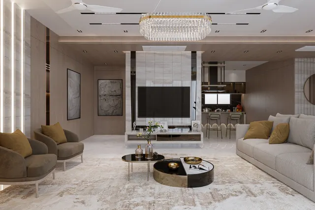
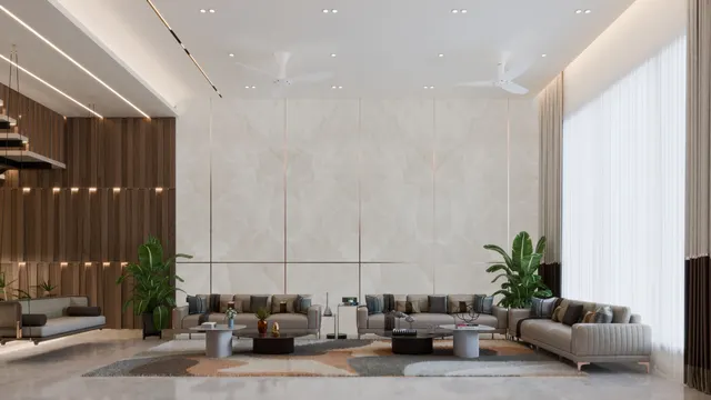
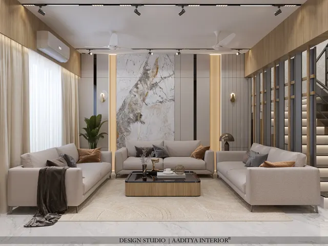
The combinations below are the ones Aaditya Interior returns to most often in Indian homes, because each has a light, forgiving base, a secondary tone that suits common furniture finishes, and an accent that can be changed with cushions and art. They are described by colour family rather than brand shade, since every brand mixes its own version; when choosing, compare three or four brand shades within the family and check their LRV. The best-for column refers to the light and the room size, which matter more than personal preference.
| # | Base (60 %) walls | Secondary (30 %) | Accent (10 %) | Mood | Works best in | Be careful with |
|---|---|---|---|---|---|---|
| 1 | Warm white (LRV 75–85) | Light oak or teak wood, oatmeal sofa | Olive or sage green | Fresh, calm | Any room; ideal for small flats | Very cool whites look grey in north light |
| 2 | Greige — grey-beige (LRV 55–70) | Charcoal sofa, black metal | Brushed brass, mustard | Modern, tailored | East or south light, larger rooms | Too much charcoal in small rooms |
| 3 | Pale sage green (LRV 55–70) | Cream sofa, natural cane | Terracotta, rust | Earthy, relaxed | North and east rooms with plants | Yellow-green sages can look sickly under cool LEDs |
| 4 | Ivory or cream (LRV 70–80) | Navy blue sofa or curtains | Mustard, gold | Classic, confident | Formal living rooms, bungalows | Navy reads black in dim rooms — light it well |
| 5 | Sand or beige (LRV 55–70) | Walnut wood, tan leather | Rust, burnt orange | Warm, traditional | Rooms with beige vitrified floors | Beige-on-beige with no contrast looks dated |
| 6 | Light warm grey (LRV 60–75) | White joinery, grey fabric | Teal, peacock blue | Cool, crisp | Hot west-facing rooms | Cold in north light; add warm wood |
Combinations 7 to 12 below use softer tints or a single deeper wall. They need a little more care with light and accessories, but they give a room more personality than a plain neutral envelope.
| # | Base (60 %) walls | Secondary (30 %) | Accent (10 %) | Mood | Works best in | Be careful with |
|---|---|---|---|---|---|---|
| 7 | Off-white (LRV 75–85) | Taupe or mushroom sofa | Dusty pink, blush | Soft, gentle | Small rooms, family homes | Pinks shift strongly under warm light |
| 8 | Cream (LRV 70–80) | Deep bottle green on one wall or sofa | Antique gold, brass | Rich, festive | Bungalow living, formal rooms | Deep green needs strong lighting |
| 9 | Pale blue-grey (LRV 60–75) | White, light wood | Natural rattan, jute | Airy, coastal | Small, hot rooms; Surat summers | Feels chilly with cool-white LED |
| 10 | Off-white with one terracotta wall (LRV 20–35 accent) | Light wood, linen | Indigo blue | Indian contemporary | Rooms with a natural feature wall | Terracotta on a west wall overheats the look |
| 11 | Pale yellow or butter (LRV 70–80) | White, light grey | Grey-blue, slate | Cheerful, bright | North-facing, dim rooms | Strong yellow becomes glaring in sun |
| 12 | Warm white with one charcoal wall (LRV 10–20 accent) | Cognac leather, oak | Brass, green plants | Dramatic, gallery-like | TV walls, large rooms | Dark walls show dust and patchy touch-ups |
Three patterns run through the twelve. Every base colour sits between about 55 and 85 per cent LRV, so the room stays bright. Every secondary colour is either a natural material or a deeper, greyed version of a colour that already appears in the room. And every accent is something that can be replaced in an afternoon. The combinations that tend to fail — red with black, bright purple with silver, lime green with orange — break all three at once: dark or saturated colours on large surfaces, no link between the colours, and accents that cannot be dialled down.
Two-colour combinations for walls
Many families search for a two-colour combination for the walls themselves. It can work, but only when the two colours differ clearly in value and the darker one covers less area. A reliable rule is a step of 20–35 points of LRV between them: a warm white of 80 with a sage of 55, or a cream of 75 with a terracotta of 35. Put the darker colour on the wall that already draws attention — behind the sofa or the TV — never on the window wall, where it will be seen in silhouette against the light and look almost black. Avoid splitting a single wall horizontally into two colours unless there is a dado, a panelling line or a picture rail to justify the joint; a painted line at an arbitrary height usually looks like an unfinished job.
Colour and light: choosing by the direction of the windows
The same paint looks different in every room because daylight differs by direction. In most of India, north light is soft, even and slightly cool all day; east light is bright and warm in the morning and neutral afterwards; south light is strong through much of the year, especially in winter; and west light is harsh, low and orange in the afternoon, and it brings heat. A colour that is perfect in a north-facing living room in Pune can look yellow and overheated in a west-facing living room in Surat at 4 pm. Choose the base colour for the light first and for taste second.
| Main window direction | Quality of light | Base colours that work | Colours to avoid on large walls | Accent tip |
|---|---|---|---|---|
| North | Soft, even, slightly cool all day | Warm whites, cream, butter, warm greige, peach-beige | Cool greys and blue-whites — they turn dull and cold | Warm accents: rust, mustard, terracotta |
| East | Bright warm mornings, neutral afternoons | Almost any light neutral; sage, pale yellow, soft grey | Very saturated yellows (glare at sunrise) | Greens and blues balance the warm mornings |
| South | Strong, bright for long hours | Greige, sand, sage, light warm grey | Very bright whites near large windows (glare) | Deeper accents survive strong light well |
| West | Harsh, low, orange afternoon light; heat | Light warm grey, off-white, pale blue-grey, cool sage | Orange, red, strong yellow — the room looks hotter | Teal, indigo and green cool the eye |
| Little daylight (inner rooms) | Mostly artificial | Warm white, cream, pale butter at LRV 75–85 | Dark accents on more than one wall | Use metallic or glossy accents to catch lamp light |
In Surat and much of Gujarat, the most common living room problem is the west window. The afternoon sun bounces off the floor and walls and colours the room orange for several hours. A cool or neutral base — a light warm grey, a pale blue-grey or a soft sage — balances that light, while a yellow or peach base intensifies it. North-facing rooms have the opposite problem: they can look grey and lifeless, and a warm white or cream lifts them. In both cases, the ceiling should stay white or near-white, because a coloured ceiling lowers the reflected light in the whole room.
Pairing wall colours with the floor and furniture you already have
Very few Indian living rooms start from a blank floor. Most have beige or ivory vitrified tile, white or cream marble, a grey tile, Kota stone in older homes, or a wood-look floor. The floor is the largest single surface in the room, so the wall colour should either share its undertone or contrast it deliberately. Beige floors carry a yellow-pink undertone; grey floors are cool; white marble usually has grey veining; Kota stone is blue-green-grey. Hold the shade card on the floor, not against the showroom wall, and look at it in daylight.
| Existing floor | Undertone | Wall bases that work | Secondary and accent ideas | Avoid |
|---|---|---|---|---|
| Beige or ivory vitrified tile | Warm yellow-pink | Warm white, cream, sand, warm greige | Walnut wood, olive or rust accents | Cool blue-grey walls — the floor looks dirty yellow |
| White or cream marble | Neutral to cool, grey veins | Off-white, light warm grey, pale sage | Navy or charcoal sofa, brass accents | Strong yellow walls; they make marble look cheap |
| Grey vitrified or cement-look tile | Cool | Light grey, off-white, pale blue-grey, greige | Oak wood, mustard or teal accents | Peach and pink bases — they clash with the grey |
| Kota or grey-green stone | Cool green-grey | Off-white, sage, warm white | Teak or cane, terracotta accents | Bright white; it makes the stone look patchy |
| Wood-look or engineered wood | Warm, medium to dark | Warm white, greige, pale sage | Charcoal or green sofa, brass | Orange-wood walls — wood on wood with no contrast |
| Dark granite or black tile | Cool, dark | Warm white, cream at LRV 75+ | Light upholstery, large light rug | Mid-tone walls — the room becomes dark overall |
Large furniture follows the same logic. A brown laminate TV unit or a teak dining set already contributes a warm, medium-dark tone, so the walls should be lighter and the accent should contrast with the wood rather than repeat it — green, blue or charcoal sit beautifully with brown wood, while orange and red on top of brown wood look muddy. A grey or white modular unit gives more freedom, but needs warmth from a rug, cushions or a timber piece. When the sofa is the one item the family loves and will keep, build the whole scheme around it: take the sofa colour as the 30 per cent, choose walls that sit two or three steps lighter in the same temperature, and pick an accent from the opposite side of the wheel.
Accent walls: where, how big and in what finish
An accent wall is the most common way to add colour to an Indian living room, and also the most commonly overdone. It works when it marks a natural focal point — the TV wall, the sofa back wall, a staircase wall in a bungalow or a niche — and when it is the only one. The accent should be a deeper or richer version of a colour that already exists in the 30 or 10 per cent of the room, so that it looks connected rather than imported. Texture paint, wallpaper, fluted or veneer panels, and lime or microcement finishes all do the job; the choice depends on budget and on how much maintenance the family accepts.
Proportion is what separates a designed feature wall from an afterthought. The accent zone should be either the full wall or a band at least about one and a half times the width of the TV unit; a narrow stripe of colour exactly the width of the television makes the wall look chopped. On a 4200 mm wall with a 1800 mm unit, an accent zone of about 2400 mm — roughly 55–60 per cent of the wall — sits well, leaving equal plain margins on either side. Deep colours need light: a charcoal, bottle-green or navy wall absorbs most of the downlight that falls on it, so plan a grazing cove or wall-washer above it, at the same warm 2700–3000 K colour temperature as the rest of the living room.
How LED colour temperature changes every colour
Indian homes spend half their waking hours under artificial light, and the type of LED installed changes colours more than most people expect. Colour temperature, measured in kelvin, describes whether white light looks warm (2700–3000 K, like a traditional bulb), neutral (around 4000 K) or cool (5700–6500 K, the blue-white of many tube lights and panels). Warm light enriches reds, oranges, browns and creams and makes blues and greys look slightly muddy. Cool light makes whites and blues crisp but turns beige towards grey, flattens wood, and makes skin look pale. The colour rendering index, or CRI, describes how faithfully the light shows colours; LEDs of CRI 90 or above show paint and fabric far more truly than the CRI 80 lamps common in budget panels.
| Light source | Colour temperature | What it does to wall colours | Best paired with |
|---|---|---|---|
| Warm white LED | 2700–3000 K | Enriches creams, terracotta, wood; greys look warmer | Warm whites, sand, sage, terracotta schemes |
| Neutral white LED | 3500–4000 K | Shows colours closest to daylight | Mixed schemes; study corners; kitchens opening to living |
| Cool white LED / tube | 5700–6500 K | Whites look blue; beige turns grey; wood looks flat | Best avoided in living rooms; use only for task areas |
| Low CRI (about 80) | Any | Colours look dull, reds and skin tones suffer | Utility areas only |
| High CRI (90 or more) | Any | Fabrics, art and paint look as chosen | Living and dining rooms, art walls |
| Mixed warm and cool in one room | — | Walls look patchy; two colours where one was painted | Avoid — keep one colour temperature per room |
The practical rule is to choose the light before the paint, or at least at the same time. A room that will be lit by 3000 K coves and spotlights should have its colours tested under 3000 K light. A family that insists on cool-white panels should avoid beige and peach bases, which will look grey and dirty under them, and lean towards whites, light greys and blue-greys. The National Building Code of India 2016, Part 8, and IS 3646 cover illumination levels; the colour temperature choice is a design decision, and warm white is the usual recommendation for living spaces.
The sample-patch method
Never decide from a shade card alone. Buy sample pots of the two or three shortlisted colours and paint patches of at least 600 × 600 mm — or paint large sheets of card and tape them up — on two walls: one beside a window and one on the darkest wall of the room. Look at them in the morning, in the afternoon and at night with the room's own lights on, for two or three days. Keep a pure white sheet beside each patch to see the undertone. A colour that still looks right on the darkest wall at night is the one to buy. The cost of sample pots is small compared with repainting a room.
What painting a living room costs in October 2026
Colour itself costs almost nothing extra; the finish and the preparation decide the price. Indicative October 2026 rates for a complete paint job — putty touch-up, primer and two finish coats — are about ₹7–12 per sq ft for distemper, ₹12–18 for economy emulsion, ₹20–30 for premium emulsion and ₹40–150 or more for texture and designer finishes, all per sq ft of paintable area. Deep and very saturated shades sometimes need an extra coat for even coverage, and some brands price deep bases slightly higher. Paintable area for walls and ceiling in a living room is typically about three times the carpet area, consistent with the painting cross-check used elsewhere on this site.
| Finish | Indicative rate (₹ per sq ft, Oct 2026) | 12 × 16 ft living room (≈ 690 sq ft walls + ceiling) | Where it fits |
|---|---|---|---|
| Distemper | ₹7–12 | ≈ ₹4,800–8,300 | Rentals, back-of-house; not washable |
| Economy emulsion | ₹12–18 | ≈ ₹8,300–12,400 | Budget homes; washable |
| Premium emulsion | ₹20–30 | ≈ ₹13,800–20,700 | The usual living room choice; stain-resistant |
| Texture / designer paint (one accent wall, ≈ 120 sq ft) | ₹40–150+ | ≈ ₹4,800–18,000 extra | TV or sofa wall only |
| Wallpaper or wall panels (accent) | Verify locally | Quoted per wall | Feature walls; check damp first |
| Extra coat for deep shades | Varies | Usually a small add-on | Navy, bottle green, charcoal, terracotta |
For a typical 12 × 16 ft living room with a 3000 mm ceiling, the walls come to about 500 sq ft after deducting a door and a window, and the ceiling adds about 190 sq ft. In premium emulsion that is roughly ₹14,000–21,000, and a texture accent wall adds ₹5,000–18,000 depending on the finish. Exterior-facing walls with seepage should be repaired before any colour goes on; no paint shade survives damp, and deep colours show efflorescence and patches most clearly.
Colour and Vastu in the living room
Many families ask whether the living room colours should follow Vastu. Traditional guidance commonly links directions with colour families — pale greens and blues for the north, whites and pale yellows for the east, earthy beiges and sands for the south and south-west, and light greys and whites for the west — and generally favours light, calm tones over dark ones in the living room. Much of this overlaps with good light-based design: light walls in the darker north, cooler tones against hot west light, earthy colours on walls that take wear. A Vastu-minded family can therefore follow the directional suggestions without compromising the combination, provided the base stays light and the accents are linked. Where a preferred colour conflicts with a directional suggestion, it is reasonable to treat the tradition as a guide rather than a rule, and to choose the version of the colour that suits the room's light; the separate article on living room Vastu covers seating and placement in detail.
Where living room colour is heading
Several directions are already visible in Indian projects. The first is the move from colour on paint to colour in materials: lime plaster, microcement, terracotta tiles, cane, fluted wood and stone are carrying more of the palette, with walls kept quieter. The second is warmth. After a decade of grey-and-white interiors, families are choosing warm whites, sands, clays and earthy greens that sit better with Indian light, wooden furniture and festive décor. The third is colour drenching in smaller spaces — painting walls, ceiling and trim of a niche, a powder room or a reading corner in one deep colour — used as a contained accent rather than a whole-room scheme.
Health and environment are shaping the paint itself. Green building rating systems such as IGBC Green Homes and GRIHA encourage low-VOC paints and finishes, and most major brands now offer low-odour, low-VOC emulsions that make repainting an occupied home far easier. Digital tools are changing selection too: brand visualiser apps and AR previews let families see a colour on a photograph of their own wall. They are useful for shortlisting, but screens cannot show undertone or LRV accurately, so the physical sample patch remains the final test.
Rules for choosing a living room colour combination
- Choose by light first: warm bases for north and inner rooms, neutral or cool bases for hot west-facing rooms.
- Keep main walls at about 55–80 per cent LRV and the ceiling at 80–90 per cent; only one accent surface may go darker.
- Plan 60-30-10: envelope (walls, ceiling, floor), large pieces (sofa, curtains, wood), accents (cushions, art, metal).
- Match the undertone of the base colour to the floor — warm with beige tile, cool or neutral with grey tile and marble.
- Repeat every accent colour at least twice in the room so it reads as intentional.
- Make the accent zone the full wall or at least 1.5 times the TV unit width — never a narrow stripe.
- Use one LED colour temperature per room, 2700–3000 K for living spaces, and CRI 90 or above where possible.
- Test 600 × 600 mm sample patches on the brightest and darkest walls for two or three days before buying.
- Repair seepage and cracks before painting; deep colours show every flaw and patch.
Frequently asked questions
Which colour is best for a living room in India?
There is no single best colour, but light warm neutrals — warm white, cream, sand and soft greige — suit the widest range of Indian living rooms because they reflect daylight, sit well with beige and marble floors and wooden furniture, and look good under warm LED light. Choose a slightly cooler neutral or a pale sage or blue-grey if the room faces west and gets hot afternoon sun.
Which two colours go well together for a living room wall?
Pairs that differ clearly in lightness and share a temperature work best: warm white with sage green, cream with terracotta, off-white with navy, light grey with teal, and beige with walnut brown. Keep 20–35 points of LRV between them and put the darker colour on the focal wall, not on the window wall.
Is a dark colour good for a small living room?
Usually not on all the walls. A dark colour on every wall of a small room absorbs light and makes it feel smaller, especially under Indian ceiling heights of 2.7–3.0 m. A single dark accent wall, well lit from above, can add depth and make a small room feel more intentional; keep the other walls and the ceiling light.
What colour sofa goes with beige walls?
Beige walls pair well with navy, charcoal, bottle green, olive, teal and rust sofas, which all contrast with the warm base. A beige or cream sofa against beige walls can work if the textures differ and there is a strong accent, but without contrast the room tends to look flat and dated.
What is the 60-30-10 rule in interior design?
It is a proportion guide: about 60 per cent of what the eye sees in the dominant colour (walls, ceiling, floor or rug), about 30 per cent in a secondary colour (sofa, curtains, large furniture), and about 10 per cent in an accent (cushions, art, small décor). It is a visual estimate, not an exact measurement, and it keeps a scheme balanced.
Which colour is good for the living room as per Vastu?
Traditional Vastu guidance generally favours light, calm colours in the living room — whites, creams, pale yellows, light greens and blues, and earthy beiges depending on the wall's direction — and advises against very dark colours on large surfaces. These suggestions largely agree with light-based design, so they can be followed comfortably with any of the combinations in this article.
Sources & standards
- Bureau of Indian Standards — IS 5: Colours for ready mixed paints and enamels (shade reference system used by the Indian paint industry)
- Bureau of Indian Standards — IS 3646 (Part 1): Code of practice for interior illumination
- National Building Code of India 2016, Part 8 — Building services, Section 1: Lighting and natural ventilation
- Indian Green Building Council — IGBC Green Homes rating system: low-VOC paints and indoor environmental quality credits
- GRIHA Council — GRIHA rating: low-VOC materials and visual comfort criteria
- Neufert, Architects' Data — colour, light and perception in interiors
- Time-Saver Standards for Interior Design and Space Planning — colour and lighting in residential interiors
- Price ranges: indicative October 2026 estimates — confirm locally before budgeting