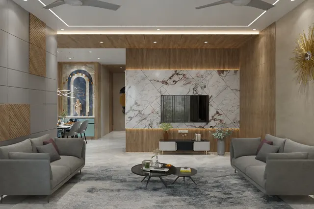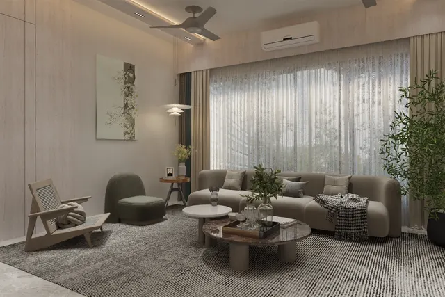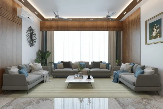


Two lamps can have the same wattage, the same lumens and the same price, and still make a room look completely different. One makes the teak sofa glow and faces look healthy; the other turns the same sofa a flat brown and gives everyone a faintly grey complexion. The difference lies in two numbers printed in small type on the box: the colour temperature, in kelvin, and the colour rendering index, or CRI. Most Indian homes are lit with fittings chosen for wattage and price alone, and these two numbers are left to chance — which is why so many expensive interiors look cheap after dark.
The confusion is understandable. Shops label lamps as warm white, natural white, cool daylight or simply white; online listings quote 6500 K as if more were better; and CRI is either missing or stated as 80+ without any explanation of what it means. Meanwhile designers talk about R9, SDCM, Duv and TM-30, which sound like laboratory jargon. Each of these numbers answers a simple question about how light will look, and once the questions are clear, specifying lighting for a home becomes much easier.
This article explains colour temperature and colour rendering from first principles: where the kelvin scale comes from, why two 3000 K lamps can still look different, what CRI actually measures and where it falls short, how LED spectra create these differences, and what values to specify room by room. It ends with a guide to reading an LED label, indicative October 2026 costs, and where the science of light and health is taking home lighting. It builds on this site's articles on warm versus cool white and on lux levels, and keeps their recommendations.
Where the kelvin scale comes from
Colour temperature borrows its idea from physics. When a dark, ideal object — a black body — is heated, it glows: first dull red, then orange, yellow, white and finally bluish white as its temperature rises. The colour of that glow depends only on the temperature, which physicists measure in kelvin, the absolute temperature scale named after the nineteenth-century physicist William Thomson, Lord Kelvin. Max Planck's law of 1900 described exactly how much light such a body emits at each wavelength, and that curve became the reference against which the colour of real light sources is described.
An incandescent bulb is almost a black body: a hot tungsten filament at around 2700 K, giving the warm, yellowish light that generations of Indian homes grew up with. A halogen lamp runs hotter, around 3000 K. LEDs and fluorescent tubes do not make light by heat at all, so their colour is described by a correlated colour temperature (CCT) — the temperature of the black body whose colour looks closest. Confusingly for newcomers, the scale runs the opposite way to emotional language: a low kelvin number such as 2700 K is called warm, and a high number such as 6500 K is called cool, because it is closer to the bluish white of a very hot source or of the open sky.
| Market name | Typical CCT | How it looks | Where it belongs in a home | Where it fails |
|---|---|---|---|---|
| Extra warm / candle | 2200–2500 K | Amber, low and intimate | Decorative lamps, outdoor sit-outs, restaurants | Any task; makes rooms look dim |
| Warm white | 2700–3000 K | Soft, yellowish, like incandescent | Living rooms, bedrooms, dining, pooja, balconies | Kitchen counters and study desks, where it feels sleepy |
| Neutral / natural white | 3500–4500 K (4000 K most common) | Clean, crisp, neither yellow nor blue | Kitchen work zones, study, bathroom mirror, utility | Bedrooms at night, where it feels clinical |
| Cool white | 5000 K | Bright white with a slight blue cast | Garages, workshops, some retail | Living spaces; flattens wood and skin |
| Cool daylight | 5700–6500 K | Bluish white, like an overcast sky | Offices with daylight-matched tasks, hospitals, inspection | Homes after dark — the commonest mistake in Indian flats |
Why two 3000 K lamps can still look different
Kelvin describes where a light sits along the warm–cool axis, but there is a second axis it does not describe: whether the light leans towards green or towards pink. Colour scientists measure this as Duv, the distance of a lamp's colour from the black-body curve. A lamp slightly above the curve looks faintly green; one slightly below looks faintly pink or magenta. The American lighting standard ANSI C78.377, widely used by LED manufacturers, sets nominal CCT steps such as 2700, 3000, 3500, 4000, 5000 and 6500 K and allows Duv within about ±0.006 of the curve. Two lamps at opposite ends of that tolerance are both legitimately 3000 K, yet side by side one looks greenish and the other pinkish.
The related measure is colour consistency, expressed in MacAdam ellipse steps, or SDCM (standard deviation of colour matching). One step is roughly the smallest colour difference a trained observer can see when two lights are compared directly. LED makers sort chips into bins by colour; a product specified at 3 SDCM keeps all units within a tight ellipse, while 5–7 SDCM allows differences that become visible when fittings sit side by side on one ceiling or along one cove. This is why this site's warm-versus-cool guide insists on buying each circuit's fittings in one batch: even good LEDs drift between production runs, and the eye is very good at spotting two whites next to each other.
| Colour consistency | What it means | Where it is acceptable |
|---|---|---|
| 1–2 SDCM | Differences practically invisible | Museums, galleries, premium retail and hotel lobbies |
| 3 SDCM | Differences hard to see even side by side | Coves, linear profiles, rows of downlights in homes |
| 4–5 SDCM | Slight differences visible when compared directly | Single fittings in separate rooms, utility areas |
| 6–7 SDCM | Differences visible side by side | Roughly the width of ANSI CCT bins; avoid for continuous lines |
| Not stated | Unknown — often wide | Ask for the datasheet before buying in quantity |
What CRI actually measures
Colour temperature describes the light itself; colour rendering describes what the light does to everything it falls on. The colour rendering index was developed by the International Commission on Illumination (CIE) in the 1960s and is defined today in the publication CIE 13.3 of 1995. The method is a comparison. A set of test colours is calculated as it would look under the lamp being tested and under a reference light of the same colour temperature — a black-body source below 5000 K, a daylight curve above it. The smaller the shift in each colour, the higher its score. The general index, written Ra, is the average of the scores for the first eight test colours, R1 to R8, which are all moderately saturated pastel shades. Ra 100 means those eight colours look identical under the lamp and the reference.
Two consequences follow. First, CRI compares a lamp only with a reference of the same kelvin, so a 2700 K lamp and a 6500 K lamp can both score Ra 95 while looking entirely different; CRI is not a measure of warmth or of quality of light in general. Second, because Ra averages only eight pastel colours, a lamp can score well on Ra while rendering saturated colours poorly. The most important of the extra test colours is R9, a strong red. Many LEDs that score Ra 80 have a low or even negative R9, which is why food looks dull, wood looks muddy and faces look tired under them. Reds are everywhere in Indian homes — in skin tones, in teak and sheesham, in tomatoes and chillies, in sindoor, silk and festive textiles — so R9 matters more than its obscurity suggests.
| CRI (Ra) | How colours look | Typical sources | Use in a home |
|---|---|---|---|
| 95–100 | Near-perfect; reds and skin very natural | Incandescent, halogen, premium LED | Art, dressing mirrors, display, photography corners |
| 90–94 | Very good; small differences only | High-CRI LED | Kitchens, wardrobes, dining, bathrooms, living rooms where budget allows |
| 80–89 | Acceptable; reds can look dull, especially if R9 is low | Most standard LED panels, bulbs and strips | General lighting in bedrooms, passages, utility |
| 70–79 | Noticeably flat colours | Budget LEDs, older fluorescent tubes | Stores, parking, service areas only |
| Below 70 | Poor; some colours hard to tell apart | Some sodium and mercury street lamps | Not for interiors |
Beyond CRI: R9, TM-30 and the newer fidelity indices
Because Ra averages only eight pastels and was designed long before LEDs, the lighting industry has developed better measures. The CIE colour fidelity index, published as CIE 224:2017, and the American method IES TM-30, first published in 2015 and revised since, both use 99 test colours drawn from real objects — skin, foliage, textiles, paints — instead of eight pastels. TM-30 reports two main numbers. Rf, the fidelity index from 0 to 100, says how accurately colours are reproduced on average, much like a modern Ra. Rg, the gamut index, says whether colours look more saturated (above 100) or duller (below 100) than under the reference. A lamp with Rf 90 and Rg 102 renders colours accurately and slightly vivid, which many people prefer for homes and shops.
TM-30 also produces a colour vector graphic, a small circular chart showing in which hues a lamp shifts colours and in which direction. For most homeowners, the practical message is shorter: ask for Ra and R9 on every fitting, and ask for TM-30 Rf and Rg on premium fittings for art, retail display, hotel rooms and dressing areas. Reputable manufacturers publish them on datasheets; a fitting that cannot state its CRI at all is best avoided.
| Metric | What it measures | Scale | Sensible home target |
|---|---|---|---|
| CCT | Warmth or coolness of white light | kelvin (K) | 2700–3000 K relaxing rooms; 4000 K work zones |
| Duv | Green or pink tint relative to the black-body curve | ± small numbers (ANSI allows about ±0.006) | Close to 0; slightly negative is often preferred for warm light |
| SDCM (MacAdam steps) | Colour consistency between units | 1–7 steps | 3 SDCM for coves and rows of downlights |
| CRI Ra | Average fidelity on eight pastel colours | Up to 100 | 80+ everywhere; 90+ in kitchens, wardrobes, bathrooms |
| R9 | Fidelity on a saturated red | Up to 100 (can be negative) | Positive always; above about 50 where skin, food or wood matter |
| TM-30 Rf | Average fidelity on 99 real-object colours | 0–100 | About 85+ for premium spaces |
| TM-30 Rg | Saturation compared with the reference | About 60–140 (100 = reference) | About 95–110; much higher looks artificial |
Why LEDs render colour differently
The reason colour rendering became a problem is the way white LEDs are made. Most white LEDs use a blue-emitting chip coated with a phosphor that converts part of the blue into a broad band of yellow-green and red light. The combination looks white, but its spectrum is very different from the smooth curve of an incandescent lamp or of daylight: a sharp blue peak, a dip in the blue-green, a broad hump in the yellow-green, and often too little energy in the deep red beyond about 630 nanometres. That missing deep red is exactly what pulls down R9.
High-CRI LEDs fix this mainly with different phosphor blends that add deep red and fill the blue-green gap. Converting light into the deep red, where the eye is less sensitive, costs some efficiency, so a high-CRI LED usually produces somewhat fewer lumens per watt than a standard one of the same power — a reasonable trade in a home, where the energy difference over a year is small compared with the gain in how the room looks. Some newer designs use violet chips with several phosphors to produce a smoother, more daylight-like spectrum.
Room-by-room: what to specify
The room-by-room colour temperatures below are the same as in this site's warm-versus-cool guide; the CRI, R9 and consistency columns add the colour-quality layer. The logic is simple. Where people relax, light should be warm and flattering; where they work, neutral and accurate; and where colour judgements are made — choosing clothes, checking food, applying make-up, looking at art — colour rendering should be high and the red rendering positive. General lighting in passages and utility areas can stay at standard Ra 80, which keeps the budget for the places that matter.
| Space | Colour temperature | CRI (Ra) | R9 | Consistency | Note |
|---|---|---|---|---|---|
| Living room | 2700–3000 K | 90+ preferred, 80 minimum | Positive; > 50 preferred | 3 SDCM on coves | Dimmable warm layers for evening |
| Bedroom | 2700–3000 K | 80+ | Positive | 3 SDCM on coves | Warm, dimmable; reading lamps at 300–500 lux |
| Dining table | 3000 K | 90+ | > 50 | Single pendant batch | Food and faces at their best |
| Kitchen counter | 4000 K | 90+ | > 50 | 3 SDCM along the strip | Under-cabinet strip plus ceiling light |
| Study desk | 4000 K | 80+ | Positive | — | Task lamp at 300–500 lux |
| Bathroom mirror | 4000 K (3000–4000 K) | 90+ | > 50 | Matched pair either side | Light on the face, not from above only |
| Wardrobe / dressing | 3000–4000 K | 90+ | > 50 | 3 SDCM | Choosing clothes needs accurate colour |
| Pooja | 2700–3000 K | 90+ | > 50 | — | Brass, marigold and kumkum read truly |
| Art and display | 3000 K (or match the room) | 95+ | > 80 | 1–3 SDCM | Narrow-beam accent, low UV and glare |
| Passages, stairs, utility | 3000–4000 K | 80+ | — | 5 SDCM acceptable | Uniformity matters more than colour |
Fig. 5 shows how this plays out on one wall. The under-cabinet LED strip is the kitchen's most important light, because it lights the counter without the cook's head shadowing it; it sits in a profile 50–75 mm behind the front edge of the wall cabinets, whose underside is commonly 550–600 mm above an 850–900 mm counter. Specify it at 4000 K, Ra 90 or more, R9 above about 50 and 3 SDCM, so vegetables, spices and the colour of cooking oil read truly. The dining pendant, 700–860 mm above the table, stays at 3000 K with Ra 90 or more. The ceiling downlights in the kitchen can be standard Ra 80–90 at 3500–4000 K, because they provide general light rather than colour-critical light.
How to read an LED box or datasheet
Indian LED packaging has improved, but the important numbers are still easy to miss. The table below lists what to look for and what a good value looks like. When the box does not show CRI, R9 or consistency, ask the dealer for the datasheet; reputable brands publish one for every product family. LED lamps and luminaires sold in India also fall under the Bureau of Indian Standards' Compulsory Registration Scheme, and a registered product carries the BIS standard mark with a registration number — a basic check that the product has been tested for safety and performance.
| Label or datasheet item | What it tells you | Good value for homes |
|---|---|---|
| Lumens (lm) | Total light output | Matched to the room using the lux method on this site |
| Watts (W) and lm/W | Power and efficiency | LED fittings commonly about 80–130 lm/W |
| CCT (K) | Warm or cool | 2700–3000 K relaxing rooms; 4000 K work zones |
| CRI / Ra | Colour fidelity on eight pastels | 80+ minimum; 90+ in kitchens, baths, wardrobes |
| R9 | Red rendering | Positive always; above about 50 where it matters |
| SDCM / MacAdam | Unit-to-unit colour consistency | 3 SDCM for coves and rows |
| Beam angle | Spread of light | Wide (60–120°) for ambient; narrow (15–36°) for accent |
| UGR | Glare from the fitting | About 19 or lower for desks and kitchens |
| Lifetime (L70 / L80 hours) | Hours until output falls to 70 or 80 per cent | Compare like with like; more is better |
| Flicker / driver quality | Visible or invisible flicker | Ask for low-flicker drivers on dimmed circuits |
What better colour costs
High colour rendering costs more, but less than most people assume, because the premium applies only to the fittings that need it. In a typical 2BHK, the colour-critical lights are the kitchen under-cabinet strip, the dining pendant, the bathroom mirror lights, the wardrobe lights and perhaps two art or display spots — a small share of the total fitting count. The ranges below are indicative October 2026 figures; standard-fitting prices match this site's lighting articles.
| Item | Standard (Ra 80) | High CRI (Ra 90+, R9 > 50) | Notes |
|---|---|---|---|
| LED panel, 12–18 W | ₹400–1,200 per piece | ₹900–2,200 per piece | Ambient light; high CRI worth it in kitchens |
| LED downlight, 6–12 W | Verify locally — wide brand range | ₹700–2,500 per piece | Check UGR and beam angle as well |
| LED strip in profile | ₹150–300 per running ft installed | ₹250–500 per running ft installed | Buy one batch per circuit; 3 SDCM |
| Tunable-white strip with controller | — | ₹350–700 per running ft installed | 2700–6500 K adjustable; needs compatible driver |
| Track or accent spot for art | ₹1,200–3,000 per piece | ₹2,500–8,000 per piece | Ra 95+ and narrow beam for display |
| Dining pendant | ₹2,000–15,000 per piece | Fit a high-CRI lamp | Many pendants take a replaceable lamp |
Light, sleep and where home lighting is heading
Colour temperature is not only about appearance. Research since the early 2000s has shown that the eye contains light-sensitive cells, distinct from the rods and cones used for vision, that respond most strongly to blue-cyan light and help set the body's daily rhythm. Bright, blue-rich light in the evening can delay the release of melatonin and make it harder to fall asleep; warm, dim light in the evening disturbs the rhythm far less. The CIE now defines a measure called melanopic equivalent daylight illuminance (CIE S 026:2018) to quantify this effect, and building standards that address health increasingly refer to it. The practical lesson for homes needs no laboratory: bright, neutral light in the day; warm, dim light after sunset; no 6500 K panels in bedrooms.
This is the idea behind tunable-white lighting, which shifts from about 4000–5000 K in the morning to 2700 K or lower in the evening, either on a schedule or with the touch of a switch. It echoes an older observation by the Dutch physicist Arie Kruithof, whose 1941 curve suggested that people find warm light pleasant at low light levels and cooler light pleasant at higher levels; later research has questioned how precise that curve is, but the general pattern still guides designers. Over the next few years, the main changes in Indian homes are likely to be affordable tunable-white strips and downlights, wider publication of R9 and TM-30 values on packaging, and better drivers that dim smoothly without flicker. None of them replaces the basic discipline of choosing the right kelvin and CRI for each circuit.
Rules for specifying colour temperature and CRI
- Write the kelvin value, CRI and R9 beside every circuit on the lighting plan, not just the wattage.
- Use 2700–3000 K where people relax and 4000 K where they work; keep 6500 K out of homes after dark.
- Never mix two colour temperatures in one sightline over the same seating, counter or table.
- Specify CRI 80 or more everywhere and CRI 90 or more in kitchens, bathrooms, wardrobes, dining and pooja.
- Ask for R9 on every colour-critical fitting; reject a negative R9 and aim for above about 50.
- Specify 3 SDCM for coves, linear profiles and rows of downlights, and buy each circuit from one batch.
- For art, retail and premium spaces, ask for TM-30 Rf and Rg as well as Ra.
- Check for BIS registration and ask for the datasheet before buying fittings in quantity.
Frequently asked questions
What is the difference between colour temperature and CRI?
Colour temperature describes the colour of the light itself — warm, neutral or cool — measured in kelvin. CRI describes how accurately that light shows the colours of objects, on a scale up to 100. A lamp can be warm and have a high CRI, or cool and have a low CRI; the two numbers answer different questions and both should be specified.
Is CRI 80 good enough for a home?
For passages, bedrooms and utility areas, yes. For kitchens, bathroom mirrors, wardrobes, dining and anywhere skin, food, wood or art matter, CRI 90 or more with a positive R9 makes a visible difference. Many Ra 80 LEDs have a very low R9, which dulls reds.
Which colour temperature is best for a living room in India?
Warm white of 2700–3000 K, on dimmable circuits. It flatters skin tones, wood and warm fabrics and suits evening use. A 4000 K reading lamp can be added beside a chair, but the room's general and cove lighting should stay warm.
What is R9 in LED lights?
R9 is the score for a strong red test colour in the CRI method. It is not included in the general Ra average, so a lamp can claim Ra 80 while rendering reds poorly. A positive R9, ideally above about 50, keeps skin, food, wood and red textiles looking natural.
Is 6500 K light bad for the eyes?
6500 K light is not harmful in normal use, but it is harsh for homes at night: it flattens warm materials, makes rooms feel clinical, and its blue-rich content in the evening can make it harder to wind down before sleep. Keep it for task areas such as workshops if wanted, and use warm light in living spaces after sunset.
What does SDCM mean on an LED datasheet?
SDCM, or MacAdam steps, measures how closely different units of the same product match in colour. At 3 SDCM, differences are hard to see even side by side; at 5–7 SDCM they become visible in a row of downlights or along a cove. Specify 3 SDCM wherever fittings are seen together.
Sources & standards
- CIE 13.3-1995 — Method of measuring and specifying colour rendering properties of light sources (International Commission on Illumination)
- CIE 224:2017 — Colour fidelity index for accurate scientific use; CIE S 026:2018 — system for metrology of optical radiation for ipRGC-influenced responses to light
- ANSI/IES TM-30 — Method for evaluating light source colour rendition (Rf, Rg, colour vector graphic), first published 2015
- ANSI C78.377 — Specifications for the chromaticity of solid-state lighting products (nominal CCTs and Duv tolerance)
- Bureau of Indian Standards — IS 16102 (self-ballasted LED lamps), IS 10322 (luminaires), IS 3646 Part 1 (interior illumination); Compulsory Registration Scheme for LED products
- National Building Code of India 2016, Part 8, Section 1 (Lighting and Natural Ventilation)
- Price ranges: indicative October 2026 estimates — confirm locally before budgeting