

The first question most people ask about a modular kitchen is "which colour?" — and it is the wrong one to start with. A kitchen that cooks badly in a beautiful colour is still a kitchen that cooks badly. The ideas that actually change daily life are the layout, where the sink and hob sit, how much counter you get beside them, and whether the storage reaches the ceiling. Colour and finish matter, but they sit on top of those decisions, not instead of them.
What follows is a set of modular kitchen design ideas drawn from real Aaditya Interior projects, each shown in a finished kitchen rather than a mood board. Treat them as a menu: most homes use two or three of these together. At the end there is a short guide to choosing the layout that fits your room, because that is the idea everything else hangs on.
1. Let an L-shape wrap the corner
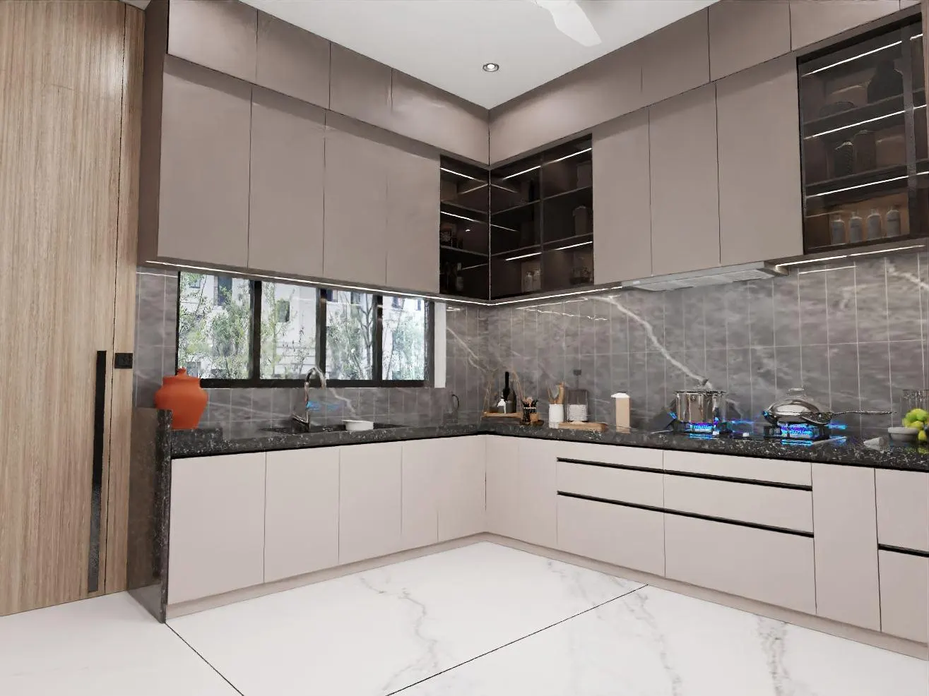
The L-shape is the workhorse of Indian kitchens, and for good reason: it uses two adjoining walls, keeps the sink, hob and fridge within a few steps of each other, and leaves the rest of the room free. Here the sink sits under the window for light and ventilation, the hob runs along the longer wall, and the corner — usually dead space — is filled with a glass-fronted tall cabinet. Keep the two arms roughly in proportion, light the under-cabinet zone, and an L-shape handles a full Indian cooking routine without crowding.
2. Use a peninsula to divide without a wall
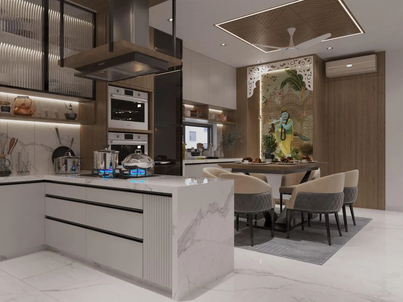
When the kitchen opens to the dining or living room, a peninsula — a counter attached at one end, like a half-island — is often smarter than a full island because it needs less floor. Wrapping it in stone with a waterfall edge makes it read as furniture rather than cabinetry, and the fluted side softens it. Built-in ovens stack neatly into the tall run behind, and an island-style chimney over the hob keeps sight lines open. A peninsula suits medium kitchens that want the open-plan feel without losing a walkway.
3. Put the colour on the cabinets
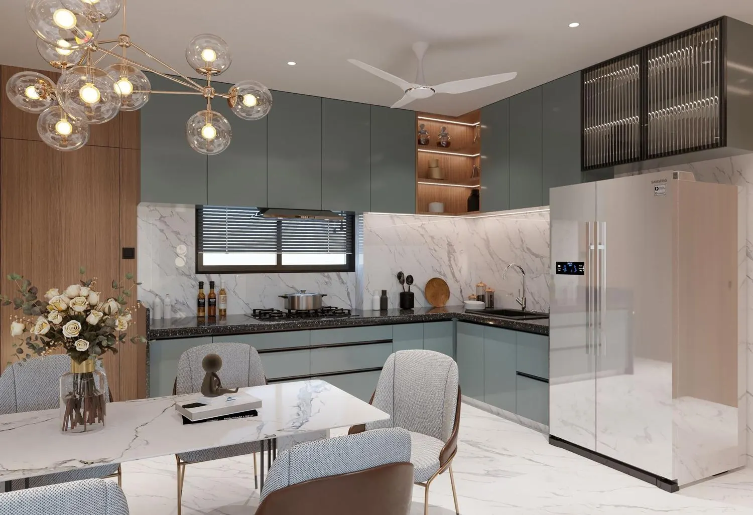
Colour is where a modular kitchen stops looking like everyone else's. Muted, slightly greyed shades — sage, olive, powder blue, clay — read as calm and age far better than bright primaries. The trick is restraint: let one colour lead, keep the counter and backsplash neutral, and bring in a warm wood tone so the scheme does not feel cold. A statement light fixture over the dining end then becomes the jewellery. Colour on the cabinets is the cheapest way to make a standard layout feel designed.
4. A pop of colour works on a single wall too
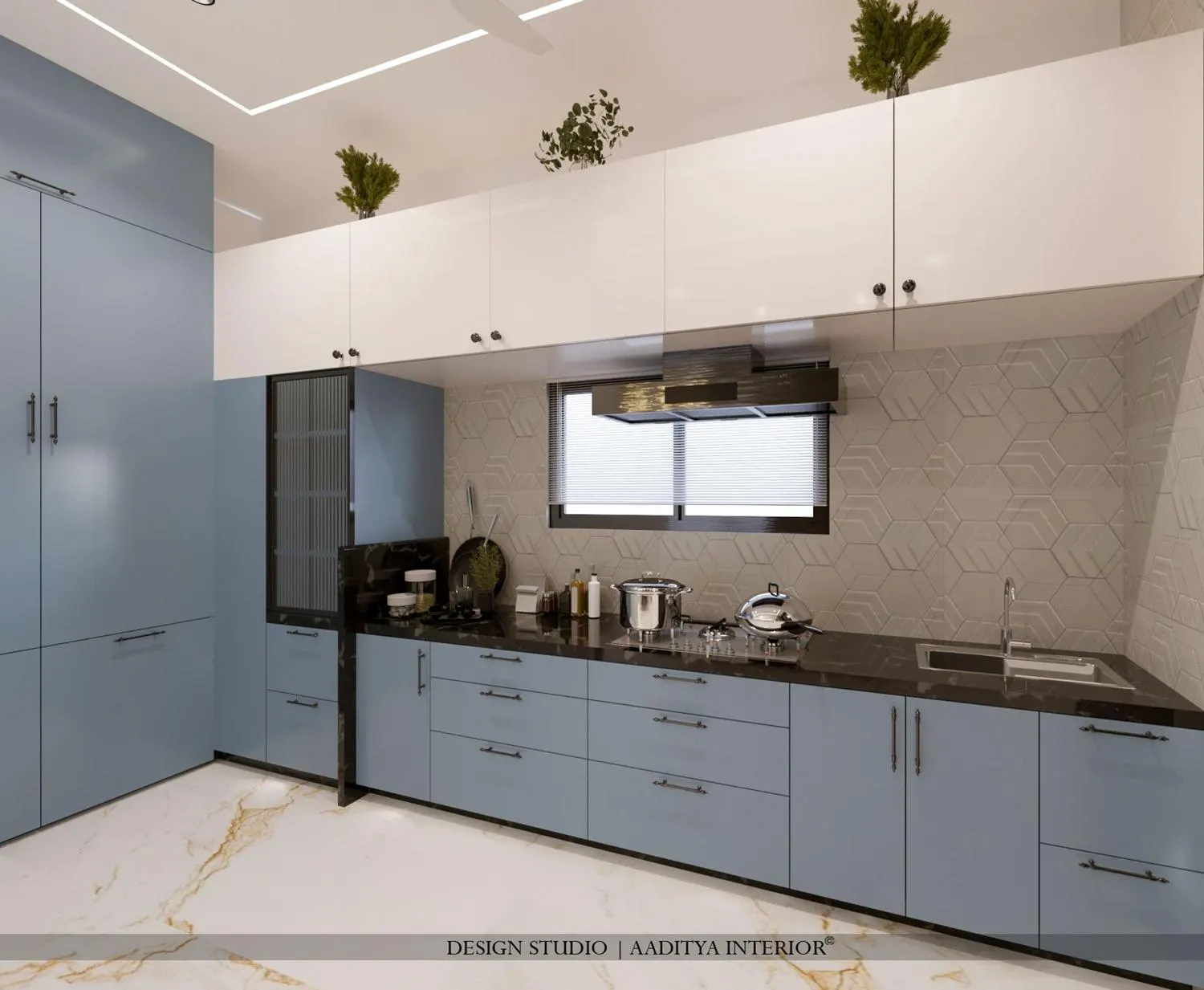
A small or single-wall kitchen is often treated as a place to play safe, but it is exactly where a pop of colour pays off, because there is less of it to overwhelm the room. Pairing a coloured base with white or cream uppers keeps the top of the room light and the eye travelling upward, which makes a compact kitchen feel taller. A patterned backsplash adds texture without adding clutter. The result is a kitchen that feels chosen, not defaulted.
5. Let a dark stone backsplash carry the drama
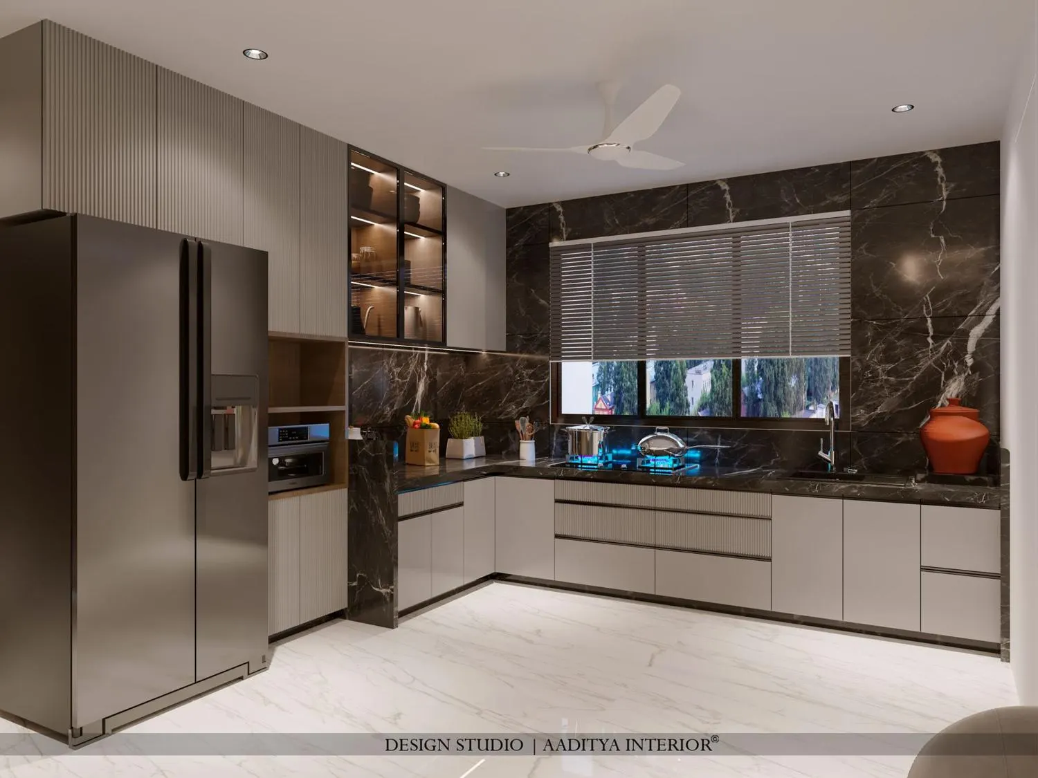
If the cabinets are quiet, the backsplash can be loud. A dark, dramatically veined marble or a large-format stone-look tile run full height behind the counter makes the cooking wall the centrepiece, and it is practical too — fewer joints mean less grout to clean behind the hob. Balance it with restrained cabinet colours and a lit glass display cabinet so the dark stone reads as rich rather than gloomy. This idea suits kitchens that want one confident gesture rather than many small ones.
6. Go handle-less, and reach the ceiling
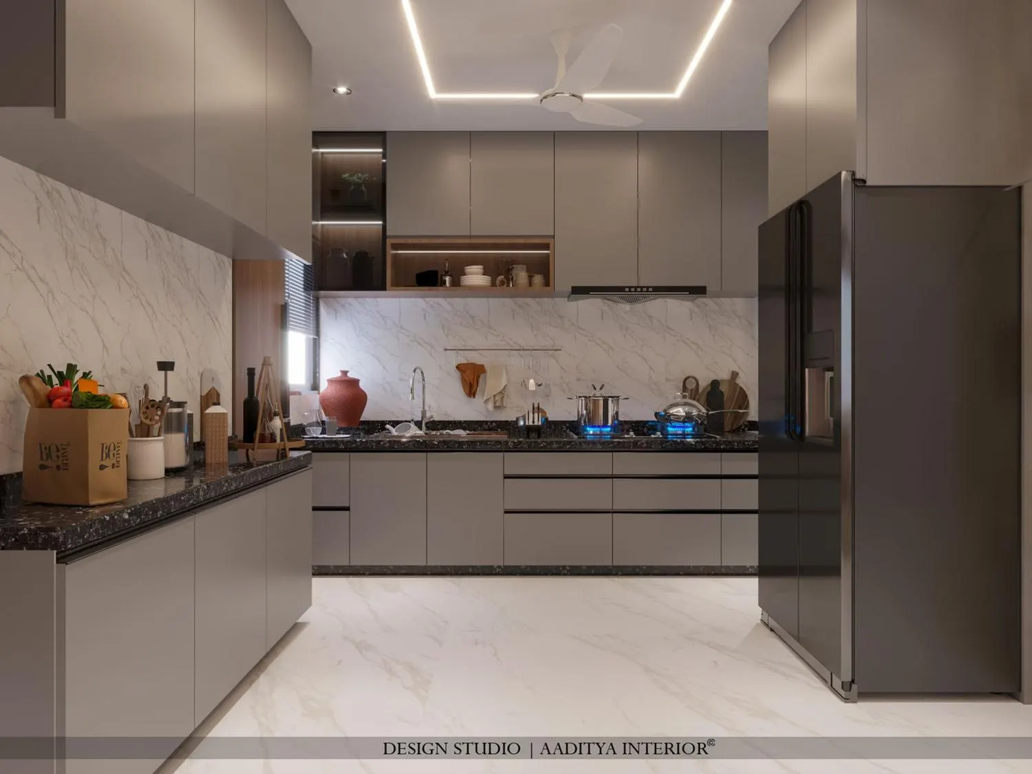
Handle-less fronts — opened with a routed J-groove or a push-latch — give the cleanest modern look and, because there is no handle to catch grease, they are genuinely easier to keep clean. Carrying the tall units all the way to the ceiling removes the dust-collecting gap above the cabinets and adds a bank of storage for things used rarely. A single lit glass niche breaks the run so it does not feel like a wall of doors. This is the quietest, most pared-back idea here — and often the most timeless.
7. Whatever the layout, respect the work triangle
Behind every good-looking kitchen is a sensible work triangle: the sink, the hob and the fridge placed so that moving between them is quick but never cramped. Keep each leg of the triangle roughly between 1.2 and 2.7 metres, and keep the walkway in front at least 1050 mm for one cook and 1200 mm where two people cook together. No finish rescues a kitchen where the fridge blocks the hob or the sink is a long walk from the chopping zone. Get the triangle right first; then choose the colour.
How to choose the layout for your kitchen
| Your kitchen | Best layout | Why |
|---|---|---|
| Narrow room, one long wall | Single-wall or parallel | Keeps everything in reach; frees the opposite wall |
| Corner space available | L-shape | Uses two walls; natural sink-hob-fridge triangle |
| Open to dining or living | L-shape + peninsula | Open feel with a soft divider and extra counter |
| Large kitchen, plenty of floor | Island or U-shape | Maximum counter and storage; room for two cooks |
| Compact flat kitchen | L-shape or parallel | Best storage per square foot in a small footprint |
Frequently asked questions
Which modular kitchen layout is best for an Indian home?
For most Indian homes the L-shape is the best all-rounder: it uses a corner, keeps the sink, hob and fridge close, and leaves floor free. Narrow kitchens suit a single-wall or parallel layout; open-plan kitchens suit an L-shape with a peninsula; and only large kitchens with real floor space justify an island. Choose by your room shape and how many people cook at once.
What colour is best for a modular kitchen?
Muted, slightly greyed colours — sage, olive, powder blue, clay — and warm neutrals age best and hide daily use better than bright or pure white fronts. A common, forgiving approach is a coloured base with white or cream upper cabinets and a neutral stone counter and backsplash, with one warm wood tone to keep the scheme from feeling cold.
Are handle-less kitchens practical?
Yes. Handle-less fronts opened with a routed J-groove or a push-latch look clean and uninterrupted and, because there is no handle to trap grease, they are usually easier to clean. The one caution is that very glossy handle-less fronts show fingerprints, so a matt or textured finish is often the more practical choice in a busy kitchen.
Sources & standards
- Bureau of Indian Standards and National Building Code of India 2016, Part 3 — kitchen space and ventilation guidance
- Neufert Architects' Data and Time-Saver Standards — kitchen work triangle and clearance conventions
- Aaditya Interior project kitchens: Modern Bungalow (Ahmedabad), Krushal Residence, Avenue 802, Astone Apartment, Golden Heaven and Kesar Heights
- This site's related guides: kitchen work triangle, L-shaped vs U-shaped vs parallel kitchen, and modular kitchen colour combinations
- Price ranges and finishes: indicative October 2026 — confirm specification and cost with a local fabricator