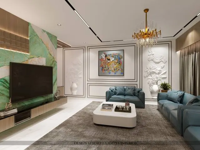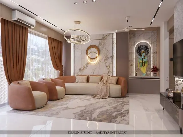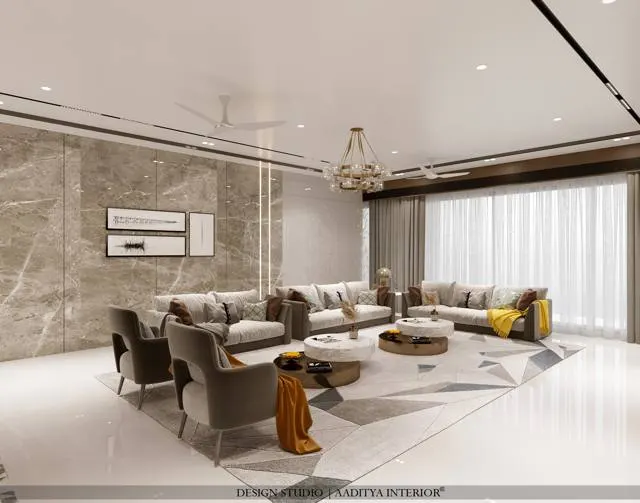


Monochrome is one of the most misunderstood words in interior design. Many people hear it and picture a stark black-and-white room — a white sofa, a black wall, a grey rug — and either love the drama or fear the coldness. But monochrome, properly understood, simply means one colour used across its full range of shades, tints and tones. A room can be monochrome in blue, in green, in terracotta or in warm beige just as easily as in black and white. What all monochrome schemes share is discipline: a single colour family, explored from its palest tint to its deepest shade, with nothing arriving to break the harmony.
In Indian homes the style has grown quickly, partly because it photographs beautifully and partly because it offers a calm, uncluttered antidote to busy, colourful interiors. But it is also the style most often got wrong. The classic failure is a room that is technically monochrome and yet feels flat, cold and cheap — a grey box. The reason is almost always the same: the scheme has colour discipline but no texture. In a monochrome room, where hue is not doing the work, texture and tonal contrast have to carry everything. Get those right and a single-colour room feels rich and layered; get them wrong and it feels like an unfinished basement.
This article explains how a monochrome scheme actually works — the tonal scale, the ratios, the all-important role of texture — and how to build one in an Indian home without it turning cold or clinical. It covers black-and-white versus single-hue schemes, the materials and finishes that give a monochrome room its depth, the lighting that keeps it warm, and what it costs.
What monochrome really means
The word comes from the Greek for 'single colour', and that is the whole idea: a scheme built from one hue, taken across its range. Every colour can be lightened with white into tints, greyed with grey into tones, and darkened with black into shades. A monochrome room uses that full ladder — the palest tint, the mid tones, the deepest shade — of a single colour, so that the eye moves through light and dark without ever meeting a competing hue. Black-and-white is only the most extreme case, where the 'colour' is a neutral and the ladder runs from pure white through every grey to pure black. A soft monochrome in warm greige, or in muted blue, works on exactly the same principle but feels gentler.
The practical lesson from the scale is contrast. A monochrome room that lives in only two or three middle tones — all mid-greys, say — looks muddy and indecisive. A good scheme spreads itself across the ladder, pairing genuinely light surfaces with genuinely dark ones and letting the mid-tones sit between. This light-to-dark contrast is what gives a monochrome room its structure and prevents the dreaded flat grey box. Designers often fix the two ends first — the lightest surface and the darkest accent — and then fill in the middle.
The ratio that keeps a scheme balanced
Like most colour schemes, a monochrome room is helped by a rough proportion. A common working rule is roughly sixty per cent in the dominant tone, thirty per cent in a secondary tone, and ten per cent in an accent tone — here all drawn from the same colour family. The sixty per cent is usually a light-to-mid tone on the big surfaces (walls, large furniture); the thirty per cent is a clearly different tone (a darker sofa, a rug, cabinetry); and the ten per cent is the darkest or sharpest accent (cushions, a lamp, a frame, a metal). Because every piece shares the one hue, the room cannot clash; the proportion simply keeps it from feeling either washed-out or oppressive.
| Role | Share of room | Tone to use | Typical surfaces |
|---|---|---|---|
| Dominant | ~60% | Light to mid tint/tone | Walls, ceiling, large sofa, floor |
| Secondary | ~30% | A clearly darker tone | Rug, cabinetry, accent sofa, curtains |
| Accent | ~10% | Darkest shade or sharpest tone | Cushions, lamp, frames, metal, art |
| Relief (optional) | a touch | Natural / off-palette neutral | Wood, plants, stone — warmth and life |
The optional fourth line matters more than it looks. A purely monochrome room can tip into feeling airless, so most successful Indian monochrome interiors allow a small amount of relief: the warmth of natural wood, the green of a few plants, the grain of a stone, the gleam of a metal. These are not breaks in the discipline so much as a safety valve, and they are the single easiest way to stop a black-and-white room from feeling cold.
Texture: the real secret of monochrome
This is the heart of the whole style. In a colourful room, different hues give the eye variety and places to rest. In a monochrome room there are no competing hues, so that job falls entirely to texture and finish. The same grey, repeated in a flat matte wall, a chunky knitted throw, a ribbed velvet cushion, a fluted wood panel, a polished metal lamp and a rough stone surface, reads as six different things because each catches light differently. Strip the texture out and all six collapse into one dull plane. This is why a flat, all-emulsion grey room feels cheap while a layered grey room feels luxurious, even though both are 'grey'.
Because texture only shows when light grazes it, lighting and texture have to be designed together. A fluted wood panel, a ribbed plaster wall or a textured rug comes alive under raking light from a wall washer, a cove or a well-placed lamp, and disappears under flat, even ceiling light. This is one of the most important and least obvious rules of the style: a monochrome room needs directional, layered light precisely so that its textures read. A room that is monochrome and flatly lit is the grey box everyone fears.
| Pair these textures | Example in a room | Effect |
|---|---|---|
| Matte against sheen | Flat wall vs polished metal lamp | Light bounces where it is wanted |
| Smooth against rough | Plaster wall vs stone or jute | Tactile contrast, visual interest |
| Hard against soft | Micro-cement vs velvet, bouclé | Comfort and depth in one tone |
| Flat against ribbed | Plain panel vs fluted wood | Shadow lines and rhythm |
| Opaque against reflective | Fabric vs mirror or glass | Depth and a sense of space |
Black-and-white or a warm single hue?
Two broad routes suit Indian homes. The first is the classic black-and-white (really white-grey-black) scheme: crisp, graphic, timeless and strong, but at risk of feeling cold in a climate and culture that leans warm. It works beautifully in formal living rooms, in modern kitchens and in homes with plenty of natural light, and it is tamed by adding warm relief — wood, brass, plants, warm lighting. The second route is a warm single hue: a monochrome built in greige, soft taupe, warm terracotta, muted olive or dusty blue. These schemes keep all the calm and discipline of monochrome but feel immediately softer and more welcoming, which is why they are often the better choice for Indian bedrooms and family rooms.
| Scheme | Feel | Best rooms | How to warm it |
|---|---|---|---|
| White–grey–black | Crisp, graphic, bold | Formal living, modern kitchen | Add wood, brass, plants, 2700 K light |
| Warm greige / taupe | Soft, calm, welcoming | Bedrooms, family rooms | Already warm; layer textures |
| Muted blue | Cool, restful, airy | Bedrooms, studies | Warm wood, brass, soft lighting |
| Muted green / olive | Grounded, natural | Living, study, pooja-adjacent | Natural stone, rattan, plants |
| Terracotta / clay | Earthy, warm, Indian | Living, dining, verandah | Jute, wood, matte finishes |
Materials and finishes for depth
Because the whole scheme rests on texture, material choice is where a monochrome room is really designed. The toolkit is wide: matte emulsion or lime-wash walls for a soft, chalky base; fluted or ribbed panels in wood or MDF for rhythm and shadow; micro-cement, textured plaster or exposed-finish surfaces for a raw, tactile quality; stone with visible grain for the floor; and, in the soft furnishings, a deliberate mix of velvet, bouclé, linen, wool and jute so that no two fabrics feel the same. The rule is simple: within the one colour, maximise the variety of surface. The more a designer varies matte against sheen, smooth against coarse, hard against soft, the richer the room.
Metal and glass add the final layer of light-play. A monochrome room welcomes one metal — brushed brass, blackened steel, or a soft chrome — used consistently on handles, light fittings, frames and legs, because the metal's reflectivity reads as a different 'texture' of the same scheme and catches light where matte surfaces absorb it. Glass, mirror and polished stone do the same. These reflective touches are what lift a monochrome room from flat to luminous, and they cost little relative to the effect.
A useful way to plan the materials is to list the surfaces in a room and deliberately assign a different finish to each, all within the one colour. The large wall might be a soft matte; the feature wall a fluted panel or a trowelled plaster; the floor a honed stone or a large tile; the sofa a flat weave; the cushions a mix of velvet and bouclé; the rug a deep pile; the coffee table a polished or raw wood; and the lamp a brushed metal. Listed this way, it becomes obvious when a scheme is relying on too few textures — the commonest reason a single-colour room disappoints — and easy to add the variety that makes it rich. The discipline is simply to keep every one of those surfaces inside the chosen hue.
Lighting and the finishing touches
Lighting in a monochrome room has two jobs: to keep the scheme warm and to reveal its textures. Warmth comes from colour temperature — around 2700 to 3000 kelvin — because cool white light turns greys cold and lifeless. Texture comes from direction: wall washers, cove light, picture lights and lamps that rake across fluted panels, plaster and rugs rather than flooding the room flatly from the ceiling. Layering matters more here than in a colourful room, because light is doing half the design work. A dimmer is almost essential, letting the room shift from bright and graphic by day to soft and intimate by night.
The finishing layer brings in the relief that keeps the room human. A few large plants add the one living green; natural wood in a side table or a bench adds warmth; a stone or ceramic object adds grain; a single piece of art in the scheme's deepest tone adds a focal point. The discipline is to keep every added element within the texture-and-tone logic of the room, so that nothing shouts, and the overall impression stays calm and resolved. In this spirit Aaditya Interior tends to build monochrome rooms around three or four hero textures rather than one flat finish, which is the surest way to keep the look rich.
What a monochrome interior costs
A monochrome scheme does not cost more than any other simply for being monochrome; the cost sits in the finishes chosen to carry the texture. Plain painted walls are cheap; fluted panelling, micro-cement, textured plaster and layered soft furnishings cost more but are exactly what the style needs. The table gives indicative October 2026 ranges for the finishes most often used, for metro and tier-2 cities, varying with material, area and quality; confirm locally before budgeting. A sensible approach is to spend the texture budget where the eye lands — the main feature wall, the sofa, the rug — and keep secondary surfaces simple.
| Finish / element | Role in a monochrome room | Indicative cost (₹) | Note |
|---|---|---|---|
| Premium emulsion (matte) | Soft base on walls and ceiling | ₹20–30 per sq ft | The value base coat |
| Textured / plaster finish | Tactile feature walls | ₹40–150 per sq ft | Lime, Venetian or trowel textures |
| Micro-cement | Seamless raw surfaces | ₹250–600 per sq ft | Walls, floors, vanities |
| Fluted wood / MDF panelling | Rhythm and shadow | ₹350–900 per sq ft | Prefinished or painted |
| Cove / profile LED lighting | Rakes light across texture | ₹150–300 per running ft | Warm, dimmable strips |
| Layered soft furnishings | Velvet, bouclé, linen, wool mix | Varies by selection | Spend on the hero pieces |
Where the style is heading
Monochrome is moving away from cold, graphic black-and-white and towards warm, textural, single-hue schemes — the 'quiet luxury' direction now visible across Indian interiors. Soft greiges, muted earth tones and tonal naturals are replacing stark grey; micro-cement, lime plaster, fluted wood and bouclé are replacing flat paint and glossy laminate; and the emphasis has shifted decisively from colour to craft and texture. The appeal is a room that feels calm, resolved and timeless without being stark. The next phase will lean further into natural, tactile, sustainable materials in a single warm tone, which suits the Indian climate and sensibility better than the chilly grey box ever did.
Ten rules for a monochrome room that is not cold
- Pick one colour family and commit — black-and-white is only the neutral version of the same idea.
- Spread the scheme across the full tonal ladder; pair genuinely light surfaces with genuinely dark ones.
- Use roughly 60% dominant, 30% secondary and 10% accent tone, all from the one colour.
- Make texture do the work colour usually does: mix matte, ribbed, woven, polished and rough surfaces.
- Design lighting to rake across textures — directional and layered, never flat ceiling light alone.
- Keep the light warm (2700–3000 K) and on a dimmer so greys never turn cold.
- Allow a little relief — wood, plants, stone, one metal — to keep the room human and warm.
- Use one metal consistently for its reflective 'texture'; brushed brass or blackened steel suit Indian homes.
- Spend the texture budget where the eye lands — feature wall, sofa, rug — and keep the rest simple.
- For Indian bedrooms and family rooms, prefer a warm single hue over stark black-and-white.
Frequently asked questions about monochrome interiors
Does monochrome mean only black and white?
No. Monochrome means one colour used across its full range of tints, tones and shades. Black-and-white is only the most extreme, neutral version. A room can be monochrome in blue, green, terracotta, greige or any single hue, taken from its palest tint to its deepest shade. The discipline — one colour family, nothing to break the harmony — is what makes it monochrome, not the specific colour.
Why does my monochrome room look flat and cold?
Almost always because it lacks texture and tonal contrast. In a monochrome room there are no competing hues to give the eye variety, so texture has to do that job. If every surface is the same flat matte finish and the tones all sit in the middle of the range, the room looks like a grey box. Add light-to-dark contrast, mix matte with ribbed, woven and polished surfaces, and rake warm light across them.
How do I warm up a black-and-white room?
Add natural relief and warm light. Introduce wood in furniture or panelling, a few large plants, a natural-fibre rug, and one warm metal such as brushed brass. Switch to warm-white light at 2700 to 3000 kelvin on a dimmer, and lean the whites towards soft, creamy whites rather than stark blue-whites. These small moves keep the graphic discipline while removing the chill.
Is monochrome a good choice for a small Indian flat?
Yes. A single colour across a small space makes it feel larger and calmer, because there are no colour breaks to chop the room up. Keep the dominant tone light to maximise the sense of space, use texture rather than bold colour for interest, and add mirrors and one metal for light-play. A warm single hue such as greige usually suits a small Indian home better than stark black-and-white.
What lighting suits a monochrome interior?
Warm and layered. Use a colour temperature of 2700 to 3000 kelvin so the tones stay warm, and layer the light — cove washes, wall washers, lamps and picture lights — so that it rakes across the room's textures and reveals them. Avoid a single flat ceiling light, which flattens everything. A dimmer lets the room shift from bright and graphic to soft and intimate.
Sources & standards
- Time-Saver Standards for Interior Design and Space Planning — colour theory, tonal value and the role of texture and light in interiors
- Ernst Neufert, Architects' Data — daylighting, artificial lighting and surface finishes
- Bureau of Indian Standards — IS 15489 (interior illumination) and National Building Code of India 2016, Part 8 (Building Services) on lighting levels and colour appearance
- Munsell and standard colour-order systems — the basis for tints, tones and shades of a single hue, described generically
- Manufacturer standard ranges for emulsion paints, textured finishes, micro-cement and LED strip lighting, described generically
- Price ranges: indicative October 2026 estimates — confirm locally before budgeting