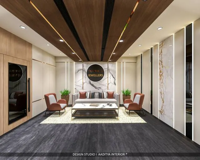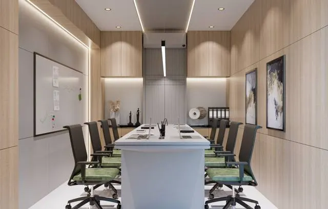



A shop is a machine for turning footfall into sales, and its interior is the machine's mechanism. In India, where a single high street can hold a century-old cloth merchant, a franchise pharmacy, a jewellery showroom and a mobile phone store side by side, the difference between a store that sells and one that merely displays is usually not the product or the price. It is whether a customer who steps inside feels invited to walk further, can see what is on offer, finds the right size or model without asking three times, and reaches the billing counter without a queue blocking the entrance.
The common mistakes are visible on almost any market street. The cash counter sits right at the door, so the first thing a customer meets is a transaction rather than the product. Goods are piled up to the ceiling in the centre of the floor, hiding the back of the shop and half the stock. Aisles shrink to 700 mm, so two people cannot pass and a parent with a pram gives up. Lighting is a grid of identical cool-white panels that flattens fabrics and makes food look grey. Trial rooms are too few and too small, and the stock room is an afterthought carved from the sales floor.
This article sets out how retail stores are planned — the zones every store needs, the main layout types and when each works, the dimensions of aisles, fixtures, counters and trial rooms, how to light merchandise, and how customer flow is shaped. It closes with fit-out costs consistent with this site's showroom and office articles, a set of rules, and answers to common questions. Fire safety, structural and electrical items are described generally; a qualified fire consultant, structural engineer and electrical designer should confirm them for any specific store.
From bazaar counter to self-service: how Indian retail evolved
For most of Indian history, retail was counter service. In a bazaar shop, a kirana store or a cloth merchant's gaddi, the customer stood or sat at the front while the shopkeeper fetched goods from shelves behind him. The interior was organised for the seller: deep shelves floor to ceiling, a raised platform or counter, and the cash box within arm's reach. That model still works well for small, high-value or highly varied stock — jewellery, sarees, medicines, hardware — where the shopkeeper's advice is part of the product. This site's article on textile offices and showrooms in Surat describes the gaddi model in detail.
Self-service retail changed the logic. From the 1990s, as organised retail grew in Indian cities, supermarkets, department stores, brand outlets and later malls put merchandise within the customer's reach and let the customer do the walking. The interior now had to guide people: wide aisles, fixtures at the right heights, signage, sightlines and lighting that draws the eye. Today most Indian stores are a hybrid — a self-service floor for browsing with assisted counters for high-value items, trial rooms, alterations or demos — and increasingly an online presence too, with pick-up counters, return desks and screens for endless-aisle ordering.
| Era and format | How the customer shops | Interior priorities | Still right for |
|---|---|---|---|
| Bazaar and counter shop | Asks; the shopkeeper fetches | Deep storage behind a counter, seating for buyers | Jewellery, sarees, pharmacies, hardware |
| Department store | Browses by department | Clear departments, signage, central cash points | Large multi-category stores |
| Supermarket and hypermarket | Self-service with a trolley or basket | Grid aisles, high shelving, checkout bank | Groceries, household goods |
| Brand store and boutique | Browses a curated range with assistance | Feature displays, lighting, trial rooms, brand identity | Fashion, footwear, cosmetics, electronics |
| Omnichannel store | Browses, tries, orders online in store, collects | Smaller stock, demo areas, pick-up and return points | Most brands from the 2020s on |
The zones of a store
Whatever its size, a store is made of the same zones. The storefront and window sell the shop to the street. Just inside, the threshold or decompression zone is the space where customers adjust from the outside world — the light, the noise, the temperature — and in which they tend to notice very little; retail writers such as Paco Underhill, in his book Why We Buy, popularised the idea that merchandise placed in this first stretch is often overlooked. Beyond it lie the main circulation route, the merchandise zones, the feature or power wall that the customer faces first, the fitting rooms, the cash and wrap counter, and the back-of-house — stock, staff room, pantry and toilet — that keeps the front running.
| Zone | What it does | Typical share or size | Design notes |
|---|---|---|---|
| Storefront and windows | Stops the passer-by; tells the story | Full frontage; window depth 600–1500 mm | Change displays often; light brighter than the street by day |
| Entry or decompression zone | Lets customers adjust; first impression | About 1.5–3 m deep from the door | Keep it open; one feature, no dense merchandise |
| Power wall | First wall the customer faces; new or key ranges | One wall bay run, often 3–6 m | Best lighting and best stock here |
| Main circulation | Leads customers past every category | 1500–2000 mm wide main aisle | A loop is easier to follow than dead ends |
| Merchandise zones | Wall bays, gondolas, tables | Most of the sales floor | Low in the centre, high on the walls |
| Fitting rooms | Converts browsing into buying | One per roughly 100–200 sq ft of apparel floor, by format | At the back, so customers pass merchandise |
| Cash and wrap counter | Billing, packing, returns, pick-ups | 1800–3000 mm long | Near the exit, beside the door, with queue space |
| Back-of-house | Stock, staff room, pantry, toilet | Commonly about 15–25 % of the store | Direct route to the floor; separate service entry if possible |
Layout types and when to use them
Store layouts fall into a handful of patterns. The grid layout of parallel aisles is the supermarket standard: efficient, easy to restock and easy to navigate, but repetitive and poor at showcasing products. The loop or racetrack layout wraps a main aisle around the store with merchandise inside and outside it, guiding the customer past every department; it suits department stores and larger fashion stores. Free-flow layouts scatter fixtures in an open arrangement that invites wandering and works for boutiques and premium brands, but wastes space and confuses customers in busy, high-volume stores. A spine layout runs one main aisle from the entrance to the back with merchandise branching off it, suiting the long, narrow shops common on Indian high streets.
| Layout | Strengths | Weaknesses | Best for | Typical floor efficiency |
|---|---|---|---|---|
| Grid | Most merchandise per sq ft; easy to navigate and restock | Monotonous; poor for showcasing | Supermarkets, pharmacies, stationery, hardware | High |
| Loop / racetrack | Leads customers past all departments; clear wayfinding | Needs a larger floor plate | Department stores, large fashion and home stores | Medium–high |
| Free-flow | Inviting, flexible, premium feel | Uses more space; can confuse in busy stores | Boutiques, premium fashion, cosmetics | Low–medium |
| Spine | Fits long narrow plots; clear route to the back | Back of the store can feel remote | High-street shops 4–8 m wide | Medium–high |
| Angular / diagonal | Diagonal sightlines open the view to the back | Odd-shaped leftover corners | Electronics, small supermarkets | Medium |
| Counter-service (boutique counter) | Personal service, security for valuables | Low browsing; staff-intensive | Jewellery, sarees, watches, mobile accessories | Medium |
Dimensions: aisles, fixtures, counters and fitting rooms
Retail dimensions come from the human body and from the products. A main aisle must let two customers with bags pass a third who has stopped to look, and be wide enough for a wheelchair user to turn; 1500–2000 mm is the usual range, wider in supermarkets with trolleys. Secondary aisles between fixtures can drop to about 1000–1200 mm, but rarely below 900 mm, and an accessible route through the store should be kept continuous. Fixtures in the middle of the floor should generally stay below about 1350–1500 mm so that a customer's eye, at roughly 1500–1600 mm, can see over them to the walls; the walls can then rise to 2100–2400 mm and carry the most stock.
The vertical position of goods matters as much as the plan. Eye level, roughly 1200–1600 mm from the floor, is the most valuable shelf height and is commonly given to best-sellers and high-margin items. The reach zone above it, up to about 1800–2000 mm, is still shoppable; the stretch zone above 2000 mm is better for display, signage and backup stock. The stoop zone below about 600 mm suits large, heavy or bulk items, and children's products whose shoppers are shorter.
| Element | Typical dimension (mm) | Notes |
|---|---|---|
| Main aisle | 1500–2000 | Wider (2000–2400) where trolleys are used |
| Secondary aisle between fixtures | 1000–1200; not below about 900 | Keep an accessible route continuous through the store |
| Wall fixture height | 2100–2400 | Top shelf for display or backup stock |
| Wall shelf depth | 300–450; hanging bays 500–600 | Garments on hangers need about 550–600 depth |
| Centre gondola height | 1350–1500 (up to 1800 in grocery) | Low enough to see the back wall in fashion stores |
| Display table height | 750–900 | Nesting tables at stepped heights add depth |
| Cash counter height and depth | 900–1050 high; 600–750 deep | Lower 750–800 section for accessibility |
| Fitting room | 1000 × 1200 minimum; 1200 × 1500 comfortable | Accessible room with about 1500 turning space; mirror, hooks, seat |
| Entrance door clear width | 1000–1200 single; wider for double doors | Level threshold or a ramp no steeper than 1:12 |
| Window display platform | 300–600 high, 600–1500 deep | Access hatch for staff to change displays |
Lighting the store
Lighting does more than let customers see; it tells them where to look. Retail lighting is designed in layers. Ambient light gives a safe, even base so that nobody walks from bright to dark. Accent light — adjustable track spots or recessed adjustable downlights — lifts selected merchandise above the ambient level. Wall washing lights the vertical surfaces where most stock sits, because a room with bright walls feels open and well stocked even when the floor is moderately lit. Decorative light, such as pendants or chandeliers, sets the mood. Window lighting must be strong enough to compete with daylight on the street.
Planning targets, which a lighting designer confirms with a calculation for the actual store, are typically about 300–500 lux of ambient light on the sales floor, as this site's textile showroom article also uses, with goods lifted to roughly 750–1000 lux or more by accents. The ratio between accent and ambient — commonly about 3:1 for a gentle emphasis, 5:1 for clear emphasis and 10:1 or more for dramatic focal displays — matters more than the absolute figure. Premium and boutique stores tend to use lower ambient light and higher contrast; supermarkets and pharmacies use higher, more uniform light. IS 3646 and the National Building Code of India 2016, Part 8, give recommended illuminance levels for different interiors, and the Energy Conservation Building Code limits lighting power for commercial buildings where it applies.
Colour temperature and colour rendering are just as important. Warm white around 3000 K suits fashion, premium boutiques, home furnishings and gold jewellery; neutral white around 4000 K suits general retail, groceries, electronics, pharmacies and textiles, where accurate colour judgement matters; cooler light is sometimes used for diamonds and silver to bring out sparkle. Whatever the choice, it should be consistent within each zone, because mixed colour temperatures make a store look careless. A colour rendering index (CRI) of 90 or more is advisable for apparel, food, cosmetics and furnishings, and good red rendering is valuable for sarees, meat and fresh produce.
| Store type | Ambient (lux, typical target) | Accent ratio | Colour temperature | Notes |
|---|---|---|---|---|
| Supermarket, pharmacy | 500–750, uniform | Low, about 1.5–3:1 | 4000 K | High CRI on fresh food; avoid glare on packaging |
| Fashion and footwear | 300–500 | 3:1 to 5:1 | 3000–3500 K | Wall washing and focused accents; good mirrors in trial rooms |
| Premium boutique | 200–400 | 5:1 to 10:1+ | 3000 K | Drama from contrast, not brightness |
| Electronics and mobiles | 500–750 | 3:1 | 4000 K | Control screen reflections; demo tables well lit |
| Jewellery | 300–500 ambient | High on counters and cases | 3000 K for gold; cooler for diamonds | Case lighting, low glare for staff and customers |
| Textile and saree showroom | 300–500 | To about 750–1000 lux on goods | ≈ 4000 K, CRI 90+ | Consistent with this site's textile showroom article |
| Home furnishings | 300–500 | 3:1 to 5:1 | 2700–3000 K | Create room-like settings with lamps |
Customer flow: how people move through a store
Customers do not walk through a store at random. Most slow down after the threshold, turn towards the first well-lit wall, follow a clear aisle if one exists, and stop where something catches the eye. Retail literature commonly notes a tendency to turn right on entering in countries where traffic drives on the right; whether that holds in a left-driving country such as India is less certain, so it is better to watch the actual store — or a similar one — and to design both walls to be attractive than to rely on a rule. What is reliable is that customers avoid narrow spaces, dead ends and places where they might be brushed from behind, and that they follow light and open sightlines.
Layout uses these habits. Destination categories — the items most customers come for, such as staples in a grocery store or the new collection in a fashion store — are placed towards the back so that customers pass other merchandise on the way. Related products sit next to each other, so that shirts lead to trousers and then to belts. Impulse items sit at the cash counter, where customers wait. Seating for companions near trial rooms keeps shoppers in the store longer. Signage is kept short and placed where decisions are made — at the entry, at aisle ends and over departments — rather than everywhere.
- Keep the first 1.5–3 m inside the door open, with one feature display rather than dense racks.
- Put the best-lit, best-stocked wall where customers look first, and refresh it often.
- Run a continuous main aisle of 1500–2000 mm with no dead ends.
- Keep centre fixtures below about 1350–1500 mm so the back wall is visible from the entrance.
- Place destination categories and fitting rooms at the back.
- Place the cash counter beside the exit, not in front of the entrance, with space for a queue.
- Give the back-of-house about 15–25 % of the area and a direct route to the floor.
- Light in layers — ambient, wall wash and accent — with one colour temperature per zone and CRI 90+ on goods.
- Plan exits, fire safety and accessibility from the first drawing, not after the fixtures are ordered.
Materials, fixtures and services
Retail floors take far more traffic than home floors, so the material choice is about wear, slip and cleaning as much as look. Large-format vitrified tiles (material about ₹60–120+ per sq ft plus laying) are the common Indian choice; heavy-duty luxury vinyl, polished concrete, terrazzo and stone suit particular brands and budgets. Ceilings are either a full gypsum ceiling, a grid ceiling with lay-in panels for easy access to services, or an open ceiling painted dark so that ducts and tracks disappear; the open ceiling is cheaper and more flexible but needs neat service routing. Fixtures are usually made from powder-coated mild steel with plywood or MDF shelves in laminate or paint, glass for display cases, and branded modular systems for slatwall and gondolas, which allow layouts to change between seasons.
Services shape the interior more than they appear to. Lighting and screens add heat, which the air-conditioning must remove; the electrical design must allow for lighting circuits by zone, sockets for demo products and point-of-sale, data for billing and CCTV, and emergency lighting. Stores are mercantile occupancies under the National Building Code of India 2016, Part 4, which, with the local fire authority's requirements, decides exits, travel distances, fire detection and suppression, extinguishers and signage according to the store's size and location. Accessibility — a level or ramped entrance no steeper than 1:12, an accessible route, a lowered counter section and an accessible fitting room — should follow the Harmonised Guidelines and Standards for Universal Accessibility in India (2021).
What a store fit-out costs
Retail fit-out costs in India depend heavily on the brand standard, the size and the scope. The indicative October 2026 bands below, per sq ft of carpet area, match this site's textile showroom article and sit within the broader commercial interior range. They exclude air-conditioning equipment, the external sign, mall fit-out charges, merchandise and GST, and they assume the landlord delivers a bare shell with power and water at the boundary.
| Level | Indicative fit-out (₹ per sq ft carpet) | What it typically includes | Typical store |
|---|---|---|---|
| Basic | ₹900–1,400 | Vitrified floor, painted or simple gypsum ceiling, standard metal and laminate fixtures, LED panels, basic cash counter | Neighbourhood store, small trader, budget franchise |
| Mid-range | ₹1,400–2,200 | Better flooring, mixed ceiling with tracks, custom wall bays, layered lighting with track spots, branded fixtures, two to four trial rooms | Regional brand store, multi-brand outlet, pharmacy chain |
| Premium | ₹2,200–3,500+ | Stone, terrazzo or engineered finishes, bespoke joinery, designer lighting, glass cases, acoustic and scent design, digital screens | National or international brand, jewellery, flagship |
For a 1,000 sq ft mid-range fashion store like the one in Fig. 1, that means roughly ₹14–22 lakh for the interior fit-out before air-conditioning, signage and GST. The illustrative split below, for a store at about ₹18 lakh, shows where the money usually goes; the fixtures and lighting together typically account for about half of the budget, which is why they deserve the most design attention.
| Item (1,000 sq ft, mid-range) | Illustrative cost (₹ lakh) | Share | Notes |
|---|---|---|---|
| Fixtures and joinery (wall bays, gondolas, tables) | 6.5 | ≈ 36 % | Custom or branded modular systems |
| Lighting (tracks, spots, ambient, window) | 2.2 | ≈ 12 % | Track spot heads about ₹800–3,500 each |
| Flooring | 1.8 | ≈ 10 % | Large-format vitrified tile or vinyl, laid |
| Storefront, glazing and entrance door | 1.8 | ≈ 10 % | Toughened glass, frame, window platforms |
| Electrical, data and CCTV wiring | 1.5 | ≈ 8 % | Zoned lighting circuits, POS and data points |
| Ceiling | 1.3 | ≈ 7 % | Gypsum, grid or open painted ceiling |
| Cash counter and fitting rooms | 1.2 | ≈ 7 % | Counter with storage, three or four trial rooms with mirrors |
| Walls, paint and in-store graphics | 1.0 | ≈ 6 % | Brand walls, wayfinding signage |
| Design, supervision and contingency | 0.7 | ≈ 4 % | Varies with the contract |
| Indicative total | ≈ 18.0 | 100 % | Excl. AC, external sign, GST |
Where retail design is going
Indian retail is changing quickly, and store interiors are changing with it. Online and offline shopping now overlap: customers research online and buy in store, or try in store and order online, so stores are adding pick-up counters, return desks, tablets for endless-aisle ordering and smaller back rooms that hold less stock. Many brands are opening smaller formats in neighbourhoods rather than only large stores in malls. Experience is becoming a reason to visit — product demos, alterations, personal styling, cafés inside stores — and the floor plan must make room for activities that do not sell directly.
Technology is moving into the fixtures: digital screens and price labels, self-checkout, contactless payment and sensors that count footfall. Energy efficiency is increasingly expected, through LED lighting with controls, daylight where available and better-insulated shopfronts. What has not changed is the basic grammar of a good store — an inviting entrance, a clear route, merchandise at the right height, layered light and a calm, visible place to pay. Aaditya Interior's commercial projects start with that grammar and then add the brand.
Frequently asked questions
What is the best layout for a small retail shop?
For a long, narrow high-street shop of about 4–8 m width, a spine layout — one clear main aisle from the entrance to the back with fixtures on both walls and low tables in the centre — usually works best. For a wider shop, a loop around a central display zone guides customers past every category. A grid suits groceries and pharmacies where customers search for specific items.
What should be the aisle width in a store?
A main aisle of about 1500–2000 mm lets customers pass each other comfortably and allows wheelchair access; secondary aisles between fixtures are commonly 1000–1200 mm, and rarely less than about 900 mm. Supermarkets with trolleys need main aisles of about 2000–2400 mm.
How much light does a retail store need?
Typical planning targets are about 300–500 lux of ambient light on the sales floor, with merchandise lifted to roughly 750–1000 lux or more by accent lights, and higher uniform levels of about 500–750 lux in supermarkets and electronics stores. Use CRI 90+ fittings for apparel, food and cosmetics. A lighting designer should confirm the levels by calculation.
Where should the cash counter be placed in a shop?
Beside the exit, usually on one side of the entrance, after the customer has had a chance to walk the store — not directly in front of the door, where it blocks the first impression. Leave space for a queue that does not block an aisle, and add a lower section of about 750–800 mm for wheelchair users. Vastu preferences for the counter's direction can usually be accommodated within this logic.
What is the cost of shop interior design per sq ft in India?
Indicatively in October 2026, a basic shop fit-out costs about ₹900–1,400 per sq ft of carpet area, a mid-range store about ₹1,400–2,200 and a premium brand store ₹2,200–3,500 or more, excluding air-conditioning, external signage and GST. A 1,000 sq ft mid-range store therefore costs roughly ₹14–22 lakh.
How many trial rooms does a clothing store need?
It depends on the format and footfall, but a common planning range is about one trial room per 100–200 sq ft of apparel floor, with at least one accessible room. Too few trial rooms create queues that lose sales; place them at the back of the store so customers pass merchandise on the way.
Sources & standards
- Bureau of Indian Standards — National Building Code of India 2016, Part 4 (Fire and Life Safety): mercantile occupancies, exits and travel distance
- Bureau of Indian Standards — National Building Code of India 2016, Part 8 (Building Services), Section 1: lighting and natural ventilation
- Bureau of Indian Standards — IS 3646 (Part 1): Code of practice for interior illumination
- Bureau of Energy Efficiency — Energy Conservation Building Code (ECBC) 2017: lighting power for commercial buildings
- Ministry of Housing and Urban Affairs — Harmonised Guidelines and Standards for Universal Accessibility in India, 2021
- Paco Underhill — Why We Buy: The Science of Shopping (concepts of the decompression zone and shopper behaviour)
- Joseph De Chiara and John Hancock Callender — Time-Saver Standards for Building Types: stores and shops; Ernst and Peter Neufert — Architects' Data: retail
- Price ranges: indicative October 2026 estimates — confirm locally before budgeting