


Walk down any market street in Surat, Ahmedabad or Indore and you will see the same thing: two shops selling almost identical goods, at almost identical prices, one full of customers and one nearly empty. The difference is often not the stock or the owner's skill at selling. It is what the customer sees in the first five seconds — whether the window tells a clear story, whether the shop looks easy to enter, whether the best products are where the eye naturally falls, and whether the space feels cared for. That is visual merchandising: the planned arrangement of goods, light, colour and signs so that customers notice products, understand them and pick them up.
Large retail chains employ visual merchandisers and send planograms — detailed display plans — to every store. Most Indian shop owners have neither, and do not need them. A kirana, a saree showroom, a footwear shop, a mobile store or a pharmacy can apply the same principles with what is already on the shelves, a few rules of height and composition, and better use of light. The common mistakes are equally consistent: windows crammed with every product, the entrance blocked by cartons and offers, bestsellers hidden at knee height, and lighting that makes the whole shop the same flat brightness.
This article sets out those principles in a form shop owners can use tomorrow morning: where to put products by height, how to plan the customer's path, how to build displays that draw the eye, how to design a window, how to light and sign goods, and how to keep the shop fresh through the year. Dimensions are consistent with this site's retail store design and shop Vastu articles, which cover layout and fit-out in more depth.
Where visual merchandising came from
Displaying goods to attract buyers is as old as trade. In Indian haats and bazaars, vegetables were piled into neat cones, brass vessels stacked by size, and the best bolts of cloth unrolled across the gaddi so that the buyer could see colour and drape. The shopkeeper's arrangement was the advertisement. What changed in the nineteenth and early twentieth centuries was the arrival of large plate-glass windows and department stores in European and American cities. For the first time, a shop could be seen fully from the street, and window dressing became a profession: department stores in London, Paris and New York became famous for theatrical windows that changed with the seasons.
In India, modern visual merchandising arrived with organised retail. From the 1990s onwards, brand stores, malls and supermarket chains brought planograms, mannequins, track lighting and seasonal window themes to Indian cities. Today the same tools are within reach of independent shops: LED track spots, modular wall systems, nesting tables and printed graphics are affordable, and social media has made every shop window a potential photograph. The principles have stayed constant — make it visible, make it easy, make it desirable — while the tools have become cheaper.
| Era | Typical display method | What it taught | Still useful for |
|---|---|---|---|
| Bazaar and haat | Goods heaped, stacked and unrolled in front of the seller | Abundance and colour attract; the seller guides | Fresh produce, sweets, textiles |
| Counter shop | Goods behind the counter, samples on top | Security; personal selling | Jewellery, pharmacies, mobiles |
| Department store windows | Themed, lit windows changed by season | A window is a story, not a stockroom | Every shop with a glazed front |
| Self-service retail | Planograms, gondolas, shelf-edge pricing | Products must sell themselves | Supermarkets, stationery, hardware |
| Brand stores and malls | Mannequins, feature walls, layered lighting | Brand identity and focal points | Fashion, footwear, cosmetics |
| Omnichannel retail | Smaller stock, demo tables, QR codes, screens | The shop as showroom and experience | Electronics, furniture, D2C brands |
Eye level is buy level: the vertical zones
The single most useful rule in visual merchandising is that customers notice and pick up what is in front of their eyes and hands. For an average Indian adult, eye height when standing is roughly 1450–1650 mm, and the comfortable reach zone runs from about waist height to just above the shoulder. That gives four vertical zones on any wall bay or shelf, and each should be used for a different purpose. Bestsellers, new arrivals and high-margin items belong in the eye-level zone; impulse and small items in the reach zone; bulk and heavy items low; and visual signals — signage, a feature graphic, a display of colour — high, where they are seen from across the shop but not handled.
| Zone | Height above floor (mm) | What to place there | What to avoid |
|---|---|---|---|
| Stretch / visual | 2000–2400 | Signage, graphics, a colour block seen from the door, display-only items | Stock customers must lift down |
| Eye level | 1600–2000 | Feature products, colour story, new ranges, face-out garments | Clutter; too many price cards |
| Prime | 1300–1600 | Bestsellers, high-margin items, the product you most want to sell | Slow sellers and refills |
| Reach | 700–1300 | Everyday items, folded stacks, small add-ons, impulse buys near the counter | Fragile goods at the edge |
| Stoop | 300–700 | Bulk packs, heavy items, refills and back-up sizes | Small items that get lost; premium goods |
| Plinth | 0–300 | Base storage or a clean kick plinth | Merchandise on the floor |
In a kirana or pharmacy this means the fast-moving brands and the items with the best margin sit between about 1300 and 1600 mm, with the bulk packs of rice, atta and oil below. In a garment shop it means face-out displays of the latest range at eye level, folded stacks in the reach zone, and back-up sizes low. In a footwear store, one shoe of each style is displayed between about 900 and 1700 mm, with boxed stock in drawers or the stockroom. Children's goods drop the whole scheme by roughly 300–400 mm. The same rule also tells you what to stop doing: putting the newest arrival on the top shelf because there was space there.
The customer's path: hot spots and cold spots
Customers do not move through a shop at random. They enter, pause for a moment to adjust to the light and scale — the decompression zone, about 1.5–3 m deep — and then tend to follow the easiest path. Retail observers have long noted that many customers drift towards the right on entering, though this depends on the layout and on local traffic habits, so it is worth watching your own shop rather than assuming. The first wall the customer faces after decompression is the power wall: the most valuable display space in the shop. The back wall is the magnet that draws people through. The corners and the area immediately behind the entrance are usually cold spots.
A few layout moves make a large difference in a small shop. Keep the decompression zone clear of stacked cartons and offer bins; a single feature table or mannequin is enough. Put the best display on the power wall and change it most often, because regular customers see it first. Give the back wall a strong colour, a bright display or the category everyone comes for, so that customers walk the whole shop. Place the cash counter near the exit — on the left side of the entrance in many layouts, so that the incoming path stays clear — with small add-on products within reach of the queue. And use the cold spots for seasonal or clearance stock that customers will seek out anyway.
| Shop area | Typical value | What to display | Common mistake |
|---|---|---|---|
| Window | Very high — sells the shop | One clear story: a new range, a festival, a hero product | Every product in stock crammed in |
| Decompression zone (first 1.5–3 m) | Low for sales, high for impression | One feature, open floor | Offer bins and cartons at the door |
| Power wall (first wall faced) | Highest inside the shop | New arrivals, bestsellers, strongest colour story | Slow stock because 'the wall was empty' |
| Centre tables and gondolas | High | Focal displays, pyramids, cross-merchandised sets | Fixtures too tall to see over |
| Back wall | Medium–high | Destination category, strong colour | Storage boxes on view |
| Queue at the cash counter | High for impulse | Small add-ons: socks, accessories, chocolates, batteries | Clutter that blocks the counter |
| Corners and behind the door | Low | Seasonal, clearance, basics customers seek out | Leaving them dark and empty |
Building a display that draws the eye
Once products are at the right height and in the right place, the arrangement itself decides whether customers notice them. Professional visual merchandisers rely on a handful of composition rules that are easy to learn. The pyramid places the tallest or most important item at the centre and builds down to each side, so the eye rises to the top and travels down. The rule of three groups items in odd numbers — three, five, seven — because odd groups look more natural than pairs. Repetition shows abundance: six identical bags in a row look more desirable than six different bags. Colour blocking groups goods by colour so that the shop reads as calm blocks rather than noise. And every display needs one focal point: a mannequin, a hero product, a brightly lit item, never five competing ones.
| Technique | How to do it | Works best for | Watch out for |
|---|---|---|---|
| Pyramid | Tallest or hero item centre-top, stepping down to each side | Tables, windows, gondola ends | A flat row of equal items |
| Rule of three | Group in odd numbers; vary height within the group | Accessories, gifts, cosmetics, home décor | Pairs that look stiff |
| Repetition | Same item repeated in a line or grid | Bags, shoes, packaged goods, mobiles | Mixing too many styles in one run |
| Colour blocking | Group by colour; light to dark left to right or top to bottom | Garments, sarees, towels, stationery | Rainbow mixes on every shelf |
| Focal point | One lit, central hero product or mannequin per display | Windows, power wall, centre tables | Several competing heroes |
| Cross-merchandising | Display items used together — shirt with tie, phone with cover | Apparel, electronics, kitchenware | Unrelated add-ons that confuse |
| Negative space | Leave gaps so products breathe | Premium goods, jewellery, watches | Emptiness that looks like low stock |
Folding, hanging and facing
In garment and textile shops the way goods are folded and hung is itself merchandising. Folded stacks should be the same width and height, with folds facing the customer and sizes running small to large from top to bottom or left to right. Hanging rails should mix side-hung garments, which hold more stock, with face-outs, which show the design; a common practice is to lead each run with a face-out of the key style. In sarees, a draped mannequin or a fall of the pallu over a display stand shows what a folded saree cannot. In kirana and pharmacy, facing — pulling products to the front edge of the shelf with labels forward — makes shelves look full and is the cheapest merchandising there is.
The shop window
The window is the shop's advertisement, and it has a few seconds to work. A passer-by walking at normal pace sees it for only a moment, so it must tell one clear story: a new collection, a festival, a single hero product, a colour. Windows fall into three types. A closed-back window has a solid back panel and works like a stage, ideal for themed displays. An open-back window lets passers-by see into the shop, ideal when the interior itself is attractive. An island or semi-open window, common in narrow Indian shops, uses a low platform with the shop visible behind. Whichever type, the display should be built as a pyramid, lit brighter than the street, and changed regularly.
In Indian cities the window has a particular problem: daylight. A west-facing shop front in the afternoon is so bright outside that the glass becomes a mirror and the display disappears. Two things help. The first is shade — an awning, a canopy or a deep projection over the front, which this site's shop Vastu article also recommends for west and south frontages. The second is light: window lighting strong enough to compete, typically well above the shop's general level, with spots aimed so that their reflection does not hit the passer-by's eye. Anti-reflective or UV-control glass reduces glare and protects merchandise from fading.
How often to change the window
Regular customers stop noticing a window after a few weeks. As a working rule, small shops benefit from changing the main window display every two to four weeks and refreshing it at every festival or season that matters to their customers: Navratri and Diwali, the wedding season, Eid, Christmas and New Year, back-to-school, the monsoon, summer. A change does not need new props; moving a different product to the centre, changing the colour story, or swapping the backdrop is enough. Keep a simple calendar so the change happens before the festival, not during it.
| When | Window theme | Inside the shop | Lead time |
|---|---|---|---|
| Weekly | Check lighting, dust, price cards | Re-face shelves; refill prime zone | Ongoing |
| Every 2–4 weeks | Change hero product or colour story | Rotate power wall and centre table | A day of planning |
| Navratri and Diwali | Festival theme, gifting, colour | Gift sets near the cash counter; extra stock in reach | Set up 2–3 weeks before |
| Wedding season | Occasion wear, jewellery, gifting | Cross-merchandised looks; seating for families | Set up before the season starts |
| Monsoon | Rainwear, footwear, home care | Mats at the door; dry, well-lit entry | Before the first heavy rains |
| End of season | Clearance, clearly signed | Clearance in cold spots, not the power wall | As stock demands |
Light, signage and price
Lighting is half of visual merchandising. A shop lit at one flat level, however bright, makes everything look equally unimportant. Good retail lighting uses layers: an even ambient level for the whole shop, accent lighting on the products that matter, and a brighter window. The contrast between accent and ambient is what draws the eye; this site's retail design article suggests ambient levels of about 300–500 lux in fashion stores with accent ratios of about 3:1 to 5:1, and higher, more uniform levels of about 500–750 lux in supermarkets and pharmacies. Colour matters as much as quantity: high colour rendering (CRI 90 or more) makes fabrics, food and skin look true, and warm white around 3000 K flatters fashion and jewellery while about 4000 K suits general goods and electronics.
Signage works in a hierarchy. The external sign names the shop and must be readable from the road. Category signs inside tell customers where things are, and should be visible above the displays, in the stretch zone. Point-of-sale signs explain a product or an offer at the display itself. Price tickets are the last layer. A frequent mistake in small shops is to reverse this: dozens of handwritten offer signs at eye level, and no clear category signs at all. Use one consistent typeface and colour for all signs, keep offer signs few and large, and test every sign by reading it from where a customer would stand.
| Element | Typical specification | Why |
|---|---|---|
| Ambient light, fashion and footwear | ≈ 300–500 lux, 3000–3500 K | Calm base so accents stand out |
| Ambient light, supermarket and pharmacy | ≈ 500–750 lux, about 4000 K, uniform | Easy reading of labels; clean feel |
| Accent on key displays | ≈ 3:1 to 5:1 over ambient | Draws the eye to the hero product |
| Colour rendering | CRI 90+ for fabrics, food, jewellery | True colours; fewer returns |
| Track spot heads | ≈ ₹800–3,500 each (indicative Oct 2026) | Re-aimable as displays change |
| Category signs | Above displays, in the 2000–2400 mm zone | Seen across the shop |
| Price tickets | Same format throughout, at the shelf edge | Trust and quick decisions |
Category notes for common Indian shops
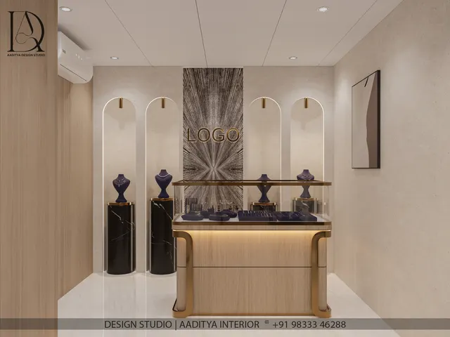
The principles above apply everywhere, but each kind of shop has its own priorities. The table below summarises what matters most in the shop types Aaditya Interior is most often asked about, from kiranas to jewellery showrooms. In counter-service shops such as jewellery and mobiles, the counter itself becomes the display, and merchandising moves into the showcase and the backlit wall behind the staff.
| Shop type | Priority display | Lighting note | Quick win |
|---|---|---|---|
| Kirana and general store | Fast movers in prime zone; bulk low; impulse at the counter | Uniform, about 4000 K | Face every shelf daily; clear the entrance |
| Saree and textile showroom | Draped displays, colour-blocked shelves behind the counter | High CRI, about 4000 K on goods | One draped mannequin per collection |
| Apparel boutique | Face-out new range on power wall; folded stacks in reach | 3000–3500 K with accents | Change the power wall every two weeks |
| Footwear | One shoe per style at 900–1700 mm; boxes in stock room | Accent the wall, light the floor evenly | Seating and mirrors near the wall |
| Mobile and electronics | Working demo tables near the door | About 4000 K; control screen glare | Power at every demo point |
| Pharmacy | Clear category signs; OTC and wellness in reach | Uniform 500–750 lux | Seasonal health display near the counter |
| Jewellery | Showcases with focused lighting; uncluttered trays | Warm for gold, cooler for diamonds | Fewer pieces per tray, better lit |
| Sweets and bakery | Glass counters, pyramid stacks, festival gift boxes | Warm but true colour; no heat on food | Gift boxes stacked at the door before festivals |
A low-cost starter plan
Visual merchandising does not need a fit-out. For a small shop, the first month can cost almost nothing beyond time and a few light fittings. Clear the entrance and the window of everything except one story. Move bestsellers into the 1300–1600 mm zone and bulk stock down. Re-face every shelf. Group goods by colour where it applies. Build one pyramid display on a table near the power wall. Add or re-aim a few track spots on the power wall and the window. Replace handwritten signs with a consistent set. Then watch the shop: which displays customers stop at, which products move, and where people never go. Adjust each fortnight.
Owners who want a sharper result can then invest in fixtures — a modular wall system, nesting tables, a mannequin or two, a better window backdrop — and in lighting. Those costs belong in the fit-out budget, which this site's retail design article prices at about ₹900–1,400 per sq ft for a basic store and ₹1,400–2,200 for mid-range at October 2026 rates. The cheapest improvement, though, is discipline: a daily ten-minute reset of the shop before opening does more than any prop.
Measuring whether it works
Every visual merchandising change is an experiment, and a shop owner can measure it with three numbers already in the billing system. Footfall is how many people enter. Conversion is the share of those who buy. Average bill value is what each buyer spends. A better window should raise footfall; better displays and easier navigation should raise conversion; cross-merchandising and the queue display should raise the average bill. Compare a fortnight before and after a change, at the same time of month, and keep what works. A simple door counter or a staff tally at busy hours is enough for a small shop.
Where visual merchandising is heading
Three trends are reshaping how shops display goods. The first is the shop as a showroom: as more buying moves online, physical shops carry less stock and more experience — demo tables, trial areas, personal service — with QR codes linking each display to the full range. The second is digital display: screens in windows and on walls let content change daily, though a screen without a clear message is just more noise. The third is sustainability: reusable props, modular fixtures and fewer printed graphics reduce waste and cost. None of these changes the basics. Customers will still notice what is at eye level, lit well and arranged clearly.
Rules for shop owners
- Keep the entrance and the first 1.5–3 m open; one feature only.
- Put bestsellers and high-margin items at about 1300–1600 mm; heavy and bulk items below 700 mm.
- Make the power wall your best display and change it every two to four weeks.
- Build displays as pyramids in odd groups with one focal point; group by colour.
- Keep centre fixtures low — about 1350–1500 mm or less — so the back wall is visible.
- Light products, not just the shop: accents of about 3:1 to 5:1 over ambient, CRI 90+.
- Use few, large, consistent signs; read each one from the customer's position.
- Never block exits, aisles or fire routes with displays; keep main aisles 1500–2000 mm.
- Change the window before every festival that matters to your customers.
Frequently asked questions
What is visual merchandising in simple words?
It is the way a shop arranges its products, lighting, colours and signs so that customers notice products, understand them and want to buy them. It covers the window, the layout, the height and grouping of displays, and the lighting and signage that support them.
What is the best height to display products?
The prime selling zone is roughly 1300–1600 mm above the floor, close to standing eye level. Feature displays work from about 1600–2000 mm, everyday items from about 700–1300 mm, and bulk or heavy items below about 700 mm. For children's products, lower the whole scheme by about 300–400 mm.
How often should a shop window be changed?
Every two to four weeks for the main display, and before each festival or season that matters to your customers. A change can be as simple as a new hero product or a new colour story; it does not require new props.
How can a small shop do visual merchandising on a low budget?
Clear the entrance and window, move bestsellers to eye level, face every shelf, group goods by colour, build one pyramid display near the first wall customers see, re-aim or add a few spot lights, and replace handwritten signs with a consistent set. Most of this costs time rather than money.
Which lighting is best for a clothing shop?
Warm to neutral white of about 3000–3500 K with high colour rendering (CRI 90+), an ambient level of about 300–500 lux, and adjustable track spots that light key displays three to five times brighter than the general level. Light mirrors and trial rooms evenly from the front.
Sources & standards
- Bureau of Indian Standards — IS 3646 (Part 1), code of practice for interior illumination
- Bureau of Indian Standards — National Building Code of India 2016, Part 4 (Fire and Life Safety: exits and travel routes) and Part 8 (Lighting and Ventilation)
- Ministry of Housing and Urban Affairs — Harmonised Guidelines and Standards for Universal Accessibility in India (2021)
- Paco Underhill — Why We Buy: The Science of Shopping, on customer movement and the decompression zone
- Neufert, Architects' Data — anthropometric heights and retail fixture dimensions
- This site's retail store design and shop Vastu articles — aisle widths, fixture heights, lighting and fit-out costs kept consistent
- Price ranges: indicative October 2026 estimates — confirm locally before budgeting