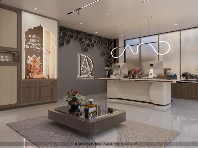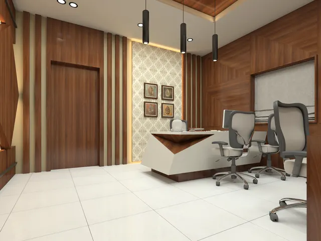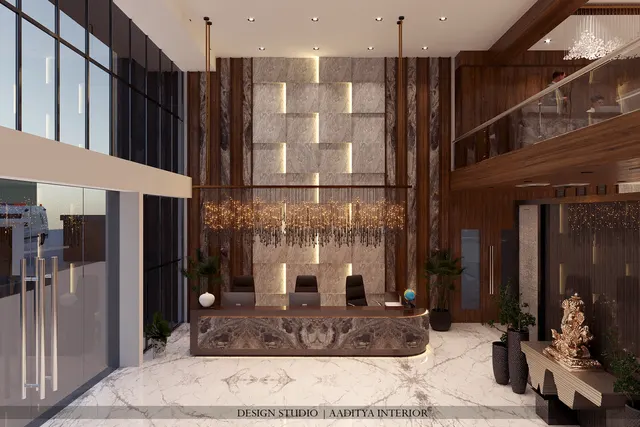



A clothing boutique is a selling machine, and its interior is the mechanism. Unlike a home, where the design serves the people who live there, a store's design has one measurable job: to bring a customer in, move them past the merchandise in a considered order, let them see and touch the garments well, make trying on easy and pleasant, and close the sale at the counter without friction. Every one of those steps is a design decision — the width of the door, the pull of the window, the path through the floor, the height of a rail, the light on a fabric, the comfort of a fitting room. Get them right and a modest shop outperforms a larger, careless one; get them wrong and footfall leaks away unconverted.
Indian boutiques face particular pressures. Rents in good high streets and malls are high, so every square foot must earn, which tempts owners to cram in stock until the floor is a maze; but an overcrowded store reads as cheap and chaotic and suppresses the very sales it was packed to increase. Trial rooms are routinely treated as an afterthought, when for apparel they are where the purchase is actually decided. Lighting is often a single flat layer that flattens colour and texture, when clothing needs layered, warm, high-quality light to look its best. And the billing counter is frequently placed and sized by instinct rather than by the queue and the wrapping it must handle.
This article sets out how a boutique is planned properly in India: the zones a store divides into and how floor area is shared between them, the aisle and circulation clearances that keep it comfortable, the dimensions of display fixtures and fitting rooms that come from the human body and the garment, the lighting layers that make clothes sell, and the indicative October 2026 fit-out costs. It is written for shop owners planning a space and for designers and students learning retail layout.
How a boutique is zoned
A store is not one room but a sequence of zones, each with a job, and good design decides their sizes and their order before any fixture is drawn. The threshold and window pull the customer in. A decompression zone just inside the door — kept deliberately open — lets them slow down and adjust from the street; cramming stock against the entrance is a classic error, because customers hurry past merchandise placed in the first stride or two. Beyond it lies the main display floor, the largest zone, organised so the customer is led along the merchandise rather than left to wander. Feature or new-arrival displays catch the eye at focal points. The fitting rooms sit deeper in, private but easy to find. The cash counter commands the exit. Back-of-house — stock, staff, store — takes the least generous but still adequate slice.
| Zone | Share of floor | Job | Design note |
|---|---|---|---|
| Entrance / decompression | 5–10 % | Let the customer slow and adjust | Keep clear; no stock in the first stride |
| Main display floor | 45–55 % | Carry the bulk of the merchandise | Lead the path; do not let it wander |
| Feature / new arrivals | 5–10 % | Catch the eye at focal points | Best light, front and centre |
| Fitting rooms | 10–15 % | Where apparel sales are decided | Private, comfortable, well lit |
| Cash counter | 5–8 % | Close the sale, handle wrapping | Commands the exit, near the door |
| Back-of-house | 10–15 % | Stock, staff, store | Adequate, not generous |
Clearances and circulation
Comfort in a store is mostly a matter of widths, and widths come from the body and from safety. The main aisle a customer walks along should be at least 1200 mm so two people can pass without a brush, and more where trolleys, prams or wheelchairs are expected; secondary aisles between fixtures can drop to around 900–1000 mm but no less, or the floor feels pinched and customers avoid the tight runs. These are also the dimensions that keep a store accessible and that align with the circulation and exit-width thinking of the National Building Code. The counter needs clear standing space in front for a small queue and clear working space behind for billing and wrapping, and the path from fitting room to counter should be short and obvious so a decided customer is not lost on the way to paying.
| Clearance | Minimum | Comfortable | Where it matters |
|---|---|---|---|
| Main circulation aisle | 1200 mm | 1500 mm | Two customers passing with bags |
| Secondary aisle between fixtures | 900 mm | 1000–1100 mm | Browsing between gondolas |
| Space in front of a wall rail | 900 mm | 1050 mm | Standing to flick through garments |
| Queue space at the counter | 1200 mm | 1800 mm | Two or three waiting customers |
| Working space behind the counter | 750 mm | 900 mm | Billing, folding and wrapping |
| Clear path to the nearest exit | 1000 mm | 1200 mm | Safe egress under NBC thinking |
Display fixtures and fitting rooms
Fixtures are dimensioned by the human reach and the hanging garment, not by guesswork. A wall-hung rail set at about 1500–1700 mm suits long garments and lets a single-hang display read cleanly; a double-hang arrangement puts a rail around 1050–1200 mm with a second near the top, doubling capacity for shirts and folded-over trousers. The highest useful shelf or rail sits around 1800 mm, the comfortable limit of an average reach; anything above that becomes display-only. Shelf depths of 300–400 mm suit folded apparel, and a hanging garment needs roughly 550–600 mm of depth clear of the wall. The fitting room is the most important fixture of all: at least 900 × 1500 mm internally, with a seat, hooks, a full-height mirror, a door or a full curtain that truly closes, and flattering, warm, even light. A mean, badly lit trial room loses sales a generous one would make.
| Fixture / element | Key dimension | Why |
|---|---|---|
| Single-hang wall rail | 1500–1700 mm high | Long garments hang clear of the floor |
| Double-hang lower rail | 1050–1200 mm high | Doubles capacity for shirts and folded trousers |
| Highest useful shelf | ≈ 1800 mm | The comfortable limit of an average reach |
| Folded-apparel shelf depth | 300–400 mm | Holds a neat stack without overhang |
| Hanging depth clear of wall | 550–600 mm | Garment on a hanger sits square |
| Fitting room, internal | ≥ 900 × 1500 mm | Room to change, with a seat and mirror |
| Cash counter | 1800 × 600 mm | Billing, bagging and card machine |
Lighting that sells clothing
Lighting is where many Indian boutiques quietly lose money. A single flat sheet of cool tubelight flattens fabric, greys skin tones in the mirror and makes a careful colour story look cheap. Clothing needs layers. A comfortable ambient layer lights the space; an accent layer of adjustable spots, warmer and brighter, picks out the feature displays and the garments on the walls so they stand forward; and the fitting room gets its own warm, even, high-colour-rendering light placed to flatter rather than to expose. Colour rendering matters as much as brightness: a lamp with a high rendering index shows a maroon as maroon and a navy as navy, so the garment the customer buys is the colour they saw. Daylight at the window is an asset to frame, not fight.
Costing the fit-out
A boutique fit-out is priced per square foot of the shop, and the band depends on how much joinery, stone, glass and lighting the design carries. The ranges below are indicative October 2026 figures for a built-out store, excluding GST, stock and the base civil shell; they move with city, finish level and the share of bespoke display. They are enough to budget a space and to see where money is best spent — which, in apparel, is on lighting and fitting rooms before anything decorative.
| Fit-out level | Indicative Oct 2026 (₹) | Unit | What it buys |
|---|---|---|---|
| Basic | ₹1,200 – ₹1,800 | per sq ft | Standard fixtures, simple lighting, paint |
| Mid | ₹1,800 – ₹2,800 | per sq ft | Part-bespoke display, layered lighting, good flooring |
| Premium | ₹2,800 – ₹4,500+ | per sq ft | Full bespoke joinery, stone, feature lighting |
| Fitting room (each) | ₹35,000 – ₹90,000 | per room | Panelling, mirror, seat, warm lighting |
| Cash counter (bespoke) | ₹40,000 – ₹1,20,000 | per counter | Joinery, stone top, display and storage |
Where boutique design is going
Retail interiors in India are moving in two directions at once. At one end, experience is the differentiator against online shopping: boutiques invest in atmosphere, curated displays, seating, good light and a generous trial experience, so that the physical visit offers what a screen cannot. At the other, flexibility rules: modular, re-configurable fixtures let a store reset its layout for a new season or a festival collection in hours rather than weeks. Integrated technology — click-and-collect points, digital look-books, smart lighting scenes for day and evening — is arriving in the better stores. What stays constant is the fundamentals: a clear path, honest clearances, well-lit garments and a trial room that closes the sale. Technology and trend sit on top of those; they do not replace them.
The shopfront, window and entrance
A boutique earns its footfall at the glass before a customer ever steps inside, so the shopfront and window are part of the selling layout, not decoration added at the end. The window display is the shop's strongest advertisement: a small number of well-chosen, well-lit garments on forms, changed often, pulls the passer-by in far better than a window crammed with stock. The display needs its own warm, bright, high-rendering light so the fabric reads true against the street, and a shallow backing that hides the shop interior enough to make the window a composed picture rather than a view of a cluttered floor. The entrance itself should be generous and obviously open — a wide, welcoming door with a clear threshold — because a mean or ambiguous entrance quietly turns people away.
Just inside, the decompression zone does the rest of the work. Customers arriving off a busy street need a step or two to slow down and shift from walking to browsing, and merchandise placed in that first stride is simply missed. Keeping the opening 1.0 to 1.5 m clear, with perhaps one feature display to catch the eye and draw the gaze inward, converts far more of the footfall than packing stock against the door. The signage, the window and the entrance together set the shop's price position in a glance, so they must match the merchandise inside — a premium boutique with a cheap, cluttered window undersells itself before the customer is even through the door.
Storage, trial logistics and back-of-house
The part of a boutique the customer never sees decides how smoothly the part they do see runs. A stockroom close to the floor lets staff replenish sizes quickly and fetch alternatives for a customer in a fitting room without crossing the whole shop, which is why back-of-house is placed near the fitting rooms and the counter rather than banished to a far corner. Even a small boutique needs somewhere to receive and check deliveries, tag and steam garments, and hold the stock that will not fit on the floor; squeezing all of that onto the selling floor makes the shop look like a warehouse and slows the staff down. A tight but genuine back-of-house of 10 to 15 per cent of the floor is money well spent, because it keeps the selling area calm and full of only what is meant to be seen.
The trial logistics tie the whole plan together. A customer who picks a garment, tries it, needs a different size, and then decides to buy should travel a short, obvious loop: floor to fitting room to counter, with staff able to reach the stock in between. When the fitting rooms sit deep but findable, the stock sits behind them, and the counter commands the exit, that loop is short and the sale closes. When they are scattered, the customer is lost at each step and some simply leave with the garment unbought. Good back-of-house planning is therefore not a support function but a direct contributor to conversion, and it belongs in the layout from the first sketch.
Accessibility and compliance sit underneath all of this and are not optional. A boutique is a mercantile occupancy, so its exits, the paths to them and its signage must satisfy the fire and life-safety thinking of the National Building Code, whatever pressure the stock puts on the floor; an aisle that doubles as an escape route cannot be narrowed below a safe width merely to add a rail. Accessibility guidelines ask for a step-free entrance where the site allows, an accessible route through the main aisles, and at least one fitting room generous enough for a wheelchair user — a larger room of about 1500 × 1500 mm with a side-opening door. Building these in from the plan costs little and widens the customer base; retrofitting them after a fit-out is expensive and often impossible, which is why a careful designer treats them as part of the layout rather than an afterthought. The same forethought applied to emergency lighting, clear exit signage and an unobstructed path to the door protects both the customers and the licence, and it reassures the kind of discerning shopper a good boutique most wants to keep.
Rules for planning a boutique
- Keep the first 1.0–1.5 m inside the door clear; customers hurry past stock placed in the first stride.
- Give the main aisle at least 1200 mm and never drop a secondary aisle below 900 mm.
- Lead the customer along the merchandise on a planned path rather than leaving them to wander.
- Set rails by the garment: single-hang around 1500–1700 mm, double-hang lower rail at 1050–1200 mm.
- Make the fitting room at least 900 × 1500 mm, with a seat, hooks, a full mirror and a door that closes.
- Light in layers — ambient, warm accent and a flattering fitting-room light — with high colour rendering.
- Place the cash counter to command the exit, with queue space in front and working space behind.
- Keep every exit and the path to it clear in line with the National Building Code, whatever the stock pressure.
Frequently asked questions
How much area does a small boutique need?
A workable small boutique starts at roughly 300–500 sq ft of selling floor, which can carry a display floor, one or two fitting rooms, a counter and modest back-of-house. Below that, the fitting rooms and circulation get squeezed and the store feels cramped. Comfortable independent boutiques commonly run 600–1,200 sq ft.
How wide should the aisles be in a clothing store?
The main aisle customers walk along should be at least 1200 mm so two people pass easily, and wider where prams or wheelchairs are expected. Secondary aisles between fixtures can drop to about 900–1000 mm but no less. Aisles that also serve as exit paths must stay clear and adequate under the National Building Code.
What size should a fitting room be?
At least 900 × 1500 mm internally, which gives room to change with a seat and a full-height mirror. Larger rooms of around 1200 × 1500 mm are more comfortable and suit bridal or heavy ethnic wear. The comfort and lighting of the fitting room matter more to sales than almost any other fixture.
What lighting is best for a clothing shop?
Layered light with high colour rendering. An ambient layer lights the space, warmer accent spots pick out feature and wall displays, and the fitting room gets its own flattering, even, warm light. High colour rendering ensures the garment looks the same colour in the store, the mirror and daylight, so the customer is not disappointed later.
Sources & standards
- National Building Code of India 2016, Part 4 (Fire and Life Safety) and Part 3 (Development, circulation and means of egress)
- National Building Code of India 2016, Part 8 — lighting and ventilation for mercantile occupancies
- Neufert, Architects' Data — retail and shop planning, fixture and circulation dimensions
- Time-Saver Standards for Building Types / Interior Design — retail store planning
- Rights of Persons with Disabilities Act 2016 and the Harmonised Guidelines for accessibility — aisle and access widths
- Price ranges: indicative October 2026 estimates — confirm locally before budgeting