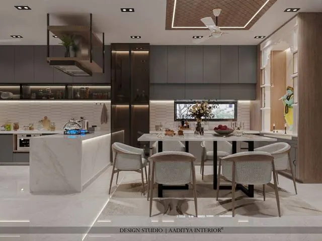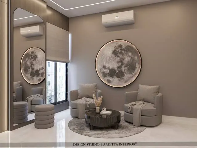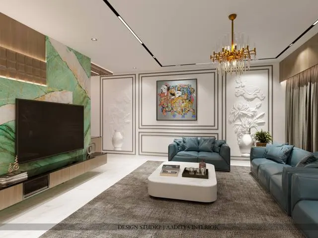

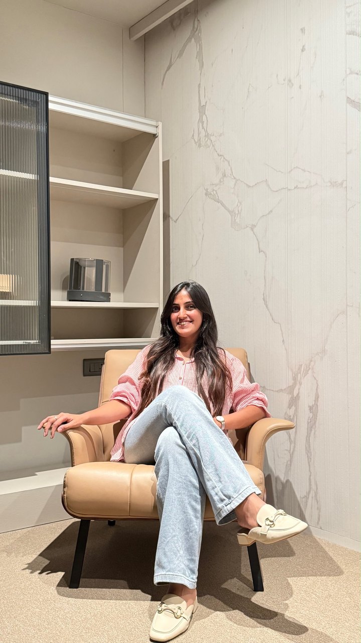

Walk into two flats with the same budget and the same square footage, and one will feel expensive while the other feels busy. The difference is rarely the price of the marble. It is usually the height of the doors, the way light falls on the walls in the evening, the number of materials on show, and whether the edge where the wardrobe meets the ceiling was drawn by a designer or left to the carpenter. Luxury is a perception, and perceptions are built from many small signals that the eye reads in a few seconds.
Indian homes often chase luxury with the wrong tools. A false ceiling with three levels, a mirror-finish laminate on every shutter, a crystal chandelier in a 2700 mm room, gold trims on the TV wall and a wallpaper on every second surface — each item was sold as premium, yet together they make a room look crowded and dated within three years. Meanwhile the things that actually signal quality — a door that reaches 2400 mm, a skirting that disappears into a recess, curtains that fall from a hidden pocket to the floor, a rug large enough to hold the furniture — cost relatively little and are often skipped.
This article explains what makes an interior read as expensive, why it works, and how to achieve it at different budgets. It looks back at how Indian palaces, havelis and Art Deco apartments expressed luxury, sets out the dimensions and details that do the heavy lifting today, compares where money buys visible quality and where it does not, and ends with rules, a quick answer and the questions homeowners most often ask. The prices used are consistent with the cost guides elsewhere on this site and are indicative October 2026 ranges.
How Indian homes have expressed luxury: a short history
Luxury has always been about scarcity, but what counts as scarce has changed. In the palaces and havelis of Rajasthan and Gujarat, luxury meant craft that took years: carved timber brackets, painted ceilings, mirror work in the sheesh mahal, stone jaalis cut by hand, and courtyards large enough to bring breeze and light deep into the plan. The rooms themselves were often sparsely furnished. Floor seating, bolsters and a few chests left space, height and ornament to do the work. Luxury lived in the envelope — the walls, ceilings, floors and openings — rather than in loose objects.
Colonial bungalows added another idea: height and volume. Ceilings of 3.6 metres or more, tall doors with fanlights, deep verandahs and big windows were climate devices first, but they also became the visual vocabulary of status. In the 1930s, Bombay's Art Deco apartments along Marine Drive and around the Oval Maidan brought a modern, urban version: terrazzo floors, streamlined built-in furniture, rounded corners, and decorative metal and glass. That ensemble, together with the Victorian Gothic buildings opposite it, was inscribed by UNESCO as a World Heritage Site in 2018. Its lesson is that a well-proportioned room with honest materials stays elegant for nearly a century.
The 1990s and 2000s brought the era of visible spending: glossy granite, mirror-polished laminates, ornate gypsum ceilings, gilt furniture and crystal everywhere. It was luxury as display. Since the late 2010s, the global and Indian conversation has moved towards what designers call quiet luxury — fewer materials, natural textures, muted colours, invisible technology and craft that reveals itself on a second look. The table below summarises the shift.
| Era | What signalled luxury | What it left us | What to borrow today |
|---|---|---|---|
| Palaces and havelis (pre-1900) | Hand craft: carving, inlay, painted ceilings, jaali, mirror work | Rich envelopes, sparse furniture | One crafted element per room, given space |
| Colonial bungalows (1850s–1940s) | Ceiling height, tall doors, verandahs, teak joinery | Volume and proportion as status | Tall doors and uncluttered ceilings |
| Art Deco apartments (1930s–1950s) | Terrazzo, streamlined built-ins, curved corners, metal and glass | Integrated furniture, durable floors | Built-ins drawn as architecture, not added later |
| Display era (1990s–2010s) | Gloss, gold, crystal, layered POP ceilings | Busy rooms that date quickly | Mostly a warning: restraint ages better |
| Quiet luxury (late 2010s onward) | Natural stone and veneer, texture, precise detail, invisible tech | Calm rooms with fewer, better things | Edit hard; spend on touch, light and junctions |
The seven signals the eye reads in the first few seconds
When a visitor enters a room, the brain reads it in roughly this order: overall volume and proportion, the quality of light, the number of competing things, the materials within reach, the junctions where materials meet, the softness and acoustics of the space, and finally the personal objects. Designers who understand this order spend money and attention accordingly. A room that fails the first three signals cannot be rescued by an expensive sofa; a room that passes them can look luxurious with fairly ordinary materials.
- Proportion and height — how tall the doors, ceilings and windows feel relative to the room.
- Light — whether the walls and ceiling glow evenly, and whether colours look natural.
- Restraint — how many materials, colours and objects compete for attention.
- Material weight — whether surfaces within reach feel solid, cool, warm or textured rather than thin and plastic.
- Junctions — where floor meets wall, wall meets ceiling, shutter meets shutter.
- Softness and quiet — rugs, curtains, upholstery and acoustics that take the echo out.
- Personality — art, books and objects that belong to the family, not to a showroom.
Proportion: height is the cheapest luxury
Nothing makes a room feel more expensive than height, and nothing destroys it faster than a low, busy ceiling. Most Indian apartments have a floor-to-floor height of about 3000–3150 mm, which leaves roughly 2750–2900 mm under the slab. A multi-level false ceiling can drop that to 2450–2550 mm at its lowest point, and the room immediately feels compressed. A single, flat gypsum ceiling held to a drop of 100–150 mm, with lighting recessed into it or a slim cove only at the perimeter, preserves most of the volume. Where services allow, leaving the slab exposed and painted in the centre of the room, with a perimeter band for lights and curtains, preserves even more.
Doors are the second lever. The builder's standard door is 2100 mm high. Raising internal doors to 2400 mm — or taking them to the underside of the false ceiling — makes every room feel taller because the eye measures height against the door. A flush shutter with a concealed or slim aluminium frame, finished in the same paint or veneer as the wall, reads as a slot in the wall rather than a piece of carpentry. The cost difference is modest: a taller shutter, a frame without architraves and better hinges. It is one of the highest-value upgrades in any renovation.
Scale of furniture is the third part of proportion. Rooms look cheap when everything is slightly too small: a 1600 mm sofa floating in a 4800 mm room, a 1200 × 1800 mm rug that only reaches the coffee table, curtains hung from a rod just above the window frame. Expensive-looking rooms use fewer pieces at a generous scale — a sofa that fills most of its wall, a rug that holds the front legs of every seat, a dining table with room for the chairs to pull out, and curtains that start at the ceiling and fall to the floor. The table below collects the dimensions designers use to get this right.
| Element | Typical builder or catalogue choice | Dimension that reads generous | Why it works |
|---|---|---|---|
| Internal door height | 2100 mm | 2400 mm or full height to ceiling | The eye reads height against the door |
| False ceiling drop (centre) | 300–450 mm, several levels | 100–150 mm, one level, or exposed slab | Keeps volume; fewer lines to look at |
| Curtain start point | Rod 100–150 mm above window | From a ceiling pocket, falling to 10–15 mm above floor | Makes windows look taller and wider |
| Living room rug | 1200 × 1800 mm | 2000 × 3000 mm or larger, front legs of all seats on it | Groups the furniture into one composition |
| Sofa length on a 4500 mm wall | 1800–2000 mm | 2400–2800 mm, or sofa plus one chair | Fills the wall instead of floating |
| Skirting | 75–100 mm tile or wood strip, proud of wall | Recessed shadow gap or flush skirting, 60–100 mm | Removes a visible line around every room |
| Wall art | Several small frames | One piece about 60–75 % of the sofa length | One strong focal point instead of noise |
| Pendant over dining table | Small fitting, hung high | About half to two-thirds of table length, 750–850 mm above top | Defines the table as a room within the room |
Light: the finish that changes every other finish
Light is the most powerful and most underrated luxury material. The same veneer looks rich under warm, even light and flat under a grid of cold panel lights. Expensive interiors almost always use layers: ambient light that washes walls and ceilings, accent light that picks out art, texture and stone, and task light at reading chairs, counters and desks. They avoid lighting a room from a single central point, and they put almost everything on dimmers or scenes so the room can move from bright family evening to a quiet, low glow.
Two technical choices matter more than the brand of fitting. The first is colour temperature: 2700–3000 K in living rooms and bedrooms gives the warm glow that flatters skin, wood and stone, while 4000 K suits kitchens and work areas. Mixing colour temperatures in one view looks careless. The second is colour rendering: fittings with a CRI of 90 or more show veneer, fabric and marble as they really are, while cheap strips with a CRI near 80 make warm materials look grey and muddy. Glare control comes next: deep-set or trimless downlights, and indirect light bounced off surfaces, are what make a lit room feel calm rather than bright.
Daylight belongs to the same discussion. Sheer curtains on a ceiling track soften harsh Indian sun into an even glow that makes every surface look better; blackout layers behind them give control. In west-facing rooms in Gujarat and much of north and central India, a sheer layer is not decoration but a working tool. In the evening, the room should never be lit only by a ceiling grid: two or three lamps at different heights, plus a washed wall, will make even a modest flat look considered.
Restraint: fewer materials, chosen well
The single most reliable rule in luxury interiors is to limit the palette. Most expensive-looking rooms use three to four main materials — for example, one floor, one wall finish, one timber or veneer, and one accent such as stone, metal or a textured fabric — with colours drawn from a narrow family. Every additional material adds a line where it meets the next, and every line is a place where workmanship can fail. A living room with marble-look tiles, a different marble on the TV wall, a fluted panel, a wallpaper, a mirror strip, two laminates and a gold trim has seven materials and twelve junctions; it will look busy however carefully it is built.
Restraint also applies to objects. Luxury interiors leave empty surfaces: a console with three objects rather than twelve, open shelves with books and space, a kitchen counter with nothing on it but a fruit bowl. That emptiness depends on storage — closed, full-height, well-organised storage that swallows the daily clutter of an Indian household. In practice, the expensive look is often bought in the wardrobes and kitchen cabinets, because they let the visible rooms stay calm.
| Common 'luxury' choice | Why it reads cheaper over time | What to do instead | Indicative cost effect (Oct 2026) |
|---|---|---|---|
| High-gloss laminate on every shutter | Shows every fingerprint and ripple; looks plastic up close | Matt or soft-touch laminate, veneer or PU on feature units only | Laminate ₹350–650; veneer ₹600–1,100; PU ₹1,000–1,800 per sq ft |
| Multi-level POP or gypsum ceiling | Lowers the room, collects dust, dates quickly | Flat ceiling with a perimeter band for light and curtains | Often cheaper: plain gypsum ₹60–80 vs designer ₹80–180 per sq ft |
| Gold or rose-gold trims on many surfaces | Reads as applied decoration; finish wears at edges | One metal finish, used on handles, lights and one detail | Saves money; spend on solid handles |
| Large crystal chandelier in a 2700 mm room | Crowds the ceiling and glares at eye level | Scaled pendant over the dining table; layered light elsewhere | Varies; layered lighting is the better spend |
| Wallpaper or textures on several walls | Competes with art and furniture | One feature wall, or none; quality paint everywhere else | Premium emulsion ₹20–30; texture ₹40–150+ per sq ft |
| Matching furniture set from one shop | Looks like a showroom, not a home | Mix one or two statement pieces with simpler ones | Same spend, better result |
| Mirror strips and mirrored furniture | Reflects clutter, doubles visual noise | One large mirror where it brings light or extends a view | Lower cost |
Material weight: what the hand and the eye can tell
People touch a home constantly — door handles, light switches, cabinet edges, countertops, stair rails. These touch points tell the hand whether the home is solid. A heavy, solid metal handle that does not flex, a door that closes with a low, damped sound, a switch plate that clicks firmly, a stone counter with a properly eased edge: none of these are large items, but together they decide whether a home feels expensive at close range. They are also among the most cost-effective upgrades, because the quantities are small.
Surfaces at eye level and within reach deserve the better materials. Natural veneer on a TV wall or a wardrobe front, a textured limewash or mineral plaster on one wall, a natural stone top on a console or vanity, linen or wool upholstery, and a solid wood dining table all register as real. Surfaces that are walked on or rarely looked at can be simpler: a large-format vitrified tile in a calm colour, laid with tight joints and good levels, can look more expensive than poorly selected marble. The rule is to spend where the hand goes and where the eye rests, and to keep everything else quiet.
| Where to spend | Why | Where to save | Why |
|---|---|---|---|
| Door hardware, handles and switches | Touched every day; small quantities | Carcass interiors of wardrobes | Not seen when shutters are closed |
| Lighting design and colour quality | Changes how every surface looks | Decorative chandeliers | One good pendant beats several average ones |
| One feature surface (stone, veneer, plaster) | Gives the room a focal point | Repeating the feature everywhere | Dilutes it and multiplies junctions |
| Rugs and curtains at full scale | Softness, acoustics, proportion | Cushion and decor accessories | Easy to add and change later |
| Workmanship on junctions and edges | Visible at close range for decades | Elaborate ceiling designs | Rarely look better than a clean ceiling |
| Sofa frame and cushioning | Comfort and shape hold for years | Side tables and occasional chairs | Simple pieces work if the main piece is good |
Junctions: the details that separate expensive from expensive-looking
If proportion is what makes a room look luxurious from the door, detailing is what keeps it looking luxurious when someone sits down. Experienced designers spend a large share of their drawing time on junctions: where the floor meets the wall, where joinery meets the ceiling, where two shutters meet, where a curtain disappears into the ceiling. In a well-detailed home, these lines are either crisp and deliberate or disappear entirely. In a poorly detailed one, they are covered with beadings, silicone, trims and patches.
Three details carry most of the effect. A recessed skirting or shadow gap at the base of a wall replaces the usual proud tile strip with a slim dark line, so the wall seems to float. A ceiling pocket for curtains — a recess about 150–200 mm wide in the false ceiling — hides the track, so fabric appears to fall straight from the ceiling. And joinery that runs to the ceiling, or stops with a deliberate shadow gap below it, avoids the dusty, awkward space above a wardrobe. Consistent shutter gaps of about 2–3 mm, aligned handle heights and doors that line up with joinery panels finish the effect.
These details have one thing in common: they must be decided early. A shadow-gap skirting needs the plaster to stop at a line and an aluminium profile fixed before the putty coat. A curtain pocket needs to be in the ceiling drawing before the gypsum frame goes up, with power for motorised tracks if they are planned. Joinery that meets the ceiling needs the ceiling level fixed before the carpenter measures. This is why luxury interiors depend on drawings and sequencing, and why the same materials can produce very different results on two sites.
Softness, sound and the senses beyond sight
Expensive rooms are quiet. Hard Indian interiors — vitrified floors, plastered walls, glass and stone — reflect sound, so a family conversation in a large living room can echo like a lobby. Rugs, full-height curtains, upholstered furniture, bookshelves and fabric or timber wall panels absorb and break up that sound. In larger homes, acoustic insulation in bedroom walls and solid-core doors with seals make a measurable difference to privacy. A well-made flush door with a good seal closes with a soft, solid sound — one of the most persuasive luxury signals there is.
Temperature and air matter too. A home that is evenly cool, without the roar of a struggling split unit or the drip of a poorly drained condenser, feels more expensive than one with a beautiful ceiling and a noisy air conditioner. Concealed ducted systems are one answer at the top end; at mid-range budgets, well-placed split units with neatly planned drain lines and pipe routes, and ceiling fans chosen for low noise, achieve much of the effect. Fresh air, no damp smell, and clean grilles all register, even when visitors cannot name them.
Luxury at three budgets: what to prioritise
The cost guides on this site place full luxury interiors at around ₹3,500–6,000 or more per sq ft of carpet area, premium at ₹2,000–3,500 and mid-range at ₹1,200–2,000, all indicative October 2026 figures. The principles in this article work across all three. What changes is how many of them can be fully delivered. The plan below shows a living–dining room where the expensive feel comes mainly from layout, scale and a few well-chosen surfaces.
| Budget band (per sq ft of carpet, Oct 2026) | Spend first on | Deliver with | Leave for later or skip |
|---|---|---|---|
| Mid-range ₹1,200–2,000 | Tall doors, flat ceiling, layered warm lighting, full-height curtains, one large rug | Matt laminate, one veneer feature, premium emulsion, good handles | Stone feature walls, imported furniture, automation |
| Premium ₹2,000–3,500 | All of the above plus shadow-gap skirting, curtain pockets, full-height joinery | Veneer and PU on feature joinery, quartz tops, dimmable CRI 90+ lighting | Bespoke furniture in every room; elaborate ceilings |
| Luxury ₹3,500–6,000+ | Full documentation, natural stone, integrated services, acoustic separation | Book-matched stone in one place, bespoke joinery, lighting scenes, ducted cooling | Nothing essential — but still edit the palette |
In Aaditya Interior's experience across residential and hospitality projects, the upgrade clients notice most after moving in is rarely the most expensive item. It is usually the lighting scenes, the quiet of a well-sealed bedroom door, the absence of clutter thanks to good storage, and the way curtains and rugs soften the rooms. These are design decisions more than purchases.
Where luxury interiors are heading
Three directions are clear. First, luxury is becoming tactile rather than shiny. Matt finishes, natural stone with honed or leathered surfaces, limewash and mineral plasters, fluted and ribbed timber, bouclé, linen and wool are replacing gloss and mirror. These materials age well and hide fingerprints, which suits Indian homes with children, helpers and dust.
Second, technology is disappearing into the architecture. Motorised curtains in ceiling pockets, lighting scenes on a wall keypad, concealed speakers, hidden air-conditioning grilles and smart locks are increasingly expected at the top end, but the visible hardware is shrinking. The expensive look is a room with fewer visible devices, not more.
Third, luxury is becoming personal and wellness-led. Clients ask for a reading corner with perfect light, a quiet bedroom, an air-purified home office, a terrace garden, craft from a particular region or a piece of furniture made for a family member. Green-building frameworks such as IGBC and GRIHA, and the Bureau of Energy Efficiency's residential code, Eco-Niwas Samhita, are also nudging high-end homes towards better daylight, shading and efficient services — comfort that is felt rather than displayed.
Rules for an interior that feels expensive
- Protect the ceiling height: one flat ceiling level with a drop of 100–150 mm is better than three levels.
- Raise internal doors to 2400 mm or to the ceiling, with slim or concealed frames.
- Limit each room to three or four main materials and one metal finish.
- Light in layers — ambient, accent and task — at 2700–3000 K, CRI 90 or more, with dimmers.
- Hang curtains from the ceiling or a ceiling pocket and let them reach the floor.
- Buy rugs and sofas at full scale; a rug should hold the front legs of every seat.
- Spend on what the hand touches: handles, switches, door closers, worktop edges.
- Draw every junction — skirting, ceiling, joinery tops — before site work starts.
- Provide enough closed storage that visible surfaces can stay almost empty.
- Edit decor to a few meaningful pieces; one large artwork beats a gallery of small ones.
Frequently asked questions
How can I make my home look expensive on a budget?
Start with the free and cheap moves: remove clutter, simplify the colour palette, and replace cool white bulbs with warm 2700–3000 K lamps. Then spend on a few high-impact items — full-height curtains on a ceiling track, a large rug, better door and cabinet handles, and one well-scaled artwork. Avoid multi-level false ceilings and glossy finishes, which cost money and make rooms look busier.
Which colours make a room look luxurious?
Muted, layered colours usually read as more expensive than bright ones: warm whites, greige, taupe, stone, deep greens and blues, and natural wood tones. The secret is to keep them in one family, add contrast through texture rather than strong colour, and let one darker element — a sofa, a veneer wall or a stone surface — anchor the room.
Is marble necessary for a luxury interior?
No. Marble is one way of adding a natural, heavy material, but a well-chosen large-format tile with tight joints, a veneer wall, a limewash finish or a quartz or sintered stone top can create the same sense of quality. If marble is used, one well-selected, book-matched surface in the living room or foyer makes more impact than marble spread thinly everywhere.
What is quiet luxury in interior design?
Quiet luxury is a style that avoids obvious signs of spending such as gold, gloss and logos, and relies instead on proportion, natural materials, precise workmanship, soft textiles and hidden technology. Rooms look calm and simple at first glance, and their quality becomes apparent at close range — in the weight of a handle, the grain of a veneer or the alignment of a shutter.
Does a false ceiling make a home look expensive?
A simple, flat false ceiling that hides wiring and houses well-placed lights can help. An elaborate multi-level ceiling usually does the opposite, because it lowers the room and adds lines. In most Indian apartments with about 2750–2900 mm under the slab, the best result comes from a drop of only 100–150 mm, or a perimeter band with the centre left at slab level.
Sources & standards
- UNESCO World Heritage Centre — Victorian Gothic and Art Deco Ensembles of Mumbai (inscribed 2018): official description
- Bureau of Indian Standards — IS 3646 (Part 1) Code of practice for interior illumination; National Building Code of India 2016, Part 8 (Building Services), Section 1: Lighting and Natural Ventilation
- Bureau of Indian Standards — National Building Code of India 2016, Part 3 (Development Control Rules): room heights
- Bureau of Energy Efficiency — Eco-Niwas Samhita (Energy Conservation Building Code for residential buildings); IGBC and GRIHA rating systems
- Neufert, Architects' Data — furniture dimensions and circulation clearances for living and dining rooms
- Time-Saver Standards for Interior Design and Space Planning — lighting layers, furniture scale and clearances
- Price ranges: indicative October 2026 estimates, consistent with this site's cost guides — confirm locally before budgeting