

Black, white and grey look effortless in photographs: a crisp white wall, a black window frame, a grey sofa, a single plant. In real Indian homes the same palette often goes wrong. Too much white feels like a clinic; too much grey feels like an office; too much black swallows light and shows every speck of dust. Under cool-white LED panels, a monochrome room can feel lifeless; in a humid monsoon, glossy black surfaces show smears and water marks within hours.
Monochrome is not the absence of design. It is design with fewer variables, which means every remaining variable — proportion, contrast, texture, light and material — has to work harder. A room with one colour family has nowhere to hide a badly proportioned black wall or a grey that turns blue under daylight. Done with care, though, monochrome is one of the most timeless palettes available: it suits apartments and villas, it lets art and people be the colour in the room, and it ages well because it was never tied to a fashionable shade.
This article explains where the black-and-white interior came from, how to plan proportions and contrast, how to choose whites, greys and blacks that behave well in Indian light, how to add warmth through texture and materials, and how to apply the palette room by room with dimensions, finishes and indicative October 2026 costs consistent with this site's other guides.
A short history of black and white in interiors
Black and white floors are among the oldest decorative patterns in architecture. Chequerboard floors of black and white stone or marble appear in European churches, palaces and merchant houses, and Dutch painters of the seventeenth century, including Johannes Vermeer, painted domestic interiors with black-and-white tiled floors that are still copied today. The pattern was popular because it used two easily available stones, made rooms look larger and more ordered, and hid wear well.
In India, contrast of dark and light stone has an equally long history. Mughal builders inlaid black stone into white marble for borders and calligraphy — the Qur'anic inscriptions around the arches of the Taj Mahal are inlaid in dark stone on white marble. In the nineteenth and twentieth centuries, black-and-white chequered marble floors became common in colonial bungalows, havelis, clubs and public buildings across the country, often with a border; many Gujarati and Rajasthani homes still have them. These floors are proof that monochrome is not a foreign import in Indian homes.
The twentieth century turned monochrome into a modern statement. Art Deco paired black lacquer, white marble and chrome for glamour, while the modernist architects associated with the Bauhaus and the International Style favoured white walls, black steel and grey concrete for honesty and clarity. Minimalism in the later twentieth century pushed white further, and the 2010s brought the grey-everything interior that many homeowners now find cold. Today's monochrome is warmer: off-whites instead of stark white, warm greys, matte black accents, and natural wood, stone and textiles to soften the palette.
| Era | Typical monochrome expression | What it teaches today |
|---|---|---|
| Mughal and earlier Indian stonework | Dark stone inlaid in white marble; borders and calligraphy | Black works best as a line or a border |
| 17th-century Europe | Black-and-white chequered stone floors | A strong floor pattern can carry a plain room |
| Colonial-era India | Chequered marble floors with borders in bungalows and havelis | Monochrome suits hot climates and long-lasting stone |
| Art Deco, 1920s–30s | Black lacquer, white marble, chrome, geometric patterns | Contrast plus shine reads as luxury — use sparingly |
| Modernism, mid-20th century | White walls, black steel windows, grey concrete | Black frames and thin lines give crispness |
| 2010s | Grey everything, high-gloss white | Too much cool grey and gloss feels cold and shows marks |
| 2020s onward | Warm whites, warm greys, matte black, wood and texture | Monochrome needs warmth from material and light |
Proportion: the 60-30-10 rule for black, white and grey
The 60-30-10 rule is a widely used decorating guide: about 60 per cent of a room in a dominant colour, 30 per cent in a secondary colour and 10 per cent in an accent. For monochrome, it translates naturally. Around 60 per cent light — walls, ceiling and often the floor — keeps the room bright. Around 30 per cent mid-tone grey — sofa, curtains, rug, a feature wall or cabinet fronts — gives depth. Around 10 per cent black — window and door frames, light fittings, a coffee table, picture frames, handles, a single strong surface — anchors the composition. The ratios can be reversed for a dramatic room, such as a dark media room, but in most Indian homes, where rooms are compact and daylight is valuable, the light-dominant version is safer.
Contrast and LRV: why some greys disappear
Light reflectance value, or LRV, measures how much light a surface reflects, from 0 for absolute black to 100 for a perfect white. Most paint manufacturers publish it on their shade cards. In a monochrome scheme, LRV is more useful than the colour name, because two greys called by different names can have nearly the same LRV and will look identical side by side, while a white with an LRV of 85 next to a charcoal of 12 creates a strong, possibly harsh, contrast.
Contrast is also a safety and accessibility issue. Accessibility guidance in several countries recommends a difference of around 30 LRV points between adjacent surfaces such as a door and its wall, a step edge and the tread, or a switch and its background, so that people with low vision can see them; India's Harmonised Guidelines and Standards for Universal Accessibility (2021) also stress visual contrast. Monochrome makes this easy to achieve deliberately: a black door frame on a white wall, a dark nosing on a pale stair, a white switch plate on a charcoal panel.
| Pairing | Approximate LRV difference | Effect | Good for |
|---|---|---|---|
| Warm white wall + off-white ceiling | ≈ 5–10 | Soft, almost seamless | Bedrooms, calm living rooms |
| Off-white wall + pale grey wall | ≈ 10–20 | Gentle shift; subtle depth | Feature walls without drama |
| White wall + mid grey cabinet | ≈ 40–60 | Clear, comfortable contrast | Kitchens, wardrobes, TV units |
| White wall + black frame or door | ≈ 70–85 | Crisp, graphic | Windows, doors, art frames, railings |
| Charcoal wall + black furniture | ≈ 5–15 | Moody, tone-on-tone | Media rooms, bars, powder rooms |
| Pale grey floor + black skirting | ≈ 50–60 | Strong outline of the room | Use only where walls are straight and true |
Warm or cool: choosing whites, greys and blacks for Indian light
No white, grey or black is truly neutral. Whites lean warm (yellow, cream, red) or cool (blue, green). Greys lean warm (greige, taupe, mushroom) or cool (blue-grey, green-grey). Even blacks differ: some read brown-black, some blue-black. The undertone matters more in India than in many other places because of the light. North-facing rooms get steady, cooler light; south and west-facing rooms get strong, warm afternoon sun; and homes in dense cities often depend on artificial light for much of the day. A cool blue-grey that looks elegant in a showroom can turn icy in a north-facing bedroom, while a warm greige keeps its comfort.
Lighting multiplies the effect. Under cool white LEDs of 5000–6500 K, every grey looks bluer and every white looks harsher. This site's colour temperature and CRI guide recommends warm white of about 2700–3000 K for living and bedrooms and good colour rendering (CRI 90 or above) where finishes matter. For monochrome interiors, this is not optional: warm light is what turns grey from office-like to calm.
| Tone family | Undertone | Works best in | Pair with | Avoid |
|---|---|---|---|---|
| Warm white / soft white | Slightly yellow or cream | North-facing rooms, bedrooms, living rooms | Warm greys, oak, brass, linen | Next to stark blue-white trims |
| Neutral bright white | Balanced | Ceilings, kitchens, bathrooms | Most greys and blacks | Large walls in harsh west light |
| Greige and taupe | Warm grey-beige | Living rooms, bedrooms, wardrobes | Walnut, cane, terracotta, black | Very yellow lighting (can look muddy) |
| Cool grey | Blue or green | South and west rooms with strong sun | White, chrome, black, glass | North rooms with cool LED light |
| Charcoal | Warm or cool | Feature walls, cabinets, sofas | Pale walls, wood, brass | Small rooms with low daylight |
| Soft black | Brown-black or blue-black | Frames, doors, metalwork, accent furniture | White walls, warm wood | Large glossy areas (shows dust and marks) |
Texture and material: the warmth in a monochrome room
When colour is restricted, texture becomes the main source of interest. A room with a white matte wall, a white bouclé chair, a white linen curtain and a white marble table is not boring, because each white catches light differently. The same is true of greys and blacks: brushed black metal, black-stained ash, charcoal wool and black granite all read differently. Successful monochrome rooms combine at least three textures — usually one rough (stone, lime plaster, woven fabric), one smooth (painted wall, lacquer, glass) and one soft (upholstery, rugs, curtains).
One natural material is the other secret. Wood — light oak, teak or walnut — is the most common, and it adds the warmth that monochrome lacks. Cane, jute, terracotta, brass and plants do the same job. A strict black-and-white room can be striking in a hotel lobby, but for a home that people live in every day, a little wood or plant green almost always makes it more comfortable. Indian craft materials suit this well: a Kota stone floor, a hand-woven cotton rug, a brass lamp, a black-and-white block-printed cushion.
| Surface | Monochrome option | Texture role | Indicative cost (October 2026) | Maintenance note |
|---|---|---|---|---|
| Walls | Premium emulsion in warm white or greige | Smooth, matte base | ₹20–30 per sq ft of paintable area | Matte shows marks; choose washable ranges |
| Feature wall | Lime-look or texture finish in grey | Rough, light-catching | ₹40–150+ per sq ft | One wall per room is enough |
| Floor | Vitrified tiles in white, grey or chequered black and white | Smooth or matte | ₹85–160+ per sq ft installed | Matt finishes hide footprints better |
| Floor, natural | Kota stone (grey-green to blue-grey) | Natural, varied | ≈ ₹70–150 per sq ft installed | Seal; avoid acidic cleaners |
| Countertop | Black granite or grey quartz | Smooth, durable | Common black granite ₹110–180; basic quartz ₹250–425 per sq ft | Polished black shows water spots; leathered hides them |
| Cabinets | Matte laminate in white, grey or black | Smooth, uniform | ₹350–650 per sq ft of shutter | Pick anti-fingerprint for black and charcoal |
| Premium cabinets | PU paint or matte acrylic | Seamless, deep colour | PU ₹1,000–1,800; acrylic ₹900–1,500 per sq ft | Dark PU shows scratches — handle with care |
| Seamless surfaces | Grey microcement | Mineral, soft sheen | ₹250–600 per sq ft | Skilled applicator; stable base |
Lighting a monochrome room
Monochrome interiors are more sensitive to light than colourful ones. Without colour to hold attention, the eye notices glare, shadows, uneven walls and light pools. Three rules help. First, use warm light: 2700–3000 K in living rooms and bedrooms, up to 3000–3500 K in kitchens where task visibility matters. Second, layer the light — cove or wall-washing ambient light, task lights, and a few accent lights on art or texture — so that the greys read as depth rather than gloom. Third, use dark surfaces carefully: a black wall absorbs most of the light that hits it, so a room with a large dark area needs more light than the same room in white, and the light should be aimed at what matters rather than at the dark surface itself.
Room-by-room: monochrome that works
Living room
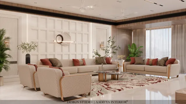
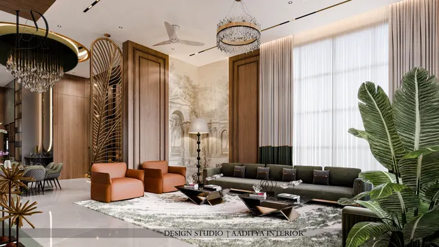
Keep walls and ceiling light — warm white or very pale greige — and put the grey into the large soft pieces: the sofa, the rug and the curtains. Use black for the thin lines: window frames, curtain rods, picture frames, lamp bases, the legs of a coffee table. A single textured grey feature wall behind the TV or sofa gives depth; a black TV console with a wood strip or wood top anchors it without making the wall heavy. Add one large plant or a wooden piece for warmth.
Kitchen
Kitchens are where monochrome is most popular and most practical. A common and durable scheme is dark base cabinets — charcoal or black — with white or pale grey wall cabinets, a white or grey quartz counter, and a light backsplash. Dark base units hide kicks and stains at floor level; light upper units keep the kitchen bright. If black is used on the counter, choose leathered or honed granite rather than polished, because water spots and fingerprints show strongly on polished black. Matte anti-fingerprint laminates or PU work best for dark shutters.
Bedroom
Bedrooms suit the softest version of monochrome: warm whites, pale greys and greige, with charcoal or black kept to a headboard frame, bedside lamps and picture frames. A full charcoal headboard wall can be beautiful and restful at night, provided the room has good daylight and the other walls stay light. Layer textures in the bedding — cotton, linen, a knitted throw — and keep the lighting warm and dimmable.
Bathroom
Black-and-white bathrooms have a long history and photograph well, but practical details matter. Matte black fittings show limescale in hard-water areas, which is common in many Indian cities; they need regular wiping with a soft cloth and mild cleaner. White large-format tiles with a grey or black accent band, black-framed mirrors and shower partitions, and a grey anti-skid floor make a durable scheme. Avoid all-black glossy wall tiles in small bathrooms: they show water marks and make the room feel smaller.
Floors: the chequerboard and its rules
A black-and-white chequered floor is the boldest monochrome move and works best in foyers, passages, kitchens and bathrooms rather than in entire flats. It needs careful setting out. The pattern should be centred on the room or on the main entrance line, cut tiles at the edges should be at least half a tile wide, and a plain border can absorb an out-of-square wall. Tile size should suit the room: 300 × 300 mm in small bathrooms and passages, 600 × 600 mm in foyers and kitchens, and larger squares only in large halls.
Common mistakes and how to avoid them
Most failed monochrome interiors fail for the same few reasons: the wrong proportions, cool light, too much gloss, no texture, and dark finishes chosen without thinking about Indian dust and humidity. Each of these is easy to avoid at the design stage and expensive to correct afterwards.
| Mistake | Why it happens | Result | Fix |
|---|---|---|---|
| Too much black | Black looks dramatic in photos | Dark, small-feeling room; needs more light | Keep black to about 10 % — lines and anchors |
| All cool grey | Grey chosen from a showroom under daylight lamps | Office-like, cold room | Warm greys and greige; one natural material |
| Cool white LEDs | Default 6000 K panels | Greys turn blue, whites harsh | 2700–3000 K warm light, CRI ≥ 90 |
| High-gloss black surfaces | Look luxurious on day one | Fingerprints, dust, water spots, scratches | Matte, anti-fingerprint, leathered or honed finishes |
| No texture | Every surface flat and smooth | Sterile, uninteresting room | Combine rough, smooth and soft surfaces |
| Black skirting on uneven walls | Copied from catalogue images | Every wave in the wall is outlined | Use skirting matched to the wall or floor instead |
| Chequered floor everywhere | Love of the pattern | Busy, tiring flat | Limit to foyer, kitchen, bath or one passage |
- Plan proportions first: roughly 60 per cent light, 30 per cent grey and 10 per cent black by visible area.
- Check LRV on shade cards and keep about 30 points of difference where edges and frames must read clearly.
- Test paint samples on site in daylight and under the actual lighting before ordering.
- Choose warm white light (2700–3000 K) with good colour rendering in living areas and bedrooms.
- Use black on lines, frames and a few anchoring pieces, not on large glossy surfaces.
- Include at least three textures and one natural material — wood, cane, stone, brass or plants.
- Pick matte, anti-fingerprint and leathered finishes for dark surfaces in Indian dust and humidity.
- Set out chequered floors from the centre line with border and half-tile minimum cuts.
Where monochrome is going
Monochrome is moving away from the cool, glossy greys of the 2010s towards softer, warmer versions: chalky off-whites, mineral greys in lime and microcement, soft blacks with brown undertones, and plenty of natural texture. Indian craft is finding a natural place in it — black-and-white block prints, handloom cottons, terrazzo with black and white chips, Kota and black granite in honed finishes. Better LED lighting with high colour rendering and smart warm-dimming is making monochrome rooms more comfortable at night. And as homeowners become more aware of indoor air quality, low-VOC paints in whites and greys, covered in this site's low-VOC paint guide, are becoming the default.
Frequently asked questions
Is a black and white interior good for an Indian home?
Yes, if it is light-dominant and warmed with texture and natural materials. Keep most surfaces light for daylight and heat reflection, use black for lines and accents, and choose matte finishes that tolerate dust and humidity. Black-and-white stone floors have a long history in Indian homes.
Which grey is best for walls?
There is no single best grey, but warm greys and greige are the safest for most Indian rooms, especially north-facing ones and those lit by warm LEDs. Cool blue-greys suit rooms with strong warm sunlight. Always test a sample on the wall and look at it in daylight and at night.
Does a black kitchen get dirty quickly?
Dark kitchens show dust, fingerprints and water spots more than light ones, especially in gloss finishes. Matte anti-fingerprint laminates or PU, leathered or honed black granite, and dark base units with light upper units make a black kitchen practical for daily Indian cooking.
How do I make a monochrome room feel warm?
Use warm whites and greys, 2700–3000 K lighting, at least three textures (for example lime-look plaster, linen and wool), and one natural material such as wood, cane, brass or plants. These changes matter more than adding colour.
What is the 60-30-10 rule in monochrome?
It is a proportion guide: about 60 per cent of the visible surface in the dominant light tone, 30 per cent in mid greys and 10 per cent in black. Reversing it gives a dramatic dark room, which suits media rooms or bars more than everyday living spaces.
Sources & standards
- Harmonised Guidelines and Standards for Universal Accessibility in India (2021), Ministry of Housing and Urban Affairs — visual contrast
- Bureau of Indian Standards — IS 3646 (interior illumination: illuminance and colour rendering)
- National Building Code of India 2016, Part 8 (Building Services — lighting and ventilation)
- UNESCO World Heritage Centre and Archaeological Survey of India — Taj Mahal inlay and calligraphy descriptions
- Paint manufacturers' published shade cards — light reflectance values (LRV) for whites, greys and blacks
- This site's colour temperature and CRI, minimalist interior, countertop and painting cost guides — lighting and finish prices
- Price ranges: indicative October 2026 estimates — confirm locally before budgeting