


A retail store is a selling machine disguised as a room, and most small Indian shops leave money on the table because no one planned the path a customer takes. Goods are stacked to the ceiling, the billing counter blocks the entrance, the aisles are too tight for two people with bags to pass, and the best products sit in the darkest corner. The owner then blames footfall or online competition when the real problem is a layout that fights the shopper instead of leading them.
Good retail design is not decoration. It is the deliberate arrangement of entrance, path, display and till so that a customer enters comfortably, is drawn past as much stock as possible, can see and reach the goods, and pays without a bottleneck — all while meeting the fire and exit rules that apply to a shop where the public gathers. The same floor area can sell far more under a planned layout than under a haphazard one, which is why sales per square foot is the number retailers watch.
This guide covers how store layout developed, how stores are planned in India today against the National Building Code and good practice, the dimensions that make aisles and displays work, lighting and visual merchandising, billing and trial rooms, indicative fit-out costs, and where retail design is heading. Dimensions are in millimetres and prices are indicative October 2026 ranges.
A short history of the planned store
The organised shop interior as we know it grew with the department store and the self-service supermarket in the twentieth century, when retailers learned that letting customers walk among the goods and handle them sold more than serving everything across a counter. The grid layout of long parallel aisles came from the supermarket and remains the most efficient way to shelve a lot of stock in a small footprint. The racetrack or loop layout, which guides shoppers on a single path past every department, came from the larger store where the aim was to expose the customer to the whole range.
In India the shift is still playing out. The traditional counter shop, where the customer stands at a counter and a shopkeeper fetches goods, coexists with self-service formats, and many successful Indian stores blend the two: open display for browsing, with a service counter for high-value or regulated goods. Whatever the format, the principles that the planned store taught — a welcoming entrance, a legible path, goods at eye level, and a calm point of payment — now apply to everything from a boutique to a pharmacy.
Customer flow and the decompression zone
The first lesson of store planning is that the area just inside the door — the decompression zone, roughly the first 1.5 m — should be kept relatively clear. A customer stepping in from the street needs a step or two to adjust from the pavement, slow down and take in the shop; goods crammed right at the threshold are simply not seen. Beyond that zone, most shoppers in India, as in much of the world, tend to drift to the right, so the right-hand wall as you enter — the power wall — earns the strongest display and the newest or highest-margin stock.
From there the layout leads the shopper on a path that exposes as much stock as the format allows, before arriving at billing. The till is placed so that it does not block the entrance and sits near the exit, usually to one side, where staff can see the door and the shop at once. A path that doubles back on itself, a counter that dams the doorway, or a dead corner that no route reaches are the classic faults that a plan drawn before fit-out avoids.
Layout types and which suits which shop
| Layout | How it works | Suits | Watch out for |
|---|---|---|---|
| Grid | Parallel aisles, long gondolas | Grocery, pharmacy, hardware | Can feel monotonous |
| Loop / racetrack | Single path past all departments | Fashion, lifestyle, larger stores | Needs enough floor area |
| Free-flow | Open, irregular groupings | Boutiques, premium, small format | Harder to stock densely |
| Herringbone | Central aisle with angled bays | Narrow deep shops | Limits aisle width |
| Counter / hybrid | Open browse plus service counter | Jewellery, mobile, regulated goods | Counter must not block flow |
| Boutique / showcase | Few pieces, generous space | High-value, experiential retail | Low density, high rent per item |
The choice follows the goods and the footprint. A pharmacy or grocery needs the density of a grid; a fashion store benefits from a loop that walks the customer past every category; a small premium boutique uses free-flow to give each piece room to be seen. Many Indian shops are narrow and deep, which suits a herringbone of angled bays off a central aisle, or a simple grid with the till at the back-front corner.
The dimensions that make a store work
Aisles must let people pass with bags and, where relevant, a trolley. A main aisle should be about 1500–1800 mm wide, secondary aisles 1000–1200 mm, and the tightest browse aisle no less than 900 mm. These widths are not only comfort; they also carry the accessibility and the means-of-escape requirements for a space the public uses. Display heights follow the body: the strongest selling band is eye to chest, roughly 1200–1600 mm, where the best stock and the newest lines belong; the top shelf above about 1800 mm is for display and light stock, and the bottom below 300 mm is for bulk and low-demand items.
The billing counter is usually 900–1050 mm high at the customer side, deep enough — 600 mm or more — to hold the terminal, packing and a display of impulse buys, with clear space behind for staff to move and bag. A trial room in a clothing store wants a clear internal size of about 900 × 1200 mm, a seat or ledge, a mirror, and a secure latch. These are not luxuries; a cramped trial room or a counter with no room to pack loses sales and tries the customer's patience.
| Element | Recommended dimension | Why |
|---|---|---|
| Main aisle width | 1500–1800 mm | Two shoppers and a trolley pass |
| Secondary aisle width | 1000–1200 mm | Comfortable single-file browse |
| Minimum browse aisle | ≥ 900 mm | Access and escape minimum |
| Prime display band | 1200–1600 mm | Eye-to-chest, best-selling zone |
| Billing counter height | 900–1050 mm | Comfortable to transact and pack |
| Trial room clear size | ≥ 900 × 1200 mm | Room to change, with seat and mirror |
Lighting and visual merchandising
Retail lighting works in layers. A base layer of ambient light makes the shop bright and legible; above it, accent lighting — typically two to three times the ambient level — picks out the displays, the power wall and the window so the eye is pulled to the goods. Flat, even lighting everywhere makes a shop look like a warehouse; contrast makes it look like a store. Colour temperature matters by category: a crisp neutral-to-cool light flatters fashion and electronics, while a warmer light suits jewellery, food and anything where richness is the selling point.
The shop window and visual merchandising
The window and the first displays are the shop's advertisement. Visual merchandising groups goods into themed, well-lit stories rather than rows of stock, keeps the window changing so passers-by look again, and uses props, height and a clear focal point to stop the eye. Inside, the principles continue: group by use or by look, face stock outward, keep shelves full but not crammed, and refresh the power wall and the window often. A clean, well-lit, frequently changed display does more for sales than an expensive fit-out left static.
| Layer | Role | Indicative level / note |
|---|---|---|
| Ambient | Overall legibility | Even base light across the shop |
| Accent | Pulls eye to displays | About 2–3× the ambient level |
| Task | Billing, trial, work areas | Bright, glare-free at the counter |
| Window / feature | Draws passers-by in | Brightest, changed regularly |
| Colour temperature | Flatters the category | Cooler for fashion, warmer for food/jewellery |
| Emergency / exit | Safety and code | Signage and backup per fire norms |
Fire, exits and the rules for shops
A shop is a mercantile occupancy where the public gathers, so the National Building Code's fire and life-safety requirements apply: a clear, unobstructed means of escape to a final exit, exit signage and emergency lighting, and travel distances and door widths appropriate to the area and the number of people. Aisles are part of the escape route and cannot be narrowed below the minimum by stacked stock. Larger stores need planned exits, extinguishers and, depending on size, detection and sprinkler provision. Accessibility — a step-free entrance or ramp and an accessible route and counter — is both good practice and increasingly required.
Storage, back-of-house and the service counter
A store that looks good on the sales floor but has nowhere to keep stock, pack orders or let staff rest soon falls apart in practice. Even a small shop needs a back-of-house zone — a store room or a screened area — where spare stock, packing material and cleaning equipment live out of the customer's sight, and a point where deliveries can be received and checked without blocking the shop. Planning this from the start avoids the familiar sight of cartons stacked in the aisle and staff stepping over stock to serve. As a rough guide, allow a tenth to a fifth of the floor area for storage and service, more for a format like a grocery that turns over bulky stock quickly.
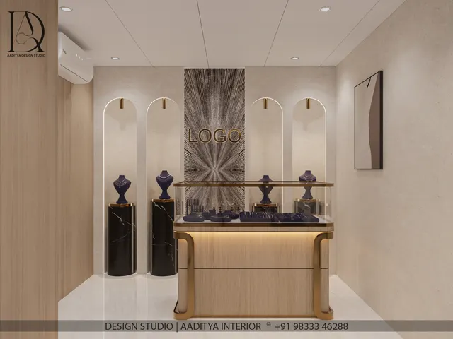
The service or billing counter deserves care because it is where the sale is closed and where queues form. It should sit near the exit, give the customer room to set down bags and the staff room to pack, and carry the terminal, the bill printer and a small display of impulse purchases at the point of payment. Behind it, staff need clear movement and a glance at the door and the floor for security. In jewellery, mobile and other high-value or regulated trades, the service counter is the heart of the shop and the open display is arranged around it, so its position is fixed first and the customer path planned to lead there.
Signage, the shopfront and first impressions
The shopfront is the single most valuable surface the store owns, because it is what decides whether a passer-by becomes a customer. Clear, legible signage with the shop name and trade, a glazed or open front that lets people see in, and good lighting after dark turn footfall into entries. Inside, simple wayfinding signage — category markers, price and offer signs that are honest and easy to read — helps the customer find and choose without a staff member at every turn. Over-cluttered windows and too many competing signs defeat the purpose; a clean front with one strong message pulls better than a wall of posters, and it costs little more to do well.
What a store fit-out costs in India
Fit-out cost depends heavily on the segment. A simple shop — basic flooring, shelving, lighting and a counter — runs an indicative ₹1,200–2,000 per sq ft; a standard branded store with good display systems, feature lighting and a worked ceiling ₹2,000–3,500; and a premium or experiential store ₹3,500–6,000 and up. Fixtures, feature lighting and the shopfront and signage are the swing items. The cost that pays back fastest is usually lighting and the shopfront, because they are what pull the customer in and show the goods.
| Item | Indicative cost | Unit | Note |
|---|---|---|---|
| Basic shop fit-out | ₹1,200–2,000 | per sq ft | Flooring, shelving, lighting, counter |
| Standard branded store | ₹2,000–3,500 | per sq ft | Display systems, feature lighting, ceiling |
| Premium / experiential store | ₹3,500–6,000+ | per sq ft | Bespoke fixtures, rich finishes |
| Billing counter, built | ₹25,000–90,000 | per counter | Depends on size and finish |
| Shopfront and signage | ₹1,500–4,000 | per sq ft of front | Glazing, branding, lit signage |
| Trial room, built | ₹18,000–45,000 | per room | Mirror, seat, lighting, latch |
The spend that repays itself fastest is almost always the part the customer meets first and dwells in longest: the shopfront, the entrance and the lighting. A dull front that hides the goods wastes every rupee spent on the fit-out behind it, while a clear, well-lit front and a welcoming entrance earn their cost in extra footfall within months. Inside, lighting that lifts the displays and a path that leads the shopper comfortably past the stock do more for sales per square foot than expensive materials on surfaces no one notices. A sensible budget therefore protects the shopfront, the lighting and the fixtures that show the goods, and economises on the back-of-house and the surfaces the customer never studies.
Rules for designing a store that sells
- Keep the first 1.5 m inside the door — the decompression zone — relatively clear so customers can adjust.
- Give the right-hand power wall the strongest display and the newest, highest-margin stock.
- Plan a clear path from entrance past the displays to a till placed near the exit, not blocking the door.
- Hold main aisles at 1500–1800 mm, secondary at 1000–1200 mm, and never below 900 mm.
- Put the best stock in the eye-to-chest band at 1200–1600 mm; keep the top for display.
- Light in layers — ambient, then accent at two to three times the level on displays and the window.
- Keep aisles clear as an escape route to a signed exit, with emergency lighting per fire norms.
- Size the billing counter at 900–1050 mm high with room to pack and a clear staff zone behind.
- Give trial rooms at least 900 × 1200 mm clear with a seat, mirror and secure latch.
- Refresh the window and the power wall often; a changing display beats a static expensive fit-out.
Where retail design is heading
The direction is experience and flexibility. As online shopping takes the routine purchase, the physical store competes on what a screen cannot offer — touch, trial, service and atmosphere — so investment is shifting towards lighting, materials, display quality and staff space rather than sheer shelving density. Modular, movable fixtures let a store change its layout for seasons and campaigns without a refit. Digital screens, click-and-collect counters and better stock visibility are entering even small Indian shops. The constant remains the planned path: however the store is dressed, a customer led comfortably from door to till past well-shown goods is the whole point.
Frequently asked questions
How wide should the aisles in a shop be?
A main aisle should be about 1500–1800 mm so two shoppers with bags, or a trolley, can pass; secondary aisles 1000–1200 mm; and the tightest browse aisle no less than 900 mm. These widths also carry the accessibility and escape-route requirements for a space the public uses, so stock must never narrow them below the minimum.
Where should the billing counter go?
Near the exit and to one side, where staff can watch the door and the shop, and never blocking the entrance. Keep the counter 900–1050 mm high and at least 600 mm deep with room to pack and a clear staff zone behind. Placing the till at the back-front corner lets the customer pass the maximum stock before paying.
What is the best layout for a small Indian shop?
Most small Indian shops are narrow and deep, which suits a simple grid of parallel shelving or an angled herringbone off one central aisle, with the till at the front corner near the door. A grid packs the most stock into a small footprint; keep the entrance clear and the right-hand wall strong.
How bright should a store be?
Light in layers rather than flooding everything evenly. A comfortable ambient base makes the shop legible, and accent lighting at about two to three times that level picks out displays, the power wall and the window. Use cooler light for fashion and electronics and warmer light for food and jewellery.
What does a shop fit-out cost per square foot?
As an indicative October 2026 guide, a basic shop fit-out runs about ₹1,200–2,000 per sq ft, a standard branded store ₹2,000–3,500, and a premium or experiential store ₹3,500–6,000 and up. Fixtures, feature lighting and the shopfront are the items that swing the cost most, and lighting and the shopfront usually repay the spend fastest.
Sources & standards
- National Building Code of India 2016, Part 4 (Fire and Life Safety) — mercantile occupancy, exits and escape
- National Building Code of India 2016, Part 3 — accessibility and general building requirements
- Neufert, Architects' Data — retail planning, aisle and display dimensions
- Time-Saver Standards for Building Types — store and retail planning
- Bureau of Indian Standards — IS 15622 tiles and relevant finish and safety references
- Price ranges: indicative October 2026 estimates — confirm locally before budgeting