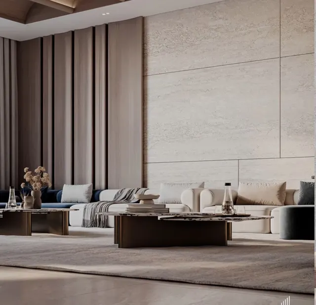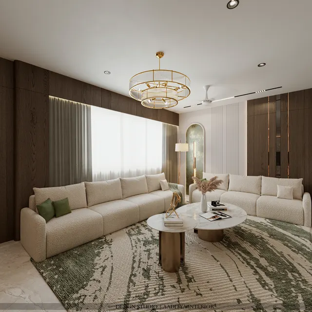


Grey was the safe choice for a decade of Indian interiors: every sample flat, every builder handover, every 'modern' living room reached for charcoal sofas and dove-grey walls. In 2026 the pendulum has swung hard the other way, towards warm earthy tones — terracotta, clay, sand and ochre — that feel grounded and inviting. But "grey is over" is the kind of slogan that sells magazine covers and misleads homeowners. Grey did not stop working; it stopped being the only answer. The real question is not which palette is in fashion, but which one suits a specific home's light, rooms and furniture.
This comparison puts the two palettes side by side on the things that actually decide a room — mood, how they behave in Indian daylight and lamplight, undertones, the materials they pair with, maintenance, small-room behaviour, resale and cost — then shows where each clearly wins, and how the greige bridge lets a home have both.
The two palettes, defined
Warm earthy tones draw from natural, mineral and plant sources: terracotta and clay from fired earth, sand and beige from stone, ochre and mustard from pigment, all built on a warm white rather than a stark one. Their common thread is a red, yellow or brown undertone that the eye reads as cosy. Grey is the achromatic family — from near-black charcoal through slate and dove to the palest cool white — and its character is set by its undertone: a blue or green undertone makes it cool and crisp, while a hint of brown or yellow pulls it towards greige, the warm grey that has become the quiet star of 2026.
Head to head
The table compares the two palettes on the criteria that decide a real room. Neither column is 'better' — they are better at different things, and the right choice depends on the home.
| Criterion | Warm earthy tones | Grey interiors |
|---|---|---|
| Overall mood | Cosy, grounded, inviting | Calm, crisp, contemporary |
| Undertone | Red / yellow / brown — warm | Blue / green (cool) or brown (greige) |
| In strong daylight | Glows and deepens; very flattering | Can look flat or cold at midday |
| Under warm (2700K) lamps | Rich and welcoming | Warms up, reads softer |
| Under cool (4000K) light | Can look muddy | Sharp and clean |
| Best metal pairing | Brass, antique gold, bronze | Chrome, nickel, matte black |
| Best wood / material | Walnut, teak, cane, stone | Oak, laminate, glass, marble |
| Small rooms | Light sand tones expand; deep terracotta cosies | Pale grey expands; charcoal can shrink |
| Hides dust / wear | Beige and clay are forgiving | Mid-grey forgiving; charcoal shows lint |
| Resale / broad appeal | On-trend and warm; wide appeal | Safe, neutral, buyer-friendly |
| Trend longevity | Rising through 2026–27 | Proven; greige keeps it current |
| Risk if done badly | Can feel heavy or dated if overdone | Can feel cold, grim or 'builder-grey' |
Where warm earthy tones win
Earthy palettes win wherever warmth and welcome matter most. In living and dining rooms they make a space feel hospitable the moment someone walks in, and they flatter skin tones and food under lamplight. In homes with abundant daylight — which most Gujarat flats have — terracotta and clay deepen and glow rather than going flat. They pair naturally with the wood, cane, brass and stone that Indian homes already love, and they hide the fine dust of a dry-season city better than a cool grey. For bedrooms, a sand or clay base feels restful; for a pooja or reading corner, ochre and warm white add quiet richness. The one caution: used too heavily and too dark, earthy schemes can feel heavy, so they want a light counterpoint and good daylight.
Where grey wins
Grey wins where crispness and neutrality are the goal. It is the ideal quiet backdrop for colourful art, patterned textiles or a statement sofa, letting those pieces lead while the walls recede. In a contemporary scheme with chrome, glass and marble, grey is the natural partner. It photographs cleanly, which matters for anyone who rents or resells, and a pale dove grey expands a small, low-light room that a deep earthy tone would close in. In home offices and utility zones where cooler 3500–4000K light helps alertness, grey stays sharp where a warm palette would turn muddy. The failure mode is the familiar one: a cold blue-grey under cold light, with no warm materials to relieve it, produces the lifeless 'builder-grey' flat everyone is tired of — which is exactly what the earthy trend is reacting against.
What each palette pairs with
A palette is never just the wall colour; it is the company the colour keeps — the metals, woods, stones and textiles around it. Warm earthy schemes and grey schemes pull in opposite directions here, and mixing the wrong partners is what makes either one look 'off' even when the paint is right. The table pairs each palette with the materials that flatter it, which is also the fastest way to shift a room warmer or cooler without repainting.
| Material | Warm earthy tones | Grey interiors |
|---|---|---|
| Metals | Brass, antique gold, bronze | Chrome, nickel, matte black |
| Woods | Walnut, teak, warm oak | Grey-washed oak, pale laminate |
| Stone | Travertine, warm marble, sandstone | Grey or white marble, quartz |
| Textiles | Linen, jute, terracotta, mustard | Wool greys, charcoal, soft blues |
| Accent plants / decor | Cane, clay pots, dried grasses | Ceramics, glass, monochrome art |
The quickest way to test a scheme is to lay the intended wall colour beside its metals and woods before committing. Brass against clay sings; brass against cold blue-grey fights. Chrome against dove grey is crisp; chrome against terracotta looks accidental. When a room feels subtly wrong despite a good wall colour, the mismatch is almost always in the metals and woods, not the paint — which is also the cheapest thing to correct.
Cost: does the palette change the budget?
Barely. The colour itself is close to free — a litre of premium emulsion costs the same in clay as in grey — so the budget is driven by the finishes and materials each palette tends to invite, not by the hue. The table shows typical, consistent rates; the real cost difference comes from whether a scheme leans on plain paint or on textured feature walls and natural materials, which either palette can do.
| Element | Typical rate (indicative Oct 2026) | Palette note |
|---|---|---|
| Premium emulsion (walls) | ₹20–30 per sq ft | Same rate in earthy or grey |
| Texture / designer feature wall | ₹40–150+ per sq ft | Earthy schemes often use one lime-look wall |
| Microcement feature wall | ₹250–600 per sq ft | Suits both; concrete-grey or warm-pigmented |
| Veneer / laminate (warm woods) | Laminate shutter ₹350–650 | Earthy leans walnut/teak; grey leans oak/grey laminate |
| Brass vs chrome fittings | Varies by piece | Brass reads warm; chrome reads cool |
In short, a warm earthy room and a grey room of the same quality cost about the same. Spend the money on good light (the right colour temperature), one well-made feature wall and honest materials, and either palette will look expensive; skimp on those, and neither will.
How to combine them: the 2026 move
The most current answer in 2026 is not to choose at all, but to bridge the two with greige — a grey warmed with brown or taupe — on the main walls, then layer warm earthy accents (a terracotta cushion, a clay vase, a cane chair, brass handles) over it. Greige keeps grey's calm, neutral, light-expanding quality while removing the coldness that dated pure grey, and it lets a family dial the warmth up or down with soft furnishings rather than repainting. For a home that wants to feel current and stay flexible, greige base plus earthy accents is the palette that quietly wins both arguments.
There is a practical reason this bridge has become the default and not just a trend. Walls are the most expensive surface to change later, so the safest colour decision is the one that stays flexible: a greige base commits to neither camp and accepts both. A family can live with greige walls and terracotta cushions this year, swap to charcoal and olive the next, and never touch a paint brush. The palette argument, in the end, is less about warm versus grey and more about building a neutral, well-lit shell and letting the inexpensive, changeable layers — cushions, rugs, art, lampshades — carry the colour and the fashion.
Frequently asked questions
Is grey out of style in 2026?
No — cold, flat 'builder-grey' is out, but grey as a family is very much in, especially greige (warm grey). Grey remains the best neutral backdrop for colourful furniture and art and for crisp contemporary schemes. What has changed is that it is no longer the default; warm earthy tones now share the lead.
Which palette makes a small flat look bigger?
Pale tones from either family expand a small room — light sand and warm white, or pale dove grey and greige. Keep one light colour across walls and large furniture and avoid deep, dark shades on every wall. Deep terracotta or charcoal can cosy a small room beautifully, but only as an accent, not wall-to-wall.
Can I mix warm earthy tones and grey in the same home?
Yes, and it is the smartest approach. Use greige as the shared base so rooms flow, then let individual rooms lean warmer (living, bedrooms) or cooler (study, utility) through accents, textiles and metals. The greige bridge keeps the whole home feeling coherent rather than like two different flats.
What light colour suits each palette?
Warm earthy schemes look best under warm 2700–3000K light, which deepens their glow; cooler light can make them muddy. Grey schemes tolerate cooler 3500–4000K in work zones for crispness, but a warm 3000K keeps living and bedroom greys from feeling cold. Always choose the wall colour and the light colour together.
Sources & standards
- This site's style guides — Earthy Interior Design; Monochrome Interior Design (Black, White and Grey); Colour Trends 2027 for Indian Homes
- Colour temperature and CRI principles — general lighting-design references (2700K–4000K behaviour)
- Finish rate bands kept consistent with this site's painting and finishes cost guides
- Price ranges: indicative October 2026 estimates — confirm locally before budgeting