


Paint is the cheapest way to apply Vastu to a home, and that is exactly why the question comes up in almost every project: which colour for which room? A family that cannot move its kitchen to the south-east, or its master bedroom to the south-west, can still choose wall colours that respect the tradition. The difficulty is that the advice found online is contradictory. One chart says the bedroom should be pink, another blue, a third earthy brown. One says red is auspicious, another says it causes quarrels. Homeowners end up choosing a colour out of anxiety rather than conviction, and sometimes paint an entire room in a dark shade that makes it gloomy and hot.
There is a more useful way to approach the question. Vastu colour guidance rests on a simple framework — directions, the five elements and the qualities each is believed to carry — and once that framework is understood the room-by-room suggestions make sense, including why different practitioners give different answers. At the same time, colour has measurable physical effects: how much light a wall reflects, how warm it feels under Indian sun, how it looks under warm or cool LED light. When the tradition and the physics are read together, most rooms end up with a palette that satisfies both.
This article sets out what Vastu practice commonly suggests for each direction and each room, explains the light-reflectance and heat logic that supports or tempers those suggestions, and gives practical palettes, finishes and indicative October 2026 painting costs. It treats Vastu as a living tradition that many Indian families value — not as building science, and not as something to fear.
Where Vastu colour guidance comes from
Vastu Shastra, the traditional Indian science of building, is concerned above all with orientation, proportion and the placement of activities within a site — which zone suits the hearth, which the entrance, which the place of worship. Its classical texts are mainly about planning and construction. The detailed colour charts found in modern Vastu books and websites are largely a later development, in which practitioners extended the directional framework to colour by linking each direction to one of the five elements, the panchabhuta — earth (prithvi), water (jal), fire (agni), air (vayu) and space (akash) — and then linking each element to colours that seem to express it.
Historic Indian homes, meanwhile, were coloured by what was available. Lime wash gave white and off-white walls that reflected heat and resisted insects; natural pigments added ochre, red oxide, indigo and earth tones; floors were finished in cow-dung plaster, lime or red oxide; and painted decoration was reserved for doorways, ceilings and shrines. The bright blue-washed houses of Jodhpur, the ochre walls of village Rajasthan and the white-washed courtyards of Gujarat all grew from local materials and climate as much as from belief. That history explains one of the most consistent strands of Vastu colour advice: keep the main walls light and soft, and use strong colour sparingly.
Because the element-to-colour link is an interpretation rather than a fixed rule, different schools assign some directions differently. The west, for example, is linked to water by some practitioners and to space or metal by others; the south is linked to fire by some and to earth by others. This is normal for an oral and interpretive tradition, and it means a family need not worry if two consultants give slightly different shades. The broad pattern, summarised below, is widely shared.
| Direction | Element as commonly taught | Colours commonly suggested | Practical note |
|---|---|---|---|
| North | Water | Light green, pale blue, mint, aqua | Cool, even north light flatters greens and blues |
| North-east | Water and space (sacred zone) | White, cream, pale yellow, very light blue | Keep it the lightest part of the home |
| East | Air / sun (varies by school) | White, pale yellow, light green, light blue | Morning sun warms whites and creams beautifully |
| South-east | Fire | Peach, soft orange, coral, warm yellow, light pink | Use warm shades as accents in kitchens |
| South | Fire or earth (varies) | Coral, terracotta, warm beige, muted red accents | Sunny side — keep large walls light to limit heat |
| South-west | Earth | Beige, sand, light brown, terracotta, earthy pink | Grounded, warm neutrals suit the master bedroom |
| West | Water or space (varies) | White, light grey, pale blue, silver | Afternoon sun is hot — light, cool tones help |
| North-west | Air | White, cream, light grey, very pale blue | Airy, light tones for guest rooms and utilities |
| Centre (Brahmasthan) | Space | White, off-white, very light cream | Keep open, uncluttered and light |
The physics behind the advice: reflectance, heat and light
The single most repeated piece of Vastu colour advice — keep the main walls light and soft — has a strong physical basis. Every paint colour has a light reflectance value, or LRV: the percentage of visible light the surface reflects, on a scale from close to 0 for black to around 85–90 for a bright white. Paint companies publish LRV on shade cards or technical datasheets for most of their colours. A wall with an LRV of 80 bounces most of the daylight that reaches it deeper into the room; a wall with an LRV of 15 absorbs most of it. In an Indian flat, where rooms are often lit from one window on one side, that difference decides whether the back half of the room needs a light switched on at noon.
Heat is the second factor. On an external wall or a terrace exposed to the sun, a dark finish absorbs far more solar energy than a light one and gets noticeably hotter to the touch, which then reaches the room inside. This is one reason why the tradition's earthy and warm colours for the south and south-west — the sunniest, hottest sides of a building in most of India — are best applied as soft, light versions rather than deep ones, and why exterior walls in hot regions do best in light tones.
The third factor is the light itself. A colour chosen under a shop's cool white tube can look completely different at home under warm 2700–3000 K evening light. Warm light deepens yellows, peaches and earthy tones and greys out cool blues; cool light does the opposite. Choosing colours in daylight and then checking a sample under the room's actual evening lighting avoids most disappointments.
| LRV band | Typical colours | How the room feels | Best use |
|---|---|---|---|
| 80–90 | Bright white, chalk white, very pale cream | Brightest, largest, can feel clinical under cool light | Ceilings, north-east zones, small or dark rooms |
| 65–80 | Off-white, ivory, pale yellow, light mint, pale blue | Light and soft — the safe body colour | Main walls in almost every room |
| 50–65 | Light beige, light grey, soft peach, sage | Warm or calm, still bright | Bedrooms, dining, larger living rooms |
| 30–50 | Mid beige, terracotta tint, dusty blue, olive | Defined, cosy, noticeably darker | Accent walls, headboard walls, large well-lit rooms |
| 15–30 | Deep terracotta, teal, mustard, forest green | Strong and enclosing | One accent wall or joinery only |
| Below 15 | Navy, charcoal, black, deep maroon | Very dark; absorbs light and heat | Small accents, trims, furniture — rarely whole walls |
Room-by-room Vastu colours
The guidance below combines what Vastu practice commonly suggests for each room with what works in Indian light and climate. Each room has a body colour for most of the wall area, an accent for one wall or joinery, and colours that are best avoided in large areas. Where the room's traditional zone and its actual position differ, the next section explains how to choose.
Entrance and foyer
The entrance is where the tradition asks for welcome, light and cleanliness. North, north-east and east entrances are commonly paired with light yellows, creams, whites and soft greens; a south or west entrance is often given warmer, earthier tones such as light beige or soft terracotta. Practically, a foyer is usually windowless and small, so a light body colour with an LRV above 65 keeps it from feeling like a corridor. The main door itself can carry a richer colour or natural wood — Vastu practice generally favours a well-made, well-maintained door over any particular colour.
Living room
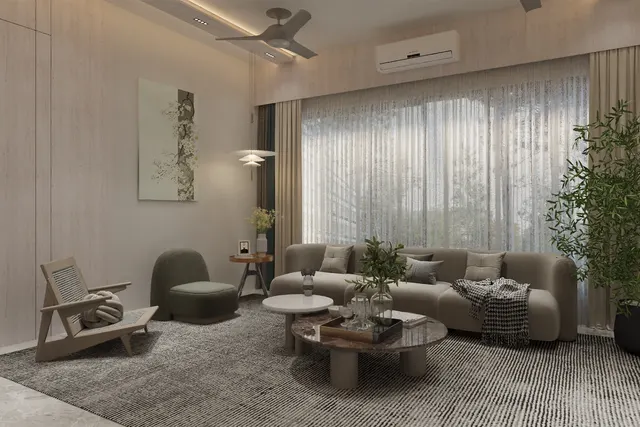
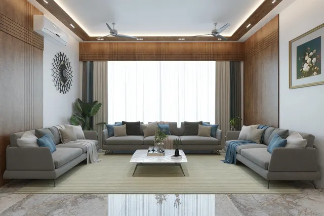
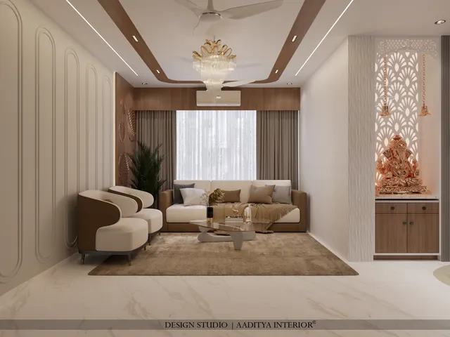
Living rooms are most often recommended light, sociable colours: white, cream, beige, light yellow, light green, light blue and pale peach. A north-facing living room suits light greens and blues; an east-facing one suits creams and pale yellows; a south- or west-facing one is cooler to the eye in off-whites and light greys with warm wood and textiles. Strong colour belongs on one feature wall — the TV wall or the wall behind the sofa — or in upholstery and rugs, which can change with the seasons.
Master bedroom
The master bedroom in the tradition sits in the south-west, the earth zone, and the colours most commonly suggested are earthy and warm: beige, sand, light brown, soft terracotta and muted rose. These are calming and they work well with wood. Very bright reds and very dark colours across all walls are generally discouraged for bedrooms, in Vastu practice and in sleep-friendly design alike. A deeper earthy tone on the headboard wall, with the other three walls in a light beige, gives warmth without darkness.
Children's room and study
Children's rooms and study areas are commonly given light green, light blue and pale yellow — colours associated with growth, calm and concentration. The west and the north-west are frequently suggested zones for children's rooms, and the north and east for study. Practically, light walls make a study brighter, and wipeable luxury emulsion survives crayons and hands. Bright colour fits well in furniture, a pin-up board or a single wall, where it can be repainted as the child grows.
Guest bedroom
The north-west, the air zone, is the traditional guest-room zone, and its colours are white, cream, light grey and very pale blue. These are neutral enough to suit any guest and light enough for a room that is often closed and used intermittently.
Kitchen
The kitchen's ideal zone is the south-east, the fire zone, and fire colours — peach, soft orange, warm yellow, terracotta, coral — are commonly suggested. The disciplined way to use them, as the kitchen Vastu guide on this site also recommends, is as accents: warm shutters or a backsplash against light walls and a light ceiling. Kitchens need high reflectance for safe working light and a scrubbable finish near the hob. Black and very dark colours over whole kitchens are usually discouraged in Vastu practice, and they also show grease and dust less forgivingly than mid-tones do.
Dining
Dining areas, traditionally in the west or near the kitchen, are often suggested warm, appetising light shades — peach, light orange, cream, light yellow and soft green. A warm white light of 2700–3000 K over the table makes these colours glow in the evening.
Pooja room
The pooja space belongs to the north-east, and its colours are the lightest in the home: white, cream, pale yellow and very light blue. Gold, brass and natural wood suit the mandir itself. Dark colours are almost universally discouraged here. A backlit panel or a white marble or Corian backdrop keeps the shrine luminous.
Bathrooms
Bathrooms in the north-west or west are commonly given white, light grey, cream or pale blue. Their colour usually comes from tiles rather than paint, so the same light palette applies to tile choice; a warm-wood-look vanity or a single feature tile adds character without darkening a small room.
| Room | Traditional zone | Body colour (most of the wall) | Accent | Avoid over large areas |
|---|---|---|---|---|
| Entrance / foyer | North, north-east, east | Cream, pale yellow, off-white | Natural wood or a rich door colour | Dark grey, black, very deep red |
| Living room | North, east, north-east | Off-white, cream, light green or blue | One feature wall, textiles | Several dark walls; black ceilings |
| Master bedroom | South-west | Beige, sand, light earthy pink | Terracotta or wood on the headboard wall | Bright red, black, harsh white under cool light |
| Children's room | West, north-west | Light green, light blue, pale yellow | One cheerful wall or furniture | Neon shades, very dark colours |
| Guest bedroom | North-west | White, cream, light grey | Pale blue, soft textiles | Heavy dark tones in a closed room |
| Kitchen | South-east (north-west second) | Off-white, cream, warm ivory | Peach, orange, terracotta, warm yellow shutters or backsplash | All-black or all-dark kitchens |
| Dining | West, near the kitchen | Cream, light peach, soft yellow | Warm wallpaper or wood panelling | Cold dark blues and greys |
| Pooja room | North-east | White, cream, pale yellow | Gold, brass, white stone, backlight | Any dark colour |
| Bathroom | North-west, west | White, light grey, pale blue tiles | Wood-look vanity, one feature tile | Dark tiles in small, windowless bathrooms |
| Study / home office | North, east | Light green, cream, pale blue | Wood shelving, pin-up wall | Strong red or orange behind a screen |
When the room is in the "wrong" zone
In most Indian flats the positions of rooms were fixed by the builder, and many homes have a kitchen in the north-west, a master bedroom in the north-east or a living room in the south. A colour question then arises: should the palette follow the room or the zone? Practitioners answer this in different ways. A practical approach that satisfies most families is to let the room's use set the body colour, and to let the zone suggest the accent.
A master bedroom in the north-east, for example, can keep its calm, light body colour — cream or very pale beige suits both the bedroom and the zone — and bring in earthy warmth through wood and textiles rather than painting the walls terracotta. A kitchen in the north-west can keep light walls with warm accents in a backsplash or a shutter colour, in line with the kitchen's fire association, while the zone's preference for whites and greys is respected on the main walls. A living room in the south can use light earthy neutrals, which suit both the zone and the sunny exposure. In each case nothing is broken, nothing is demolished and the room still works.
| Situation | Body colour | Accent | Reasoning |
|---|---|---|---|
| Master bedroom in the north-east | Cream, ivory, very pale beige | Wood headboard, earthy textiles | Light zone and calm room agree on a pale base |
| Kitchen in the north-west | Off-white, light grey-cream | Peach or warm yellow backsplash or shutters | Zone suggests light tones; kitchen's fire colours stay as accents |
| Living room in the south or south-west | Warm off-white, light sand | Terracotta cushions, wood, brass | Earth tones suit the zone; light base offsets sun and heat |
| Bedroom in the south-east | Light peach or warm cream | Soft coral or rose fabric | Fire zone softened to a restful level |
| Pooja unit in the living room east wall | Wall stays the living-room colour | White, cream or gold backdrop for the mandir only | The shrine carries the sacred palette; the room stays coherent |
| Toilet in the north-east | White, very light tiles | None | Lightest possible palette; keep it spotless and ventilated |
Kitchens, bathrooms and other rooms where colour comes from materials
In kitchens and bathrooms, most of the visible colour is not paint at all. It comes from shutters, countertops, backsplash tiles, wall and floor tiles and fittings. A Vastu palette for these rooms is therefore a materials palette. For a kitchen, that means a light countertop or one with warm flecks, shutters in ivory, warm grey or a soft fire colour, and a backsplash where an orange, terracotta or warm-yellow tile can carry the tradition without overwhelming the room. Fig. 4 shows how the zones divide on a typical kitchen wall.
Colours to use carefully, and why
Popular Vastu guidance includes a short list of colours that are discouraged over large areas. The reasons given within the tradition are symbolic — black associated with heaviness or negativity, intense red with aggression, very dark colours with stagnant energy. The practical reasons are physical and overlap remarkably well: dark colours swallow light, absorb heat, make rooms feel smaller and show dust, scratches and patchy touch-ups. None of these colours is forbidden in a well-designed home; they simply work best in small amounts.
| Colour | Common Vastu view | Practical view | Where it can still work |
|---|---|---|---|
| Black | Discouraged over large areas | Very low LRV, heats up in sun, shows dust | Metal trims, light fittings, a single fluted panel |
| Deep red / maroon | Too intense for bedrooms; acceptable as accents in the south-east and south | Dominates a room, darkens it | Kitchen accents, cushions, a door, a rug |
| Dark grey / charcoal | Generally discouraged in main rooms | Fashionable but gloomy in low-light flats | Bathroom floor, TV wall in a bright room, joinery |
| Navy / deep blue | Mixed — blue is a water colour, but very dark tones are discouraged | Cold under warm light, very low LRV | Upholstery, a study accent, a children's mural |
| Pure stark white under cool light | White is favoured | Can feel clinical and show every mark | Choose a warm off-white; use warm white lighting |
| Neon and fluorescent shades | Discouraged — restless | Tiring to live with, fades unevenly | Small children's accents only, if at all |
Paint types, sheen and what each room costs
Choosing the right colour is half the job; choosing the right paint is the other half. Ceilings take a flat or matt finish that hides undulations. Living rooms and bedrooms suit matt or low-sheen emulsions, which make colours look soft and even. Kitchens, children's rooms, dining areas and passages benefit from a washable luxury emulsion with a slight sheen, because hands, food and furniture mark them. Bathrooms need a moisture- and mould-resistant paint on any painted area above the tiles. The rates below are indicative October 2026 ranges per square foot of paintable area, all-in with putty, primer and two finish coats, consistent with the painting cost guide on this site.
| Room or surface | Recommended paint | Sheen | Indicative rate (₹ per sq ft, all-in) |
|---|---|---|---|
| Ceilings, all rooms | Ceiling white or economy emulsion | Flat / matt | ₹12–18 |
| Living room walls | Premium emulsion | Matt or low sheen | ₹20–30 |
| Master and guest bedrooms | Premium emulsion | Matt | ₹20–30 |
| Children's room, dining, passage | Luxury washable emulsion | Soft sheen | ₹20–30 |
| Kitchen walls (outside the splash zone) | Washable or kitchen-and-bath emulsion | Soft sheen | ₹20–30 |
| Accent or feature wall | Texture or designer finish | Varies | ₹40–150+ |
| Exterior walls | Exterior weather-shield emulsion, light colour | Low sheen | ₹17–26 |
| Rental or budget rooms | Distemper or economy emulsion | Flat | ₹7–18 |
For a typical 2BHK of around 2,800–3,200 sq ft of paintable wall and ceiling area, an all-premium-emulsion repaint therefore comes to roughly ₹60,000–95,000, plus the cost of any texture or designer feature wall. Changing a colour for Vastu reasons on one or two walls costs a fraction of that — usually a few thousand rupees — which is why paint is the most practical Vastu remedy available.
Where colour in Indian homes is heading
Three trends are shaping how Indian families choose colours, Vastu-minded or not. The first is a shift towards earthy, warm neutrals — sand, clay, terracotta, sage and warm whites — which sits very comfortably with the traditional palette for the south-west and south-east. The second is healthier paint: low-VOC and zero-VOC emulsions, mineral and lime-based paints, and anti-bacterial and anti-fungal finishes, which matter in closed, air-conditioned flats. The third is better tools: paint companies now publish LRV data and offer phone apps and visualisers that preview a colour on a photograph of the room, and smart lighting can shift the colour temperature of a room through the day. The combination makes it easier than ever to test a palette before committing — and to choose colours that respect both the tradition and the light the family actually lives in.
Ten rules for a Vastu colour palette that works
- Take a compass reading at site and draw the 3 × 3 grid on the actual plan before choosing any colour.
- Keep ceilings white or very pale (LRV 80+) in every room, whatever the wall colour.
- Use light, soft body colours (LRV 60–80) on most walls; keep strong colours to one wall or to joinery.
- Keep the north-east and the centre of the home the lightest areas in the house.
- Use warm fire colours in the kitchen as accents — backsplash and shutters — on a light base.
- Give the master bedroom earthy, warm neutrals; avoid bright red and black across whole walls.
- When a room sits in the 'wrong' zone, let the room's use set the body colour and the zone suggest the accent.
- Keep sun-facing exterior walls and terraces in light colours to limit heat gain.
- Test every colour as a 600 × 600 mm patch on the actual wall, in daylight and under the room's evening light.
- Choose washable emulsion where hands and food reach; spend on preparation before spending on paint tier.
Frequently asked questions
Which colour is best for the bedroom as per Vastu?
For the master bedroom, Vastu practice commonly suggests earthy, warm neutrals — beige, sand, light brown, soft terracotta and muted rose — in keeping with the south-west earth zone. For children's bedrooms, light green, light blue and pale yellow are common suggestions. Very bright reds and very dark colours over all walls are generally discouraged.
Which colour is lucky for the main door as per Vastu?
Different practitioners give different colours by direction, often matching the door to the colour family of the zone it faces. More consistent across Vastu practice is the guidance that the main door should be solid, well-made, well-lit and well-maintained. Natural wood and rich warm colours are popular and practical choices.
Is grey a good colour as per Vastu?
Light grey is commonly associated with the west and north-west and is widely considered acceptable for guest rooms, bathrooms and living rooms. Dark grey and charcoal over large areas are generally discouraged, and in practice they also make low-light flats feel gloomy. Warm, light greys paired with wood and white work well.
Can I use dark colours if Vastu suggests light ones?
Yes, in moderation. A dark accent wall, dark joinery or dark upholstery in a well-lit room is a design choice many Vastu-minded families make. Keep dark colours off ceilings, away from the pooja space and off the wall directly opposite the main window, where they cost the most light.
What colour should the pooja room be as per Vastu?
White, cream, pale yellow and very light blue are the most common suggestions, with gold, brass, white marble or natural wood for the mandir itself. These are the lightest colours in the home, consistent with the north-east's association with light and purity.
Sources & standards
- Vastu Shastra tradition as transmitted through practitioners and texts — direction, five-element (panchabhuta) and colour associations; traditional guidance, not building code, and associations vary between schools
- Bureau of Indian Standards — IS 15489 (paints, plastic emulsion — specification) and IS 428 (washable distemper)
- National Building Code of India 2016, Part 8 (Building Services, Section 1: Lighting and Natural Ventilation) — daylighting principles and surface reflectances
- CIBSE / SLL lighting guidance and paint manufacturers' technical datasheets — light reflectance value (LRV) definitions and typical values
- Eco-Niwas Samhita (Energy Conservation Building Code for residential buildings), BEE — cool and light-coloured roof and wall guidance for hot climates
- Indian paint manufacturers' published shade cards and product ranges — emulsion tiers, sheen levels, low-VOC ranges (described generically)
- Price ranges: indicative October 2026 estimates — confirm locally before budgeting